
みなさんこんにちは。
THE THORユーザーの JonyとAi(@10to1_travel)です。
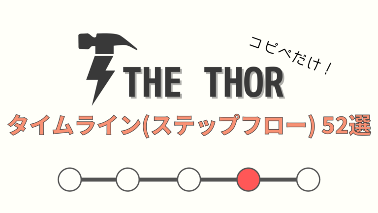
今回は THE THOR(ザ・トール)にステップフローを、CSSと PHPだけで実装するカスタマイズを紹介します。
目的地の行き方や、料理の手順などを解説するのに便利なステップフローボックス。箇条書きリストで紹介する人もいますが、それでは手順の内容が分かりにくいですね。
THE THOR(ザ・トール)にはステップフローの機能がありません。今回のカスタマイズを実装すると、手順を解説していくのが楽しくなりますよ!
まず初めに、ウェブサイトにおけるステップフローとは何かを知る必要があります。完成図と合わせてお伝えしますので、知ってるよ!って人は【ステップフローの作り方】までジャンプしてください。
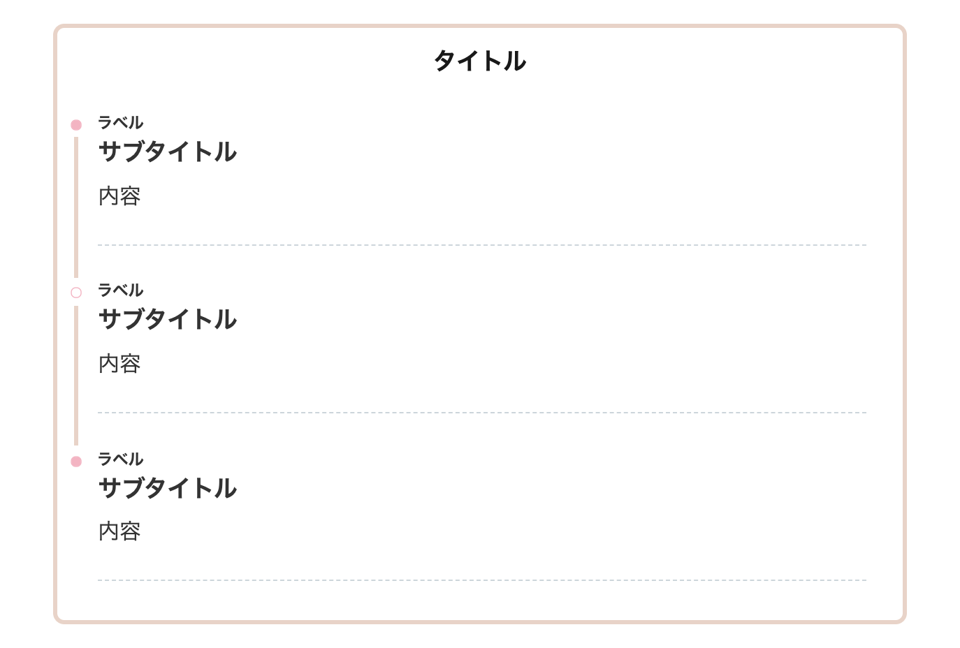
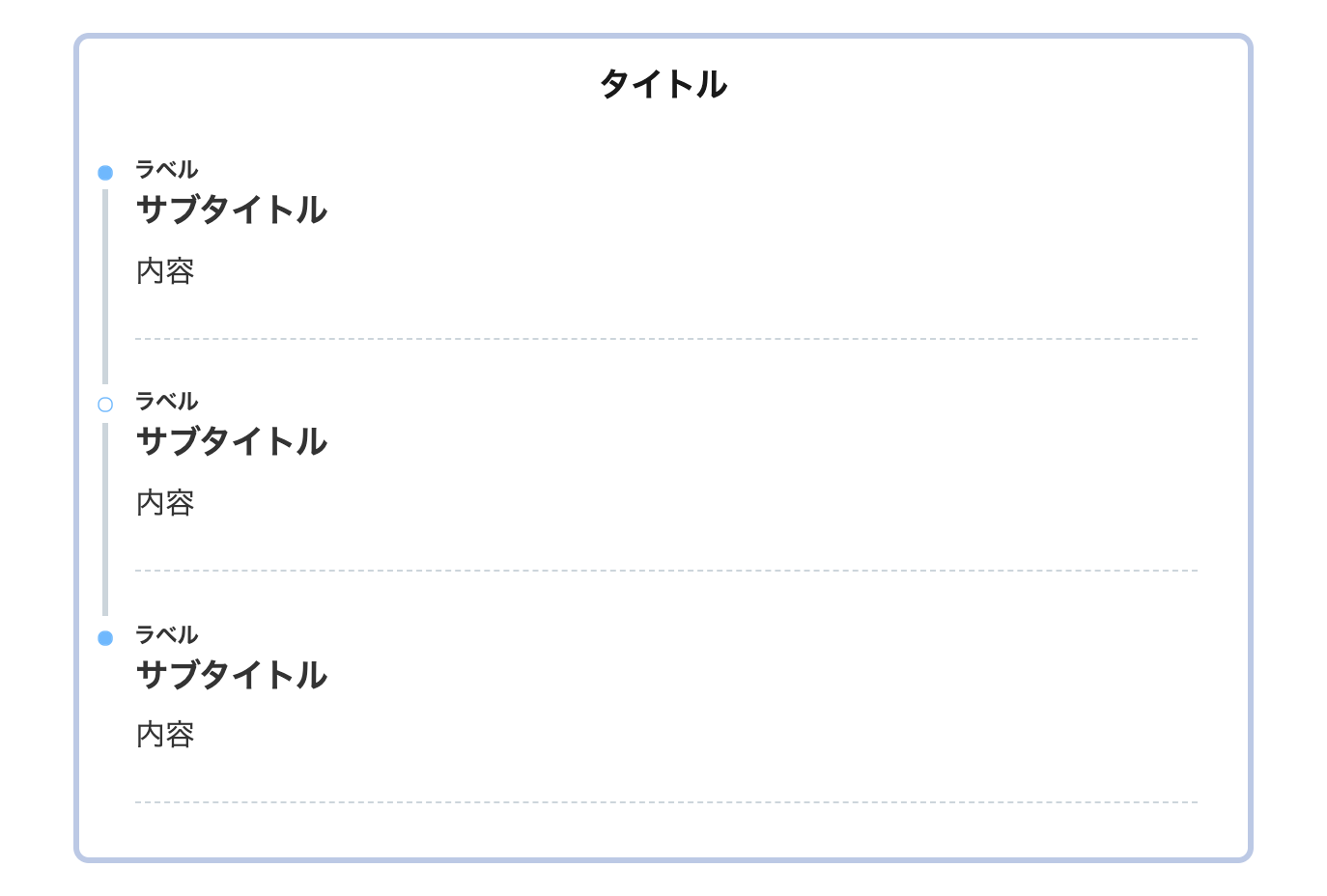
- 1 ステップフロー(タイムライン)とは?【完成図】
- 2 THE THORでステップフローを作る手順 STEP3
- 3 THE THOR ステップフロー:デザインサンプル52選
- 3.1 1. シンプル
- 3.2 2. シンプル(ピンク)
- 3.3 3. シンプル(ブルー)
- 3.4 4.シンプル(イエロー)
- 3.5 5. シンプル(枠あり)
- 3.6 6. シンプル(枠あり・ピンク)
- 3.7 7. シンプル(枠あり・ブルー)
- 3.8 8. シンプル(枠あり・イエロー)
- 3.9 9. シンプル(枠あり・角丸)
- 3.10 10. シンプル(枠あり・角丸・ピンク)
- 3.11 11. シンプル(枠あり・角丸・ブルー)
- 3.12 12. シンプル(枠あり・角丸・イエロー)
- 3.13 13. シンプル(破線)
- 3.14 14. シンプル(点線)
- 3.15 15. シンプル(二重線)
- 3.16 16. 上下ボーダー
- 3.17 17.左右ボーダー
- 3.18 18. 左のみボーダー
- 3.19 19. クール
- 3.20 20. シャドーボックス
- 3.21 21. ステッチ風
- 3.22 22. ステッチ風(ブルー)
- 3.23 23. ステッチ風(ピンク)
- 3.24 24. 四角タイムライン
- 3.25 25. 四角タイムライン(枠あり)
- 3.26 26. 四角タイムライン(角丸)
- 3.27 27. 四角タイムライン(枠あり・角丸・影)
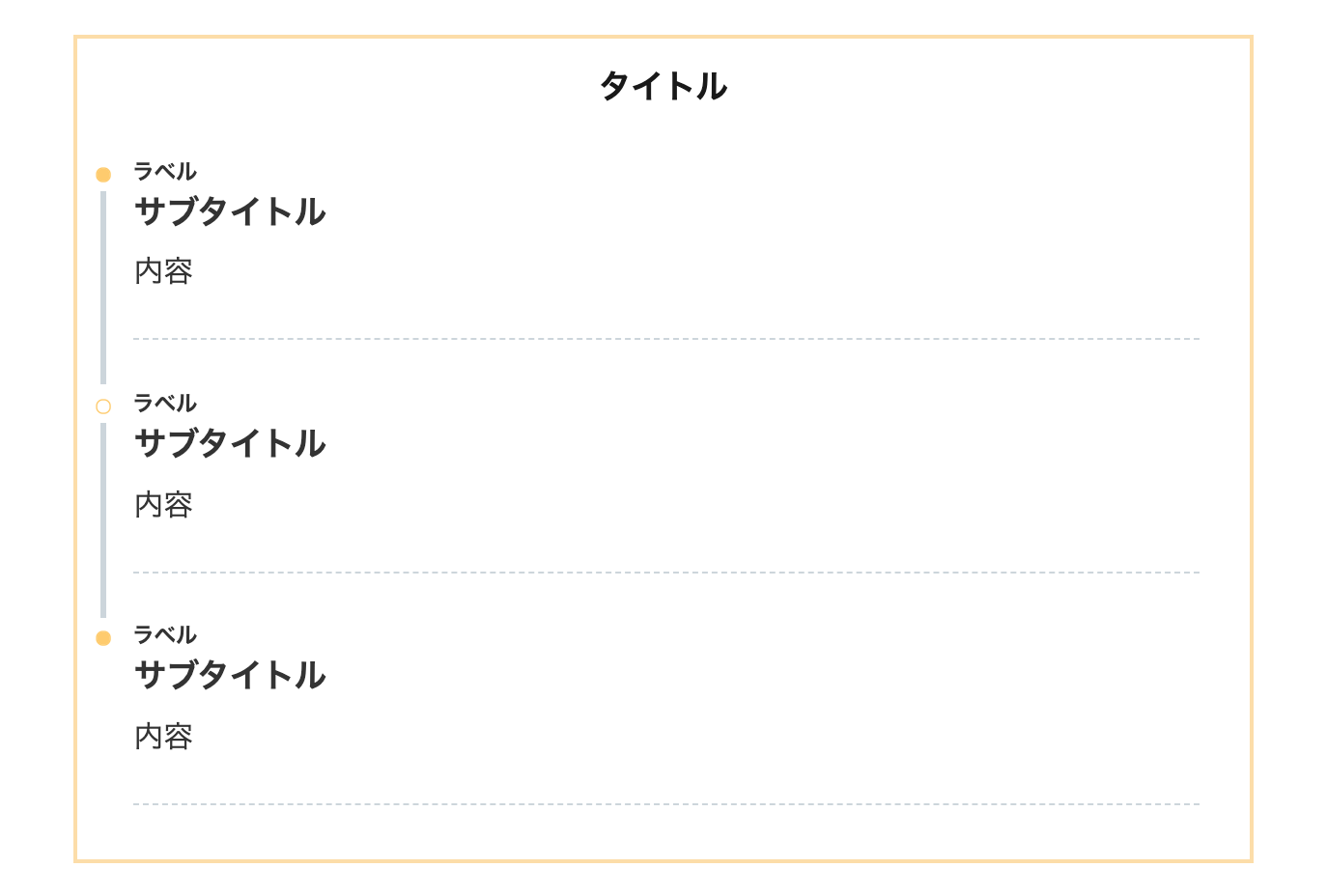
- 3.28 28. SANGO風
- 3.29 29. SANGO風(イエロー)
- 3.30 30. SANGO風(ブルー)
- 3.31 31. SANGO風(角丸)
- 3.32 32. SANGO風(角丸・イエロー)
- 3.33 33. SANGO風(角丸・ブルー)
- 3.34 34. SANGO風(影あり)
- 3.35 35. SANGO風(枠あり・角丸・影あり)
- 3.36 36. SANGO風(枠あり・角丸・影あり・イエロー)
- 3.37 37. SANGO風(角丸・影あり・ブルー)
- 3.38 38. SANGO風(枠あり)
- 3.39 39. SANGO風(枠あり・ブルー)
- 3.40 40. SANGO風(枠あり・イエロー)
- 3.41 41. SANGO風(枠あり・影あり)
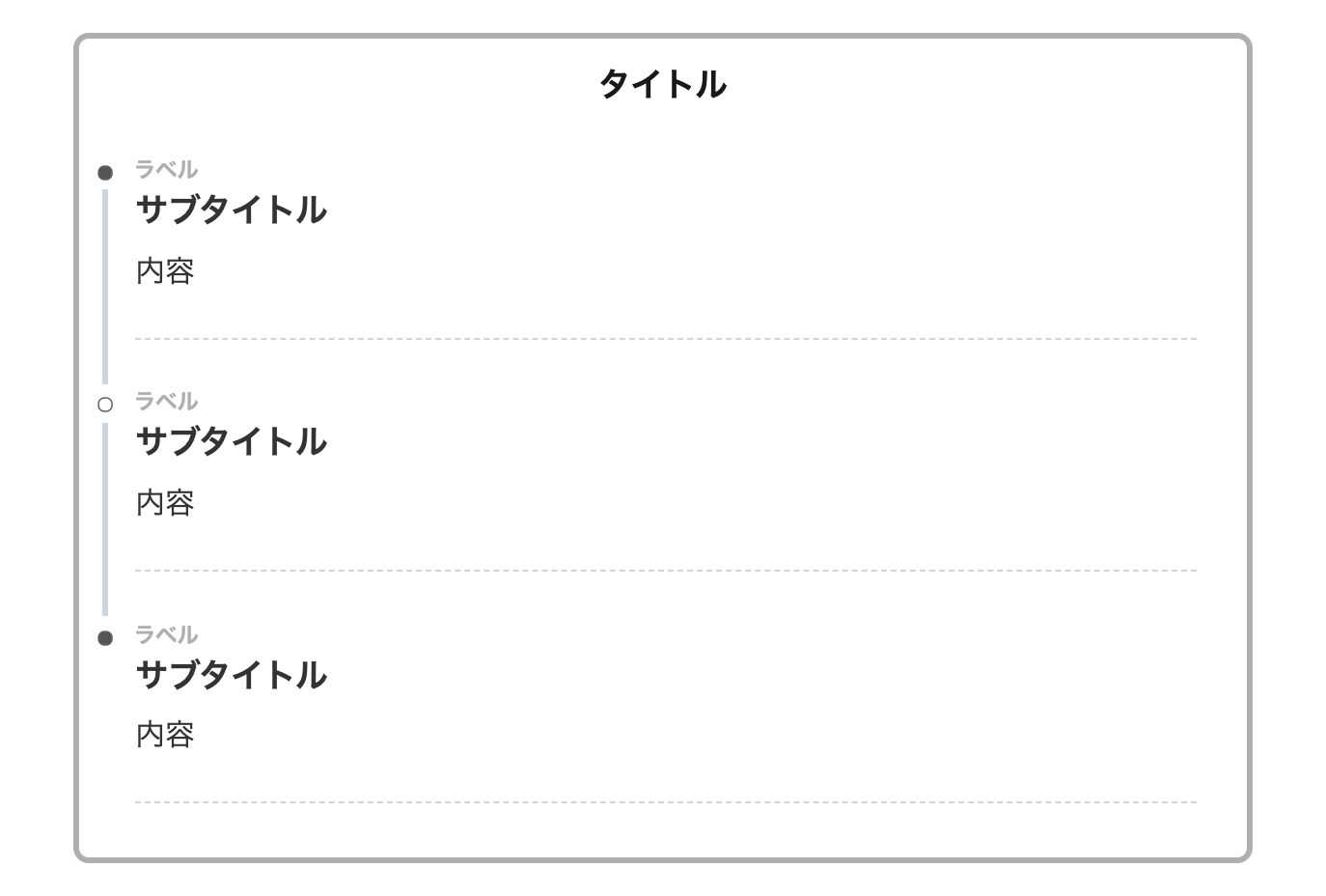
- 3.42 42. AFFINGER5風
- 3.43 43. THE THORのデフォルト風
- 3.44 44. Twitterナイトモード風
- 3.45 45. Googleマップ風
- 3.46 46. manablog風
- 3.47 47. クール&シンプル
- 3.48 48. クール&カジュアル
- 3.49 49. MASAa.net風
- 3.50 50. アイコン付き
- 3.51 51. 背景ありラベル
- 3.52 52.グラデーション
- 4 ステップフローの色をカスタマイズする方法
- 5 ステップフロー(タイムライン)の使い方
- 6 THE THORにステップフローを実装したユーザーさんのコメント
- 7 THE THORでステップフロー(タイムライン)を作るカスタマイズ:まとめ
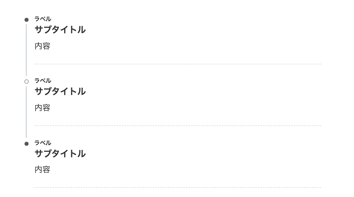
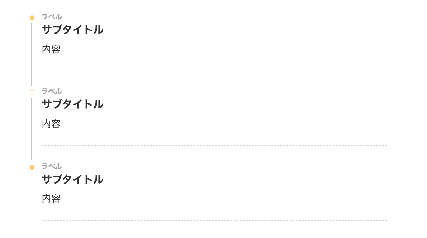
ステップフロー(タイムライン)とは?【完成図】
ステップフローボックスとは文字通り時系列で手順を表すボックスのことです。
タイムラインとも呼ばれてますね。よく、旅行の時刻表やハウツー手順などで使用されています。
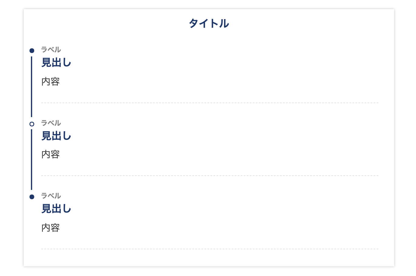
以下が、THE THOR(ザ・トール)の機能だけで作った精いっぱいのステップフローです。
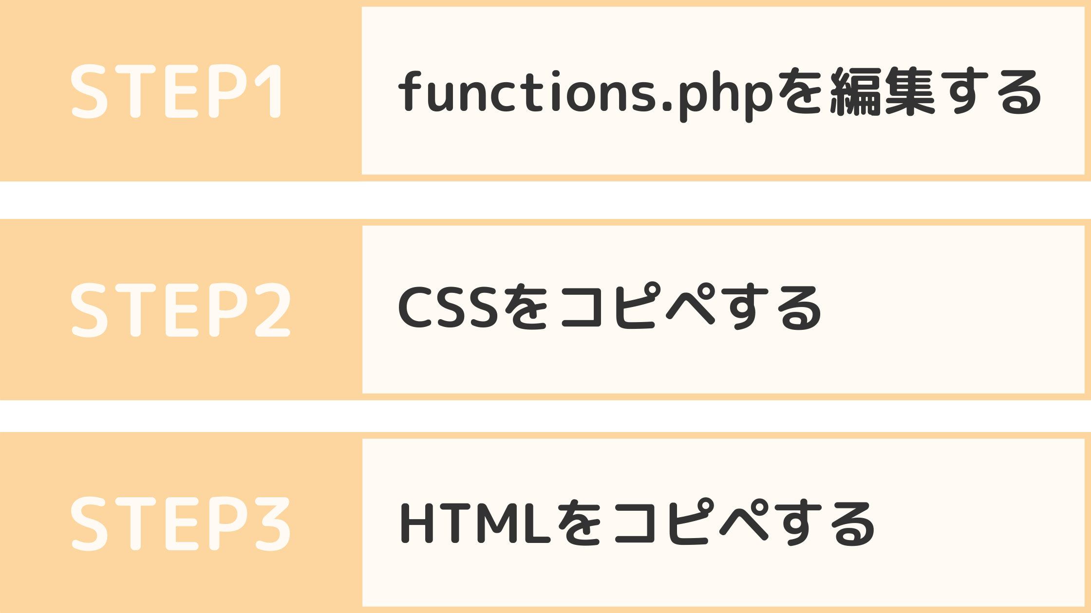
【ステップフローを作る手順】
1. functions.phpを編集する
2. CSSをコピペする
3. HTMLをコピペ
でもわかりにくいし、デザインが制限過ぎて見栄えは良くないよね。
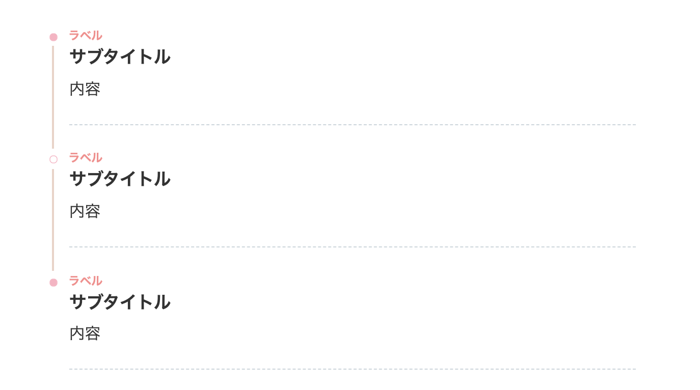
そして以下が今回 THE THOR(ザ・トール)に実装するステップフローの完成図です。
- STEP1functions.phpを編集するTHE THOR(ザ・トール)でステップフローを実装させるコードを functions.phpに貼り付けます。
- STEP2CSSをコピペするステップフローのデザインを整える CSSを THE THORの「追加CSS」にコピペします。

- STEP3HTMLをコピペするHTMLコードを記事内に貼ってタイムラインを使用します。
しかもリンクとか画像も入れられるねんな♪
ステップフローがあれば手順を分かりやすく読者に解説していくことができます。とっても便利ですね。
今回のカスタマイズは Rirarinoを運営するるこさんの記事を参考にさせていただきました。
THE THORでステップフローを作る手順 STEP3
THE THOR(ザ・トール)にステップフローを作る手順を解説していきます。今回のカスタマイズはレスポンシブと言って、 PC・モバイル共に同じサイズで表示されます。
※カスタマイズは自己責任でお願いします。
STEP1. functions.phpを編集する
まず STEP1ではステップフローを動作させるためのコードを functions.phpに貼り付けます。
以下のコードをコピーしてください。
-
//timelineショートコードコンテンツ内に余計な改行や文字列が入らないように除外
if ( !function_exists( 'remove_wrap_shortcode_wpautop' ) ):
function remove_wrap_shortcode_wpautop($shortcode, $content){
//tiショートコードのみを抽出
$pattern = '/\['.$shortcode.'.*?\].*?\[\/'.$shortcode.'\]/is';
if (preg_match_all($pattern, $content, $m)) {
$all = null;
foreach ($m[0] as $code) {
$all .= $code;
}
return $all;
}
}
endif;

//ステップフローの作成(timelineショートコード)
add_shortcode('timeline', 'timeline_shortcode');
if ( !function_exists( 'timeline_shortcode' ) ):
function timeline_shortcode( $atts, $content = null ){
extract( shortcode_atts( array(
'title' => null,
), $atts ) );
$content = remove_wrap_shortcode_wpautop('ti', $content);
$content = do_shortcode( shortcode_unautop( $content ) );
$title_tag = null;
if ($title) {
$title_tag = '<div class="timeline-title">'.$title.'</div>';
}
$tag = '<div class="timeline-box">'.
$title_tag.
'<ul class="timeline">'.
$content.
'</ul>'.
'</div>';
return apply_filters('timeline_tag', $tag);
}
endif;

//ステップフロー作成(ステップフローの中の項目)
add_shortcode('ti', 'timeline_item_shortcode');
if ( !function_exists( 'timeline_item_shortcode' ) ):
function timeline_item_shortcode( $atts, $content = null ){
extract( shortcode_atts( array(
'title' => null,
'label' => null,
), $atts ) );
$title_tag = null;
if ($title) {
$title_tag = '<div class="timeline-item-title">'.$title.'</div>';
}

$content = do_shortcode( shortcode_unautop( $content ) );
$tag = '<li class="timeline-item">'.
'<div class="timeline-item-label">'.$label.'</div>'.
'<div class="timeline-item-content">'.
'<div class="timeline-item-title">'.$title.'</div>'.
'<div class="timeline-item-snippet">'.$content.'</div>'.
'</div>'.
'</li>';
return apply_filters('timeline_item_tag', $tag);
}
endif;
※クリックするとショートコードが表示されます。
コピーしたら次は THE THOR(ザ・トール)の子テーマの「テーマのための関数(functions.php)」に貼り付けます。
と進んでください。
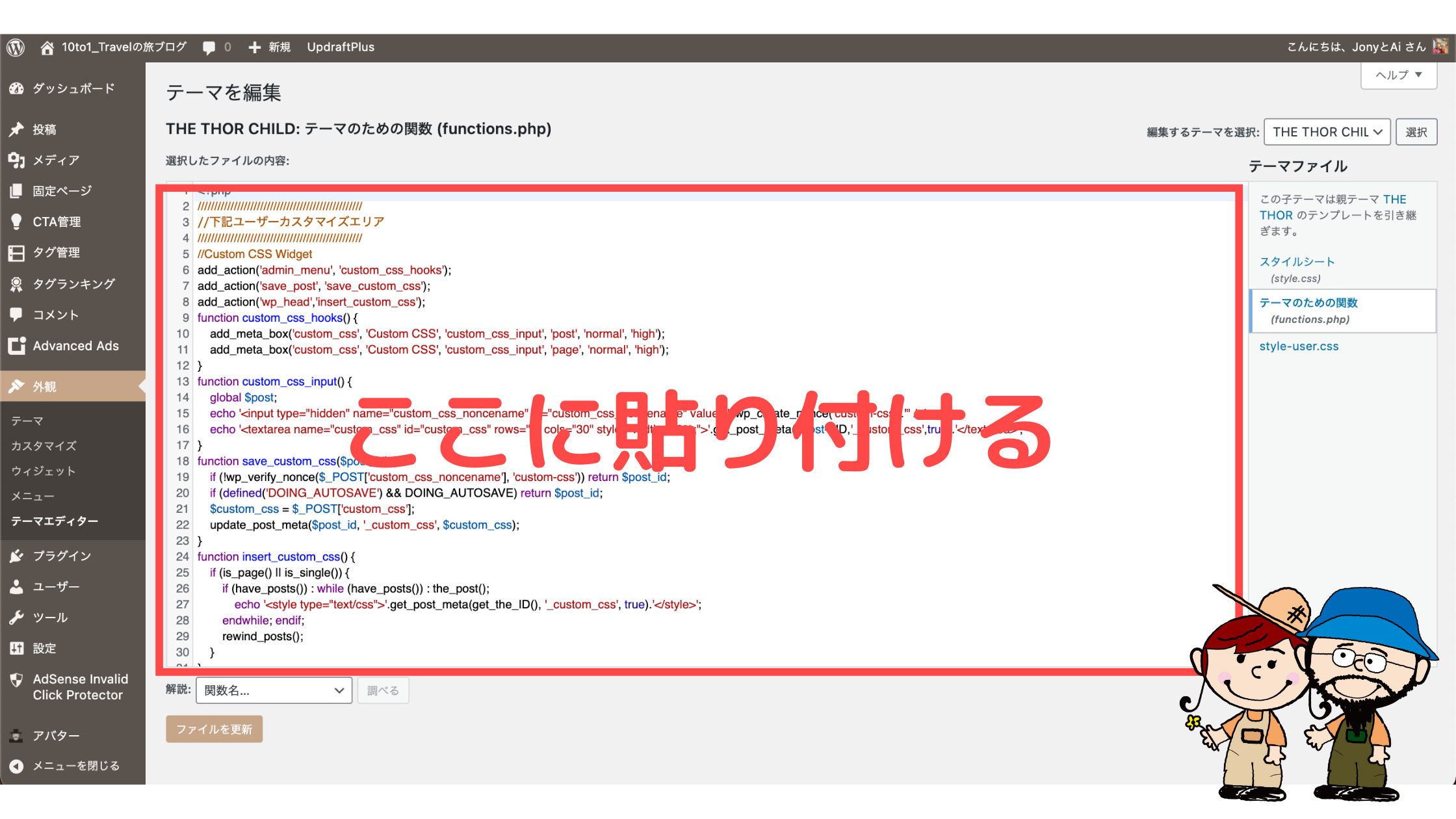
※この時、必ず子テーマ(the-thor-child)を選択してることを確認し、子テーマを編集してください。
最後に「ファイルを更新」をクリックして functions.phpの編集は完了です。
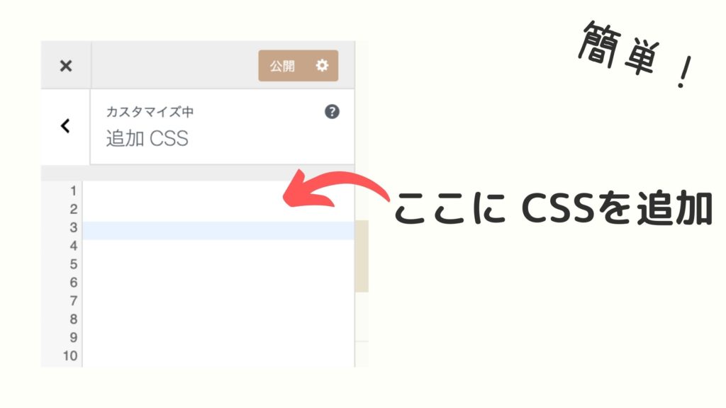
STEP2. 「追加CSS」にコピペする
STEP2ではステップフローのデザインを整えるための CSSコードを THE THOR(ザ・トール)の「追加CSS」にコピペします。
以下の CSSをコピーしてください。
-
/*ステップフロー*/
.timeline-box ul > li:before {
content: "";
}
.partsUl-1 .timeline-box ul {
background-color: transparent;
}
.timeline > li.timeline-item {
padding-left: 0;
}
.content .timeline-item-content {
margin-top:0;
margin-left: 5px;
padding: 0 0 1.5em 1.1em;
width: 95%;
}
/*ステップフローの内容*/
.content .timeline-item-snippet {
margin-top: .5em;
padding: 0 0 1.5em;
border-bottom: dashed 1px #c0c0c0;/*内容の下の破線*/
color: #505050;/*内容の文字色*/
}
/*ステップフローボックス*/
.timeline-box {
margin-bottom: 20px;
box-sizing: border-box;
background:#fffbf4;/*ボックスの背景色*/
box-shadow:0 2px 4px rgb(0 0 0 / 15%);/*ボックスのシャドー*/
}
.timeline-box *{
box-sizing: border-box;
}
.timeline-box .timeline {
list-style: none;
padding: 0 0 6px 0;
margin: 0;
}
.content .timeline ul {
margin-bottom: 20px;
}
/*ステップフローのタイトル*/
.timeline-title {
font-weight: bold;/*太文字*/
font-size: 1.1em;/*フォントサイズ*/
text-align: center;/*フォント位置*/
margin-bottom:2rem;
border-bottom: solid 3px #f89174; /*タイトルの下ボーダー色*/
padding: 10px 0;
background-color: #f89174; /*タイトルの背景色 */
color: #ffffff; /*タイトルの文字色 */
}
.timeline > li {
margin-bottom: 60px;
}
.timeline > li.timeline-item {
overflow: hidden;
margin: 0 0 0 13px;
position: relative;
}
/*ステップフローのラベル*/
.timeline-item-label {
padding-top: 2px;
font-weight: 700;
font-size: 18px;
margin-left: 1.4em;
color:#90969a;/*ラベルの文字色*/
}
@media screen and (max-width : 480px){
.timeline-item-label {
font-size:16px;
}
}
/*ステップフローの見出し*/
.timeline-item-title {
font-size: 1.1em;/*見出しのフォントサイズ*/
font-weight: 700;
line-height: 1.5;
color:#333;/*見出しの文字色*/
}
/*ステップフローの●カラー(上)*/
.content .timeline-item:first-of-type:before {
background: #6bb6ff;/*●のカラー*/
}
/*ステップフローの●カラー(中)*/
.content .timeline-item:before {
content: '';
width: 14px;
height: 14px;
background: #ffffff;/*●のカラー*/
position: absolute;
left: 0;
top: 7px;
border-radius: 50%;
border: solid 3px #6bb6ff;
}
/*ステップフローの●カラー(下)*/
.content .timeline-item:last-of-type:before {
background: #6bb6ff;/*●のカラー*/
}
.content .timeline-item:last-of-type:after {
background: 0 0;
}
/*ステップフローの縦線*/
.content .timeline-item:after {
content: "";
width: 3px;/*ラインの太さ*/
background: #ccd5db;/*ラインの色*/
display: block;
position: absolute;
top: 25px;
bottom: 0;
left: 5px;
}
※クリックすると CSSが表示されます。
コピーしたら THE THOR(ザ・トール)の「追加CSS」に貼り付けます。
と進んで、枠内に貼り付けてください。
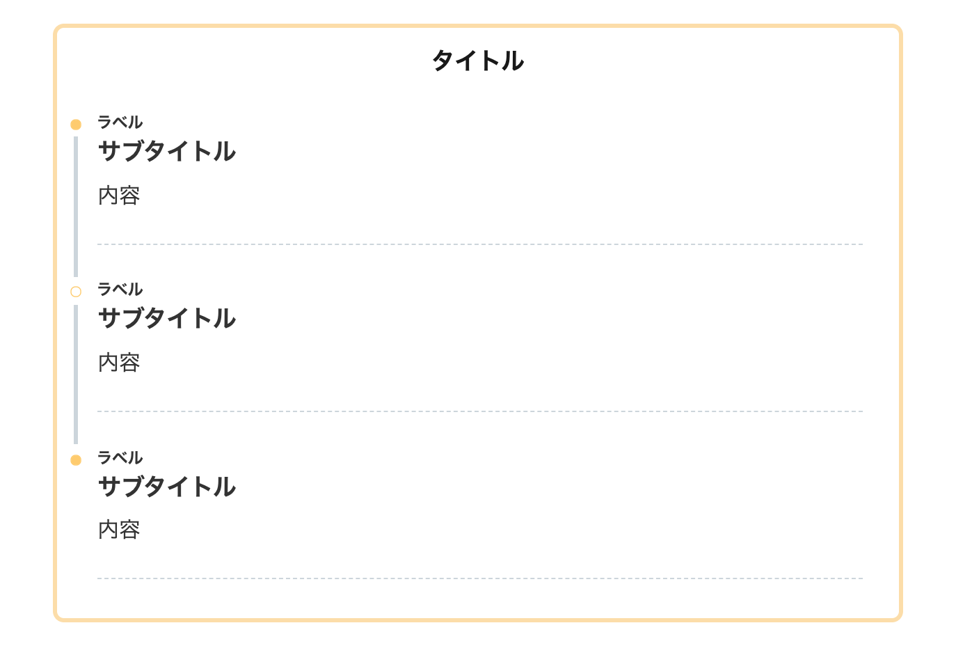
ちなみに上記の CSSは、34.SANGO風(影あり)のデザインです。
希望のデザインにしたい場合は、CSSを直接カスタマイズするか、後半に紹介するデザインサンプルから好きな CSSを選び使用してください。
THE THORの「追加CSS」についてもっと詳しく知りたい人は、以下の記事をご覧ください。
みなさんこんにちは。 THE THOR(ザ・トール)のデザインをもっと細かくカスタマイズしたい時に、ネットで調べたら【コピペだけ!】ってタイトルありますよね。 でも コピペってどこに?追加 CSSって[…]
これでステップフローを機能させるための設定は完了です!あとはステップフローを設置するための HTMLを貼ればステップフローが出現します。
STEP3. HTMLをコピペする
最後に STEP3では記事にステップフローを使用するための HTMLコードをコピペします。
[timeline title="タイトル"]
   [ti label="ラベル" title="見出し"]内容[/ti]
   [ti label="ラベル" title="見出し"]内容[/ti]
   [ti label="ラベル" title="見出し"]内容[/ti]
[/timeline]
HTMLとは簡単に言うと文字や表などをブログ内で表示するためのコードです。
家で言うと、
- HTML:骨組み
- CSS:外壁などの外観
って感じですね。
上記の HTMLタグをコピーして、記事の好きなところに貼り付けて使用します。ちゃんとステップフローボックスが表示されてれば完了です!
ワンクリックでステップフローを設置できるAddQuickTagがオススメ!
上記の HTMLコードをいちいちコピペするの大変ですよね。そんな時はチョー便利なプラグイン「AddQuickTag」を利用しましょう。
AddQuickTagは文章や HTMLを保存し、ワンクリックで呼び出すことができるブログ必須プラグインです。
もちろん無料。
使い方は「AddQuickTag 使い方」でググってくださいすいません。。。
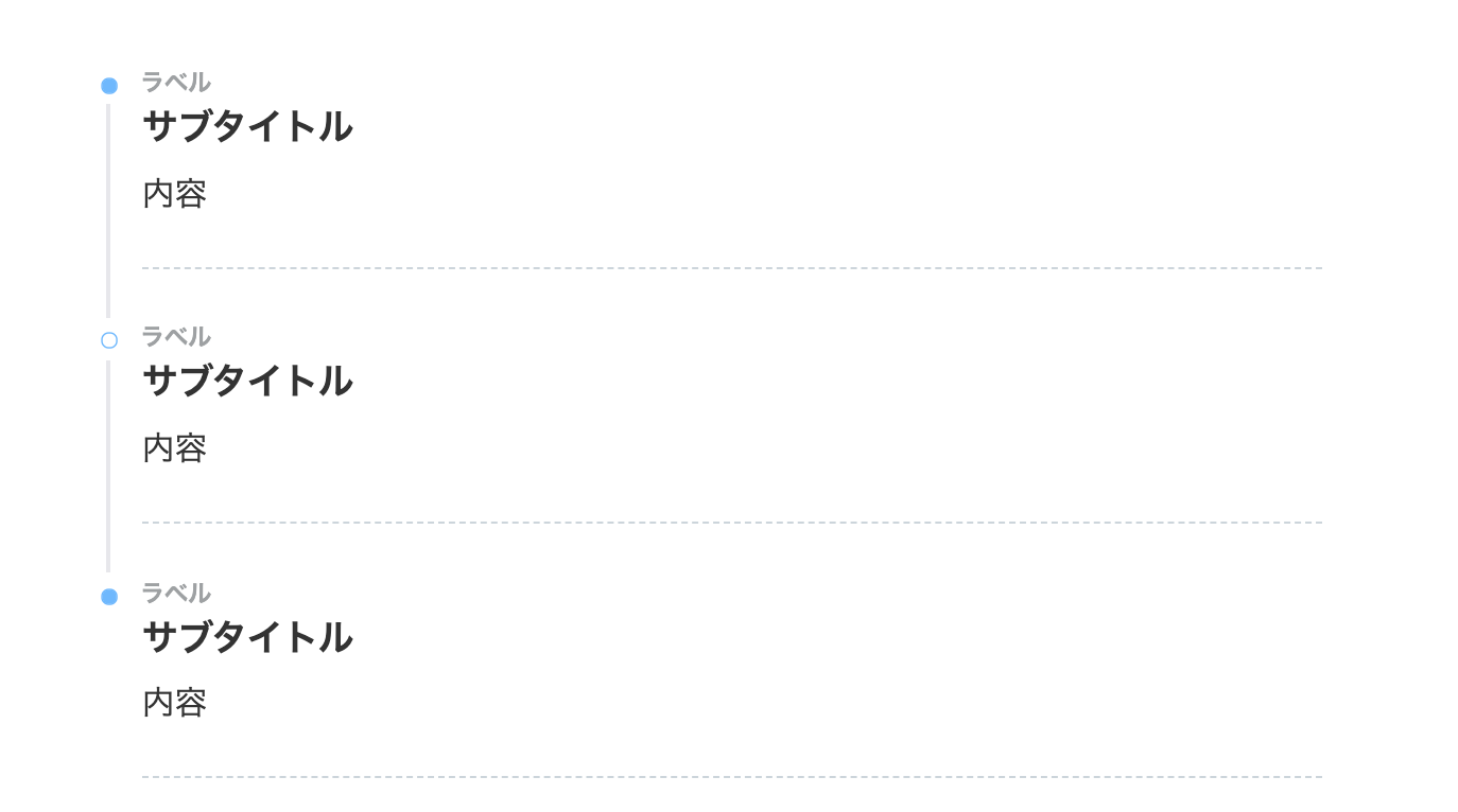
THE THOR ステップフロー:デザインサンプル52選
それでは私たちが作ったおしゃれなステップフロー(タイムライン)のデザインを紹介していきます。
この後にステップフローの色やアイコンを変更する方法を紹介してます。自分のサイトに合ったデザインにしたい人はご覧ください。
※「CSSをコピペ」のボタンをクリックするとデザインの CSSが表示されます。
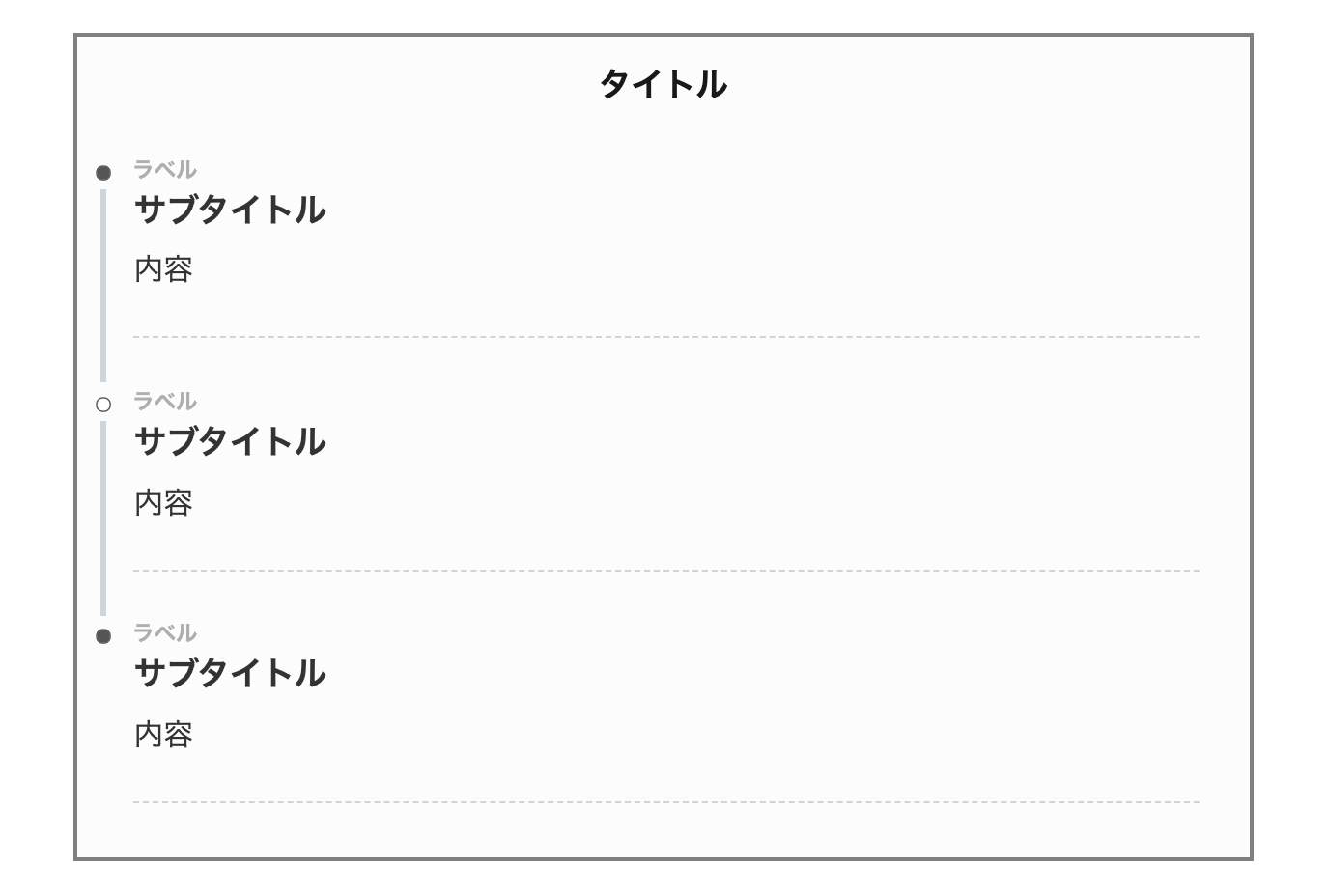
1. シンプル
タイトルや枠がなく、シンプルなデザインです。
必要最低限のデザインですね。
- CSSをコピペ
-
/*タイムライン*/
.timeline-box ul > li:before {
content: "";
}
.partsUl-1 .timeline-box ul {
background-color: transparent;
}
.timeline > li.timeline-item {
padding-left: 0;
}
.content .timeline-item-content {
margin-top:0;
margin-left: 5px;
padding: 0 0 1.5em 1.1em;
width: 95%;
}
.content .timeline-item-snippet {
margin-top: .5em;
padding: 0 0 1.5em;
border-bottom: dashed 1px #ccd5db;
}
/*ボックス*/
.timeline-box {
margin-bottom: 20px;
padding-top: 10px;
box-sizing: border-box;
}
.timeline-box *{
box-sizing: border-box;
}
.timeline-box .timeline {
list-style: none;
padding: 0 0 6px 0;
margin: 0;
}
.content .timeline ul {
margin-bottom: 20px;
}
/*タイトル*/
.timeline-title {
display: none;
width:0;
height:0;
}
.timeline > li {
margin-bottom: 60px;
}
.timeline > li.timeline-item {
overflow: hidden;
margin: 0 0 0 10px;
position: relative;
}
/*ラベル*/
.timeline-item-label {
padding-top: 2px;
font-weight: 700;
font-size: 14px;
margin-left: 1.8em;
}
@media screen and (max-width : 480px){
.timeline-item-label {
font-size:16px;
}
}
/*見出し*/
.timeline-item-title {
font-size: 1.1em;
font-weight: 700;
line-height: 1.5;
}
/*●部分*/
.content .timeline-item:first-of-type:before {
background: #555;
}
.content .timeline-item:last-of-type:before {
background: #555;
}
.content .timeline-item:before {
content: '';
width: 14px;
height: 14px;
background: #ffffff;
position: absolute;
left: 0;
top: 7px;
border-radius: 50%;
border: solid 2px #555;
}
.content .timeline-item:last-of-type:after {
background: 0 0;
}
/*縦線*/
.content .timeline-item:after {
content: "";
width: 3px;
background: #ccd5dd;
display: block;
position: absolute;
top: 25px;
bottom: 0;
left: 5px;
}
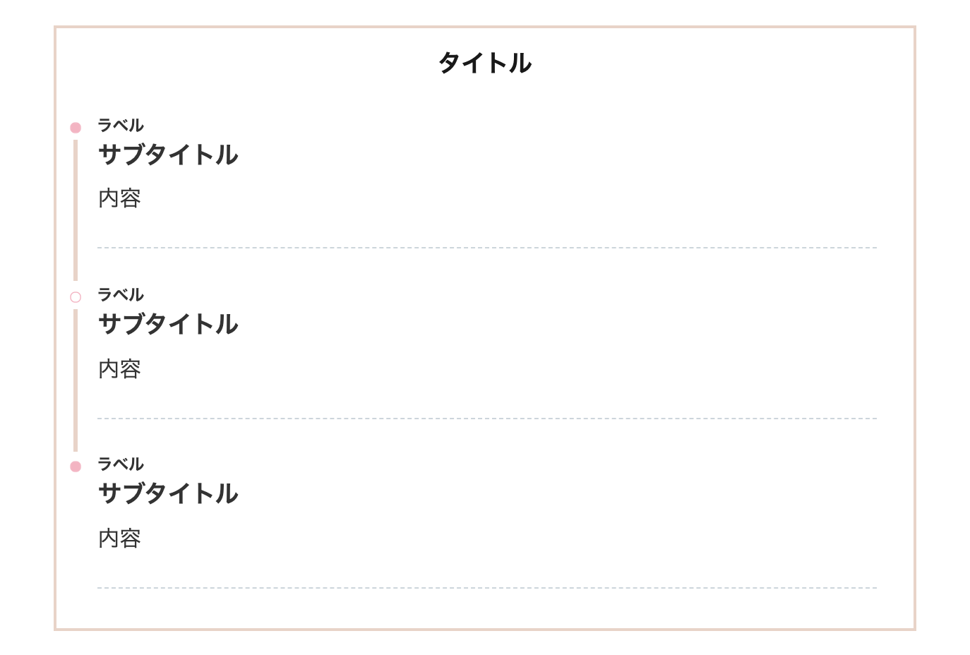
2. シンプル(ピンク)
シンプルデザインのピンクバージョンです。
女の子に人気のデザインです。
- CSSをコピペ
-
/*タイムライン*/
.timeline-box ul > li:before {
content: "";
}
.partsUl-1 .timeline-box ul {
background-color: transparent;
}
.timeline > li.timeline-item {
padding-left: 0;
}
.content .timeline-item-content {
margin-top:0;
margin-left: 5px;
padding: 0 0 1.5em 1.1em;
width: 95%;
}
.content .timeline-item-snippet {
margin-top: .5em;
padding: 0 0 1.5em;
border-bottom: dashed 1px #ccd5db;
}
/*ボックス*/
.timeline-box {
margin-bottom: 20px;
padding-top: 10px;
box-sizing: border-box;
}
.timeline-box *{
box-sizing: border-box;
}
.timeline-box .timeline {
list-style: none;
padding: 0 0 6px 0;
margin: 0;
}
.content .timeline ul {
margin-bottom: 20px;
}
/*タイトル*/
.timeline-title {
display: none;
width:0;
height:0;
}
.timeline > li {
margin-bottom: 60px;
}
.timeline > li.timeline-item {
overflow: hidden;
margin: 0 0 0 10px;
position: relative;
}
/*ラベル*/
.timeline-item-label {
padding-top: 2px;
font-weight: 700;
font-size: 14px;
margin-left: 1.8em;
color:#f0908d;
}
@media screen and (max-width : 480px){
.timeline-item-label {
font-size:16px;
}
}
/*見出し*/
.timeline-item-title {
font-size: 1.1em;
font-weight: 700;
line-height: 1.5;
}
/*●部分*/
.content .timeline-item:first-of-type:before {
background: #f4b3c2;
}
.content .timeline-item:last-of-type:before {
background: #f4b3c2;
}
.content .timeline-item:before {
content: '';
width: 14px;
height: 14px;
background: #ffffff;
position: absolute;
left: 0;
top: 7px;
border-radius: 50%;
border: solid 2px #f4b3c2;
}
.content .timeline-item:last-of-type:after {
background: 0 0;
}
/*縦線*/
.content .timeline-item:after {
content: "";
width: 3px;
background:#e8d3c7;
display: block;
position: absolute;
top: 25px;
bottom: 0;
left: 5px;
}
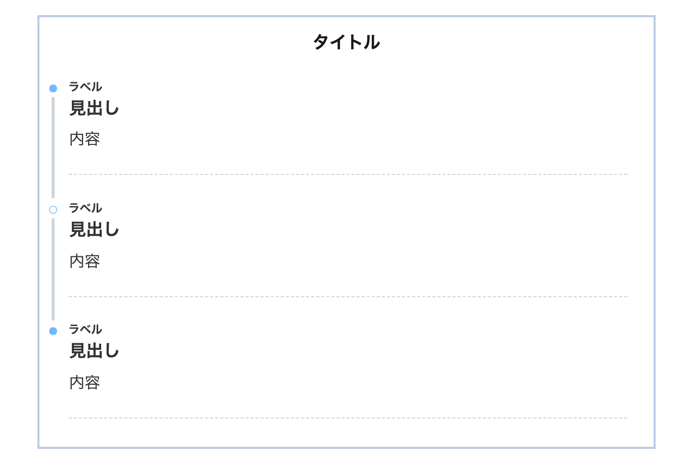
3. シンプル(ブルー)
シンプルデザインのブルーバージョンです。
Webっぽいデザインですね。
- CSSをコピペ
-
/*タイムライン*/
.timeline-box ul > li:before {
content: "";
}
.partsUl-1 .timeline-box ul {
background-color: transparent;
}
.timeline > li.timeline-item {
padding-left: 0;
}
.content .timeline-item-content {
margin-top:0;
margin-left: 5px;
padding: 0 0 1.5em 1.1em;
width: 95%;
}
.content .timeline-item-snippet {
margin-top: .5em;
padding: 0 0 1.5em;
border-bottom: dashed 1px #ccd5db;
}
/*ボックス*/
.timeline-box {
margin-bottom: 20px;
padding-top: 10px;
box-sizing: border-box;
}
.timeline-box *{
box-sizing: border-box;
}
.timeline-box .timeline {
list-style: none;
padding: 0 0 6px 0;
margin: 0;
}
.content .timeline ul {
margin-bottom: 20px;
}
/*タイトル*/
.timeline-title {
display: none;
width:0;
height:0;
}
.timeline > li {
margin-bottom: 60px;
}
.timeline > li.timeline-item {
overflow: hidden;
margin: 0 0 0 10px;
position: relative;
}
/*ラベル*/
.timeline-item-label {
padding-top: 2px;
font-weight: 700;
font-size: 14px;
margin-left: 1.8em;
color:#9ea1a3;
}
@media screen and (max-width : 480px){
.timeline-item-label {
font-size:16px;
}
}
/*見出し*/
.timeline-item-title {
font-size: 1.1em;
font-weight: 700;
line-height: 1.5;
}
/*●部分*/
.content .timeline-item:first-of-type:before {
background: #6bb6ff;
}
.content .timeline-item:last-of-type:before {
background: #6bb6ff;
}
.content .timeline-item:before {
content: '';
width: 14px;
height: 14px;
background: #ffffff;
position: absolute;
left: 0;
top: 7px;
border-radius: 50%;
border: solid 2px #6bb6ff;
}
.content .timeline-item:last-of-type:after {
background: 0 0;
}
/*縦線*/
.content .timeline-item:after {
content: "";
width: 3px;
background: #e7e7eb;
display: block;
position: absolute;
top: 25px;
bottom: 0;
left: 5px;
}
4.シンプル(イエロー)
シンプルデザインのイエローバージョンです。
少しカジュアルになりました。
- CSSをコピペ
-
/*タイムライン*/
.timeline-box ul > li:before {
content: "";
}
.partsUl-1 .timeline-box ul {
background-color: transparent;
}
.timeline > li.timeline-item {
padding-left: 0;
}
.content .timeline-item-content {
margin-top:0;
margin-left: 5px;
padding: 0 0 1.5em 1.1em;
width: 95%;
}
.content .timeline-item-snippet {
margin-top: .5em;
padding: 0 0 1.5em;
border-bottom: dashed 1px #ccd5de;
}
/*ボックス*/
.timeline-box {
margin-bottom: 20px;
padding-top: 10px;
box-sizing: border-box;
}
.timeline-box *{
box-sizing: border-box;
}
.timeline-box .timeline {
list-style: none;
padding: 0 0 6px 0;
margin: 0;
}
.content .timeline ul {
margin-bottom: 20px;
}
/*タイトル*/
.timeline-title {
display: none;
width:0;
height:0;
}
.timeline > li {
margin-bottom: 60px;
}
.timeline > li.timeline-item {
overflow: hidden;
margin: 0 0 0 10px;
position: relative;
}
/*ラベル*/
.timeline-item-label {
padding-top: 2px;
font-weight: 700;
font-size: 14px;
margin-left: 1.8em;
color:#9ea1a3;
}
@media screen and (max-width : 480px){
.timeline-item-label {
font-size:16px;
}
}
/*見出し*/
.timeline-item-title {
font-size: 1.1em;
font-weight: 700;
line-height: 1.5;
}
/*●部分*/
.content .timeline-item:first-of-type:before {
background: #ffcc66;
}
.content .timeline-item:last-of-type:before {
background: #ffcc66;
}
.content .timeline-item:before {
content: '';
width: 14px;
height: 14px;
background: #ffffff;
position: absolute;
left: 0;
top: 7px;
border-radius: 50%;
border: solid 2px #ffcc66;
}
.content .timeline-item:last-of-type:after {
background: 0 0;
}
/*縦線*/
.content .timeline-item:after {
content: "";
width: 3px;
background: #c0c6c9;
display: block;
position: absolute;
top: 25px;
bottom: 0;
left: 5px;
}
5. シンプル(枠あり)
シンプルデザインに枠を付けました。
一番使い勝手が良さそうです。
- CSSをコピペ
-
/*タイムライン*/
.timeline-box ul > li:before {
content: "";
}
.partsUl-1 .timeline-box ul {
background-color: transparent;
}
.timeline > li.timeline-item {
padding-left: 0;
}
.content .timeline-item-content {
margin-top:0;
margin-left: 5px;
padding: 0 0 1.5em 1.1em;
width: 95%;
}
.content .timeline-item-snippet {
margin-top: .5em;
padding: 0 0 1.5em;
border-bottom: dashed 1px #ccd5db;
}
/*ボックス*/
.timeline-box {
margin-bottom: 20px;
padding-top: 10px;
box-sizing: border-box;
border:solid 3px gray;
background:#fcfcfc;
}
.timeline-box *{
box-sizing: border-box;
}
.timeline-box .timeline {
list-style: none;
padding: 0 0 6px 0;
margin: 0;
}
.content .timeline ul {
margin-bottom: 20px;
}
/*タイトル*/
.timeline-title {
font-weight: bold;
font-size: 1.1em;
text-align: center;
margin-bottom:2rem;
}
.timeline > li {
margin-bottom: 60px;
}
.timeline > li.timeline-item {
overflow: hidden;
margin: 0 0 0 10px;
position: relative;
}
/*ラベル*/
.timeline-item-label {
padding-top: 2px;
font-weight: 700;
font-size: 14px;
margin-left: 1.8em;
color:#afafb0;
}
@media screen and (max-width : 480px){
.timeline-item-label {
font-size:16px;
}
}
/*見出し*/
.timeline-item-title {
font-size: 1.1em;
font-weight: 700;
line-height: 1.5;
}
/*●部分*/
.content .timeline-item:first-of-type:before {
background: #555555;
}
.content .timeline-item:last-of-type:before {
background: #555555;
}
.content .timeline-item:before {
content: '';
width: 14px;
height: 14px;
background: #ffffff;
position: absolute;
left: 0;
top: 7px;
border-radius: 50%;
border: solid 2px #555555;
}
.content .timeline-item:last-of-type:after {
background: 0 0;
}
/*縦線*/
.content .timeline-item:after {
content: "";
width: 3px;
background:#ccd5dd;
display: block;
position: absolute;
top: 25px;
bottom: 0;
left: 5px;
}
6. シンプル(枠あり・ピンク)
シンプルデザイン枠ありのピンクです。
女の子のブログに合いそうです。
- CSSをコピペ
-
/*タイムライン*/
.timeline-box ul > li:before {
content: "";
}
.partsUl-1 .timeline-box ul {
background-color: transparent;
}
.timeline > li.timeline-item {
padding-left: 0;
}
.content .timeline-item-content {
margin-top:0;
margin-left: 5px;
padding: 0 0 1.5em 1.1em;
width: 95%;
}
.content .timeline-item-snippet {
margin-top: .5em;
padding: 0 0 1.5em;
border-bottom: dashed 1px #ccd5db;
}
/*ボックス*/
.timeline-box {
margin-bottom: 20px;
padding-top: 10px;
box-sizing: border-box;
border:solid 3px #e8d3c7;
}
.timeline-box *{
box-sizing: border-box;
}
.timeline-box .timeline {
list-style: none;
padding: 0 0 6px 0;
margin: 0;
}
.content .timeline ul {
margin-bottom: 20px;
}
/*タイトル*/
.timeline-title {
font-weight: bold;
font-size: 1.1em;
text-align: center;
margin-bottom:2rem;
}
.timeline > li {
margin-bottom: 60px;
}
.timeline > li.timeline-item {
overflow: hidden;
margin: 0 0 0 10px;
position: relative;
}
/*ラベル*/
.timeline-item-label {
padding-top: 2px;
font-weight: 700;
font-size: 14px;
margin-left: 1.8em;
}
@media screen and (max-width : 480px){
.timeline-item-label {
font-size:16px;
}
}
/*見出し*/
.timeline-item-title {
font-size: 1.1em;
font-weight: 700;
line-height: 1.5;
}
/*●部分*/
.content .timeline-item:first-of-type:before {
background: #f4b3c2;
}
.content .timeline-item:last-of-type:before {
background: #f4b3c2;
}
.content .timeline-item:before {
content: '';
width: 14px;
height: 14px;
background: #ffffff;
position: absolute;
left: 0;
top: 7px;
border-radius: 50%;
border: solid 2px #f4b3c2;
}
.content .timeline-item:last-of-type:after {
background: 0 0;
}
/*縦線*/
.content .timeline-item:after {
content: "";
width: 3px;
background: #e8d3c7;
display: block;
position: absolute;
top: 25px;
bottom: 0;
left: 5px;
}
7. シンプル(枠あり・ブルー)
シンプルデザイン枠ありのブルーです。
こちらも使いやすそうですね。
- CSSをコピペ
-
/*タイムライン*/
.timeline-box ul > li:before {
content: "";
}
.partsUl-1 .timeline-box ul {
background-color: transparent;
}
.timeline > li.timeline-item {
padding-left: 0;
}
.content .timeline-item-content {
margin-top:0;
margin-left: 5px;
padding: 0 0 1.5em 1.1em;
width: 95%;
}
.content .timeline-item-snippet {
margin-top: .5em;
padding: 0 0 1.5em;
border-bottom: dashed 1px #ccd5db;
}
/*ボックス*/
.timeline-box {
margin-bottom: 20px;
padding-top: 10px;
box-sizing: border-box;
border:solid 3px #bbc8e6;
}
.timeline-box *{
box-sizing: border-box;
}
.timeline-box .timeline {
list-style: none;
padding: 0 0 6px 0;
margin: 0;
}
.content .timeline ul {
margin-bottom: 20px;
}
/*タイトル*/
.timeline-title {
font-weight: bold;
font-size: 1.1em;
text-align: center;
margin-bottom:2rem;
}
.timeline > li {
margin-bottom: 60px;
}
.timeline > li.timeline-item {
overflow: hidden;
margin: 0 0 0 10px;
position: relative;
}
/*ラベル*/
.timeline-item-label {
padding-top: 2px;
font-weight: 700;
font-size: 14px;
margin-left: 1.8em;
}
@media screen and (max-width : 480px){
.timeline-item-label {
font-size:16px;
}
}
/*見出し*/
.timeline-item-title {
font-size: 1.1em;
font-weight: 700;
line-height: 1.5;
}
/*●部分*/
.content .timeline-item:first-of-type:before {
background: #6bb6ff;
}
.content .timeline-item:last-of-type:before {
background: #6bb6ff;
}
.content .timeline-item:before {
content: '';
width: 14px;
height: 14px;
background: #ffffff;
position: absolute;
left: 0;
top: 7px;
border-radius: 50%;
border: solid 2px #6bb6ff;
}
.content .timeline-item:last-of-type:after {
background: 0 0;
}
/*縦線*/
.content .timeline-item:after {
content: "";
width: 3px;
background: #ccd5db;
display: block;
position: absolute;
top: 25px;
bottom: 0;
left: 5px;
}
8. シンプル(枠あり・イエロー)
シンプルデザインのイエローです。
カジュアルなブログにぴったりですね。
- CSSをコピペ
-
/*タイムライン*/
.timeline-box ul > li:before {
content: "";
}
.partsUl-1 .timeline-box ul {
background-color: transparent;
}
.timeline > li.timeline-item {
padding-left: 0;
}
.content .timeline-item-content {
margin-top:0;
margin-left: 5px;
padding: 0 0 1.5em 1.1em;
width: 95%;
}
.content .timeline-item-snippet {
margin-top: .5em;
padding: 0 0 1.5em;
border-bottom: dashed 1px #ccd5db;
}
/*ボックス*/
.timeline-box {
margin-bottom: 20px;
padding-top: 10px;
box-sizing: border-box;
border:solid 3px #fddea5;
}
.timeline-box *{
box-sizing: border-box;
}
.timeline-box .timeline {
list-style: none;
padding: 0 0 6px 0;
margin: 0;
}
.content .timeline ul {
margin-bottom: 20px;
}
/*タイトル*/
.timeline-title {
font-weight: bold;
font-size: 1.1em;
text-align: center;
margin-bottom:2rem;
}
.timeline > li {
margin-bottom: 60px;
}
.timeline > li.timeline-item {
overflow: hidden;
margin: 0 0 0 10px;
position: relative;
}
/*ラベル*/
.timeline-item-label {
padding-top: 2px;
font-weight: 700;
font-size: 14px;
margin-left: 1.8em;
}
@media screen and (max-width : 480px){
.timeline-item-label {
font-size:16px;
}
}
/*見出し*/
.timeline-item-title {
font-size: 1.1em;
font-weight: 700;
line-height: 1.5;
}
/*●部分*/
.content .timeline-item:first-of-type:before {
background: #ffcc66;
}
.content .timeline-item:last-of-type:before {
background: #ffcc66;
}
.content .timeline-item:before {
content: '';
width: 14px;
height: 14px;
background: #ffffff;
position: absolute;
left: 0;
top: 7px;
border-radius: 50%;
border: solid 2px #ffcc66;
}
.content .timeline-item:last-of-type:after {
background: 0 0;
}
/*縦線*/
.content .timeline-item:after {
content: "";
width: 3px;
background: #ccd5db;
display: block;
position: absolute;
top: 25px;
bottom: 0;
left: 5px;
}
9. シンプル(枠あり・角丸)
シンプルデザイン枠ありの角を丸くしてみました。
- CSSをコピペ
-
/*タイムライン*/
.timeline-box ul > li:before {
content: "";
}
.partsUl-1 .timeline-box ul {
background-color: transparent;
}
.timeline > li.timeline-item {
padding-left: 0;
}
.content .timeline-item-content {
margin-top:0;
margin-left: 5px;
padding: 0 0 1.5em 1.1em;
width: 95%;
}
.content .timeline-item-snippet {
margin-top: .5em;
padding: 0 0 1.5em;
border-bottom: dashed 1px #ccd5db;
}
/*ボックス*/
.timeline-box {
margin-bottom: 20px;
padding-top: 10px;
box-sizing: border-box;
border:solid 4px #afafb0;
border-radius: 10px;
}
.timeline-box *{
box-sizing: border-box;
}
.timeline-box .timeline {
list-style: none;
padding: 0 0 6px 0;
margin: 0;
}
.content .timeline ul {
margin-bottom: 20px;
}
/*タイトル*/
.timeline-title {
font-weight: bold;
font-size: 1.1em;
text-align: center;
margin-bottom:2rem;
}
.timeline > li {
margin-bottom: 60px;
}
.timeline > li.timeline-item {
overflow: hidden;
margin: 0 0 0 10px;
position: relative;
}
/*ラベル*/
.timeline-item-label {
padding-top: 2px;
font-weight: 700;
font-size: 14px;
margin-left: 1.8em;
color:#afafb0;
}
@media screen and (max-width : 480px){
.timeline-item-label {
font-size:16px;
}
}
/*見出し*/
.timeline-item-title {
font-size: 1.1em;
font-weight: 700;
line-height: 1.5;
}
/*●部分*/
.content .timeline-item:first-of-type:before {
background: #555555;
}
.content .timeline-item:last-of-type:before {
background: #555555;
}
.content .timeline-item:before {
content: '';
width: 14px;
height: 14px;
background: #ffffff;
position: absolute;
left: 0;
top: 7px;
border-radius: 50%;
border: solid 2px #555555;
}
.content .timeline-item:last-of-type:after {
background: 0 0;
}
/*縦線*/
.content .timeline-item:after {
content: "";
width: 3px;
background:#ccd5dd;
display: block;
position: absolute;
top: 25px;
bottom: 0;
left: 5px;
}
10. シンプル(枠あり・角丸・ピンク)
シンプルデザイン角丸のピンクです。
こっちの方が可愛さが出てますね。
- CSSをコピペ
-
/*タイムライン*/
.timeline-box ul > li:before {
content: "";
}
.partsUl-1 .timeline-box ul {
background-color: transparent;
}
.timeline > li.timeline-item {
padding-left: 0;
}
.content .timeline-item-content {
margin-top:0;
margin-left: 5px;
padding: 0 0 1.5em 1.1em;
width: 95%;
}
.content .timeline-item-snippet {
margin-top: .5em;
padding: 0 0 1.5em;
border-bottom: dashed 1px #ccd5db;
}
/*ボックス*/
.timeline-box {
margin-bottom: 20px;
padding-top: 10px;
box-sizing: border-box;
border:solid 4px #e8d3c7;
border-radius: 10px;
}
.timeline-box *{
box-sizing: border-box;
}
.timeline-box .timeline {
list-style: none;
padding: 0 0 6px 0;
margin: 0;
}
.content .timeline ul {
margin-bottom: 20px;
}
/*タイトル*/
.timeline-title {
font-weight: bold;
font-size: 1.1em;
text-align: center;
margin-bottom:2rem;
}
.timeline > li {
margin-bottom: 60px;
}
.timeline > li.timeline-item {
overflow: hidden;
margin: 0 0 0 10px;
position: relative;
}
/*ラベル*/
.timeline-item-label {
padding-top: 2px;
font-weight: 700;
font-size: 14px;
margin-left: 1.8em;
}
@media screen and (max-width : 480px){
.timeline-item-label {
font-size:16px;
}
}
/*見出し*/
.timeline-item-title {
font-size: 1.1em;
font-weight: 700;
line-height: 1.5;
}
/*●部分*/
.content .timeline-item:first-of-type:before {
background: #f4b3c2;
}
.content .timeline-item:last-of-type:before {
background: #f4b3c2;
}
.content .timeline-item:before {
content: '';
width: 14px;
height: 14px;
background: #ffffff;
position: absolute;
left: 0;
top: 7px;
border-radius: 50%;
border: solid 2px #f4b3c2;
}
.content .timeline-item:last-of-type:after {
background: 0 0;
}
/*縦線*/
.content .timeline-item:after {
content: "";
width: 3px;
background: #e8d3c7;
display: block;
position: absolute;
top: 25px;
bottom: 0;
left: 5px;
}
11. シンプル(枠あり・角丸・ブルー)
シンプル角丸のブルーです。
- CSSをコピペ
-
/*タイムライン*/
.timeline-box ul > li:before {
content: "";
}
.partsUl-1 .timeline-box ul {
background-color: transparent;
}
.timeline > li.timeline-item {
padding-left: 0;
}
.content .timeline-item-content {
margin-top:0;
margin-left: 5px;
padding: 0 0 1.5em 1.1em;
width: 95%;
}
.content .timeline-item-snippet {
margin-top: .5em;
padding: 0 0 1.5em;
border-bottom: dashed 1px #ccd5db;
}
/*ボックス*/
.timeline-box {
margin-bottom: 20px;
padding-top: 10px;
box-sizing: border-box;
border:solid 4px #bbc8e6;
border-radius: 10px;
}
.timeline-box *{
box-sizing: border-box;
}
.timeline-box .timeline {
list-style: none;
padding: 0 0 6px 0;
margin: 0;
}
.content .timeline ul {
margin-bottom: 20px;
}
/*タイトル*/
.timeline-title {
font-weight: bold;
font-size: 1.1em;
text-align: center;
margin-bottom:2rem;
}
.timeline > li {
margin-bottom: 60px;
}
.timeline > li.timeline-item {
overflow: hidden;
margin: 0 0 0 10px;
position: relative;
}
/*ラベル*/
.timeline-item-label {
padding-top: 2px;
font-weight: 700;
font-size: 14px;
margin-left: 1.8em;
}
@media screen and (max-width : 480px){
.timeline-item-label {
font-size:16px;
}
}
/*見出し*/
.timeline-item-title {
font-size: 1.1em;
font-weight: 700;
line-height: 1.5;
}
/*●部分*/
.content .timeline-item:first-of-type:before {
background: #6bb6ff;
}
.content .timeline-item:last-of-type:before {
background: #6bb6ff;
}
.content .timeline-item:before {
content: '';
width: 14px;
height: 14px;
background: #ffffff;
position: absolute;
left: 0;
top: 7px;
border-radius: 50%;
border: solid 2px #6bb6ff;
}
.content .timeline-item:last-of-type:after {
background: 0 0;
}
/*縦線*/
.content .timeline-item:after {
content: "";
width: 3px;
background: #ccd5db;
display: block;
position: absolute;
top: 25px;
bottom: 0;
left: 5px;
}
12. シンプル(枠あり・角丸・イエロー)
シンプル角丸のイエローです。
- CSSをコピペ
-
/*タイムライン*/
.timeline-box ul > li:before {
content: "";
}
.partsUl-1 .timeline-box ul {
background-color: transparent;
}
.timeline > li.timeline-item {
padding-left: 0;
}
.content .timeline-item-content {
margin-top:0;
margin-left: 5px;
padding: 0 0 1.5em 1.1em;
width: 95%;
}
.content .timeline-item-snippet {
margin-top: .5em;
padding: 0 0 1.5em;
border-bottom: dashed 1px #ccd5db;
}
/*ボックス*/
.timeline-box {
margin-bottom: 20px;
padding-top: 10px;
box-sizing: border-box;
border:solid 4px #fddea5;
border-radius: 10px;
}
.timeline-box *{
box-sizing: border-box;
}
.timeline-box .timeline {
list-style: none;
padding: 0 0 6px 0;
margin: 0;
}
.content .timeline ul {
margin-bottom: 20px;
}
/*タイトル*/
.timeline-title {
font-weight: bold;
font-size: 1.1em;
text-align: center;
margin-bottom:2rem;
}
.timeline > li {
margin-bottom: 60px;
}
.timeline > li.timeline-item {
overflow: hidden;
margin: 0 0 0 10px;
position: relative;
}
/*ラベル*/
.timeline-item-label {
padding-top: 2px;
font-weight: 700;
font-size: 14px;
margin-left: 1.8em;
}
@media screen and (max-width : 480px){
.timeline-item-label {
font-size:16px;
}
}
/*見出し*/
.timeline-item-title {
font-size: 1.1em;
font-weight: 700;
line-height: 1.5;
}
/*●部分*/
.content .timeline-item:first-of-type:before {
background: #ffcc66;
}
.content .timeline-item:last-of-type:before {
background: #ffcc66;
}
.content .timeline-item:before {
content: '';
width: 14px;
height: 14px;
background: #ffffff;
position: absolute;
left: 0;
top: 7px;
border-radius: 50%;
border: solid 2px #ffcc66;
}
.content .timeline-item:last-of-type:after {
background: 0 0;
}
/*縦線*/
.content .timeline-item:after {
content: "";
width: 3px;
background: #ccd5db;
display: block;
position: absolute;
top: 25px;
bottom: 0;
left: 5px;
}
13. シンプル(破線)
ボックスを破線にして、線を太くすることによりカジュアルなデザインになりました。
- CSSをコピペ
-
/*タイムライン*/
.timeline-box ul > li:before {
content: "";
}
.partsUl-1 .timeline-box ul {
background-color: transparent;
}
.timeline > li.timeline-item {
padding-left: 0;
}
.content .timeline-item-content {
margin-top:0;
margin-left: 5px;
padding: 0 0 1.5em 1.1em;
width: 95%;
}
.content .timeline-item-snippet {
margin-top: .5em;
padding: 0 0 1.5em;
border-bottom: dashed 1px #ccd5db;
}
/*ボックス*/
.timeline-box {
margin-bottom: 20px;
padding-top: 10px;
box-sizing: border-box;
border:dashed 4px #fcd69e;
border-radius: 10px;
background: #fffff9;
}
.timeline-box *{
box-sizing: border-box;
}
.timeline-box .timeline {
list-style: none;
padding: 0 0 6px 0;
margin: 0;
}
.content .timeline ul {
margin-bottom: 20px;
}
/*タイトル*/
.timeline-title {
font-weight: bold;
font-size: 1.1em;
text-align: center;
margin-bottom:2rem;
}
.timeline > li {
margin-bottom: 60px;
}
.timeline > li.timeline-item {
overflow: hidden;
margin: 0 0 0 10px;
position: relative;
}
/*ラベル*/
.timeline-item-label {
padding-top: 2px;
font-weight: 700;
font-size: 14px;
margin-left: 1.8em;
color:#afafb0;
}
@media screen and (max-width : 480px){
.timeline-item-label {
font-size:16px;
}
}
/*見出し*/
.timeline-item-title {
font-size: 1.1em;
font-weight: 700;
line-height: 1.5;
}
/*●部分*/
.content .timeline-item:first-of-type:before {
background: #f89174;
}
.content .timeline-item:last-of-type:before {
background: #f89174;
}
.content .timeline-item:before {
content: '';
width: 14px;
height: 14px;
background: #ffffff;
position: absolute;
left: 0;
top: 7px;
border-radius: 50%;
border: solid 2px #f89174;
}
.content .timeline-item:last-of-type:after {
background: 0 0;
}
/*縦線*/
.content .timeline-item:after {
content: "";
width: 3px;
background:#ccd5dd;
display: block;
position: absolute;
top: 25px;
bottom: 0;
left: 5px;
}
14. シンプル(点線)
ボックスの線をドット(dotted)にすることにより、可愛さが出ましたね。
- CSSをコピペ
-
/*タイムライン*/
.timeline-box ul > li:before {
content: "";
}
.partsUl-1 .timeline-box ul {
background-color: transparent;
}
.timeline > li.timeline-item {
padding-left: 0;
}
.content .timeline-item-content {
margin-top:0;
margin-left: 5px;
padding: 0 0 1.5em 1.1em;
width: 95%;
}
.content .timeline-item-snippet {
margin-top: .5em;
padding: 0 0 1.5em;
border-bottom: dashed 1px #ccd5db;
}
/*ボックス*/
.timeline-box {
margin-bottom: 20px;
padding-top: 10px;
box-sizing: border-box;
border:dotted 5px #bbc8e6;
border-radius: 10px;
background:#f7fcfe;
}
.timeline-box *{
box-sizing: border-box;
}
.timeline-box .timeline {
list-style: none;
padding: 0 0 6px 0;
margin: 0;
}
.content .timeline ul {
margin-bottom: 20px;
}
/*タイトル*/
.timeline-title {
font-weight: bold;
font-size: 1.1em;
text-align: center;
margin-bottom:2rem;
}
.timeline > li {
margin-bottom: 60px;
}
.timeline > li.timeline-item {
overflow: hidden;
margin: 0 0 0 10px;
position: relative;
}
/*ラベル*/
.timeline-item-label {
padding-top: 2px;
font-weight: 700;
font-size: 14px;
margin-left: 1.8em;
color:#f19072;
}
@media screen and (max-width : 480px){
.timeline-item-label {
font-size:16px;
}
}
/*見出し*/
.timeline-item-title {
font-size: 1.1em;
font-weight: 700;
line-height: 1.5;
}
/*●部分*/
.content .timeline-item:first-of-type:before {
background: #0268b7;
}
.content .timeline-item:last-of-type:before {
background:#0268b7;
}
.content .timeline-item:before {
content: '';
width: 14px;
height: 14px;
background: #ffffff;
position: absolute;
left: 0;
top: 7px;
border-radius: 50%;
border: solid 2px #0268b7;
}
.content .timeline-item:last-of-type:after {
background: 0 0;
}
/*縦線*/
.content .timeline-item:after {
content: "";
width: 3px;
background:#ccd5dd;
display: block;
position: absolute;
top: 25px;
bottom: 0;
left: 5px;
}
15. シンプル(二重線)
枠線を二重線にすることにより少しクールで知的な感じになりました。
- CSSをコピペ
-
/*タイムライン*/
.timeline-box ul > li:before {
content: "";
}
.partsUl-1 .timeline-box ul {
background-color: transparent;
}
.timeline > li.timeline-item {
padding-left: 0;
}
.content .timeline-item-content {
margin-top:0;
margin-left: 5px;
padding: 0 0 1.5em 1.1em;
width: 95%;
}
.content .timeline-item-snippet {
margin-top: .5em;
padding: 0 0 1.5em;
border-bottom: dashed 1px #ccd5db;
}
/*ボックス*/
.timeline-box {
margin-bottom: 20px;
padding-top: 10px;
box-sizing: border-box;
border:double 5px #668ad8;
background:#f1f8ff;
}
.timeline-box *{
box-sizing: border-box;
}
.timeline-box .timeline {
list-style: none;
padding: 0 0 6px 0;
margin: 0;
}
.content .timeline ul {
margin-bottom: 20px;
}
/*タイトル*/
.timeline-title {
font-weight: bold;
font-size: 1.1em;
text-align: center;
margin-bottom:2rem;
}
.timeline > li {
margin-bottom: 60px;
}
.timeline > li.timeline-item {
overflow: hidden;
margin: 0 0 0 10px;
position: relative;
}
/*ラベル*/
.timeline-item-label {
padding-top: 2px;
font-weight: 700;
font-size: 14px;
margin-left: 1.8em;
color:#668ad8;
}
@media screen and (max-width : 480px){
.timeline-item-label {
font-size:16px;
}
}
/*見出し*/
.timeline-item-title {
font-size: 1.1em;
font-weight: 700;
line-height: 1.5;
}
/*●部分*/
.content .timeline-item:first-of-type:before {
background: #668ad8;
}
.content .timeline-item:last-of-type:before {
background:#668ad8;
}
.content .timeline-item:before {
content: '';
width: 14px;
height: 14px;
background: #ffffff;
position: absolute;
left: 0;
top: 7px;
border-radius: 50%;
border: solid 2px #668ad8;
}
.content .timeline-item:last-of-type:after {
background: 0 0;
}
/*縦線*/
.content .timeline-item:after {
content: "";
width: 3px;
background:#ccd5dd;
display: block;
position: absolute;
top: 25px;
bottom: 0;
left: 5px;
}
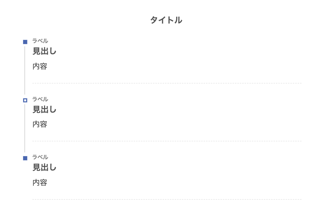
16. 上下ボーダー
上下にボーダーを設置して、クールな印象のデザインにしました。
- CSSをコピペ
-
/*タイムライン*/
.timeline-box ul > li:before {
content: "";
}
.partsUl-1 .timeline-box ul {
background-color: transparent;
}
.timeline > li.timeline-item {
padding-left: 0;
}
.content .timeline-item-content {
margin-top:0;
margin-left: 5px;
padding: 0 0 1.5em 1.1em;
width: 95%;
}
.content .timeline-item-snippet {
margin-top: .5em;
padding: 0 0 1.5em;
border-bottom: dashed 1px #ccd5db;
}
/*ボックス*/
.timeline-box {
margin-bottom: 20px;
padding-top: 10px;
box-sizing: border-box;
border-top:solid #1e366a 3px;
border-bottom:solid #1e366a 3px;
}
.timeline-box *{
box-sizing: border-box;
}
.timeline-box .timeline {
list-style: none;
padding: 0 0 6px 0;
margin: 0;
}
.content .timeline ul {
margin-bottom: 20px;
}
/*タイトル*/
.timeline-title {
font-weight: bold;
font-size: 1.1em;
text-align: center;
margin-bottom:2rem;
color:#1e366a ;
}
.timeline > li {
margin-bottom: 60px;
}
.timeline > li.timeline-item {
overflow: hidden;
margin: 0 0 0 10px;
position: relative;
}
/*ラベル*/
.timeline-item-label {
padding-top: 2px;
font-weight: 700;
font-size: 14px;
margin-left: 1.8em;
color:#1e366a ;
}
@media screen and (max-width : 480px){
.timeline-item-label {
font-size:16px;
}
}
/*見出し*/
.timeline-item-title {
font-size: 1.1em;
font-weight: 700;
line-height: 1.5;
color:#1e366a ;
}
/*●部分*/
.content .timeline-item:first-of-type:before {
background: #1e366a ;
}
.content .timeline-item:last-of-type:before {
background:#1e366a ;
}
.content .timeline-item:before {
content: '';
width: 14px;
height: 14px;
background: #ffffff;
position: absolute;
left: 0;
top: 7px;
border-radius: 50%;
border: solid 2px #1e366a ;
}
.content .timeline-item:last-of-type:after {
background: 0 0;
}
/*縦線*/
.content .timeline-item:after {
content: "";
width: 3px;
background:#ccd5dd;
display: block;
position: absolute;
top: 25px;
bottom: 0;
left: 5px;
}
17.左右ボーダー
左右ボーダーで二重線にしてみました。
少しカジュアルになりました。
- CSSをコピペ
-
/*タイムライン*/
.timeline-box ul > li:before {
content: "";
}
.partsUl-1 .timeline-box ul {
background-color: transparent;
}
.timeline > li.timeline-item {
padding-left: 0;
}
.content .timeline-item-content {
margin-top:0;
margin-left: 5px;
padding: 0 0 1.5em 1.1em;
width: 95%;
}
.content .timeline-item-snippet {
margin-top: .5em;
padding: 0 0 1.5em;
border-bottom: dashed 1px #93b69c;
}
/*ボックス*/
.timeline-box {
margin-bottom: 20px;
padding-top: 10px;
box-sizing: border-box;
border-right:double #93b69c 5px;
border-left:double #93b69c 5px;
}
.timeline-box *{
box-sizing: border-box;
}
.timeline-box .timeline {
list-style: none;
padding: 0 0 6px 0;
margin: 0;
}
.content .timeline ul {
margin-bottom: 20px;
}
/*タイトル*/
.timeline-title {
font-weight: bold;
font-size: 1.1em;
text-align: center;
margin-bottom:2rem;
color:#555555;
}
.timeline > li {
margin-bottom: 60px;
}
.timeline > li.timeline-item {
overflow: hidden;
margin: 0 0 0 10px;
position: relative;
}
/*ラベル*/
.timeline-item-label {
padding-top: 2px;
font-weight: 700;
font-size: 14px;
margin-left: 1.8em;
color:#93b69c ;
}
@media screen and (max-width : 480px){
.timeline-item-label {
font-size:16px;
}
}
/*見出し*/
.timeline-item-title {
font-size: 1.1em;
font-weight: 700;
line-height: 1.5;
color:#555555;
}
/*●部分*/
.content .timeline-item:first-of-type:before {
background: #93b69c ;
}
.content .timeline-item:last-of-type:before {
background:#93b69c ;
}
.content .timeline-item:before {
content: '';
width: 14px;
height: 14px;
background: #ffffff;
position: absolute;
left: 0;
top: 7px;
border-radius: 50%;
border: solid 2px #93b69c ;
}
.content .timeline-item:last-of-type:after {
background: 0 0;
}
/*縦線*/
.content .timeline-item:after {
content: "";
width: 3px;
background:#ccd5dd;
display: block;
position: absolute;
top: 25px;
bottom: 0;
left: 5px;
}
18. 左のみボーダー
ブログの見出しデザインをモチーフにしました。
こちらも見やすいですね!
- CSSをコピペ
-
/*タイムライン*/
.timeline-box ul > li:before {
content: "";
}
.partsUl-1 .timeline-box ul {
background-color: transparent;
}
.timeline > li.timeline-item {
padding-left: 0;
}
.content .timeline-item-content {
margin-top:0;
margin-left: 5px;
padding: 0 0 1.5em 1.1em;
width: 95%;
}
.content .timeline-item-snippet {
margin-top: .5em;
padding: 0 0 1.5em;
border-bottom: dashed 1px #e0e0e0;
}
/*ボックス*/
.timeline-box {
margin-bottom: 20px;
padding-top: 10px;
box-sizing: border-box;
border-left:solid #f8b500 5px;
background:#f7f7f7;
}
.timeline-box *{
box-sizing: border-box;
}
.timeline-box .timeline {
list-style: none;
padding: 0 0 6px 0;
margin: 0;
}
.content .timeline ul {
margin-bottom: 20px;
}
/*タイトル*/
.timeline-title {
font-weight: bold;
font-size: 1.1em;
text-align: center;
margin-bottom:2rem;
color:#555555;
}
.timeline > li {
margin-bottom: 60px;
}
.timeline > li.timeline-item {
overflow: hidden;
margin: 0 0 0 10px;
position: relative;
}
/*ラベル*/
.timeline-item-label {
padding-top: 2px;
font-weight: 700;
font-size: 14px;
margin-left: 1.8em;
color:gray;
}
@media screen and (max-width : 480px){
.timeline-item-label {
font-size:16px;
}
}
/*見出し*/
.timeline-item-title {
font-size: 1.1em;
font-weight: 700;
line-height: 1.5;
color:#555555;
}
/*●部分*/
.content .timeline-item:first-of-type:before {
background: #555555;
}
.content .timeline-item:last-of-type:before {
background:#555555;
}
.content .timeline-item:before {
content: '';
width: 14px;
height: 14px;
background: #ffffff;
position: absolute;
left: 0;
top: 7px;
border-radius: 50%;
border: solid 3px #555555;
}
.content .timeline-item:last-of-type:after {
background: 0 0;
}
/*縦線*/
.content .timeline-item:after {
content: "";
width: 3px;
background:#ccd5dd;
display: block;
position: absolute;
top: 25px;
bottom: 0;
left: 5px;
}
19. クール
タイムラインの枠線を点線(dotted)にして、全体をスッキリした印象にまとめてみました。
- CSSをコピペ
-
/*タイムライン*/
.timeline-box ul > li:before {
content: "";
}
.partsUl-1 .timeline-box ul {
background-color: transparent;
}
.timeline > li.timeline-item {
padding-left: 0;
}
.content .timeline-item-content {
margin-top:0;
margin-left: 5px;
padding: 0 0 1.5em 1.1em;
width: 95%;
}
.content .timeline-item-snippet {
margin-top: .5em;
padding: 0 0 1.5em;
border-bottom: dashed 1px #e0e0e0;
}
/*ボックス*/
.timeline-box {
margin-bottom: 20px;
padding-top: 10px;
box-sizing: border-box;
border:dotted 1px #1e366a;
}
.timeline-box *{
box-sizing: border-box;
}
.timeline-box .timeline {
list-style: none;
padding: 0 0 6px 0;
margin: 0;
}
.content .timeline ul {
margin-bottom: 20px;
}
/*タイトル*/
.timeline-title {
font-weight: bold;
font-size: 1.1em;
text-align: center;
margin-bottom:2rem;
color:#1e366a;
}
.timeline > li {
margin-bottom: 60px;
}
.timeline > li.timeline-item {
overflow: hidden;
margin: 0 0 0 10px;
position: relative;
}
/*ラベル*/
.timeline-item-label {
padding-top: 2px;
font-weight: 700;
font-size: 14px;
margin-left: 1.8em;
color:gray;
}
@media screen and (max-width : 480px){
.timeline-item-label {
font-size:16px;
}
}
/*見出し*/
.timeline-item-title {
font-size: 1.1em;
font-weight: 700;
line-height: 1.5;
color:#1e366a;
}
/*●部分*/
.content .timeline-item:first-of-type:before {
background: #1e366a;
}
.content .timeline-item:last-of-type:before {
background:#1e366a;
}
.content .timeline-item:before {
content: '';
width: 14px;
height: 14px;
background: #ffffff;
position: absolute;
left: 0;
top: 7px;
border-radius: 50%;
border: solid 3px #1e366a;
}
.content .timeline-item:last-of-type:after {
background: 0 0;
}
/*縦線*/
.content .timeline-item:after {
content: "";
width: 3px;
background:#1e366a;
display: block;
position: absolute;
top: 25px;
bottom: 0;
left: 5px;
}
20. シャドーボックス
ボックスシャドーを付けることで、タイムラインが見やすくなりましたね。
- CSSをコピペ
-
/*タイムライン*/
.timeline-box ul > li:before {
content: "";
}
.partsUl-1 .timeline-box ul {
background-color: transparent;
}
.timeline > li.timeline-item {
padding-left: 0;
}
.content .timeline-item-content {
margin-top:0;
margin-left: 5px;
padding: 0 0 1.5em 1.1em;
width: 95%;
}
.content .timeline-item-snippet {
margin-top: .5em;
padding: 0 0 1.5em;
border-bottom: dashed 1px #e0e0e0;
}
/*ボックス*/
.timeline-box {
margin-bottom: 20px;
padding-top: 10px;
box-sizing: border-box;
box-shadow :0px 0px 5px silver;
}
.timeline-box *{
box-sizing: border-box;
}
.timeline-box .timeline {
list-style: none;
padding: 0 0 6px 0;
margin: 0;
}
.content .timeline ul {
margin-bottom: 20px;
}
/*タイトル*/
.timeline-title {
font-weight: bold;
font-size: 1.1em;
text-align: center;
margin-bottom:2rem;
color:#1e366a;
}
.timeline > li {
margin-bottom: 60px;
}
.timeline > li.timeline-item {
overflow: hidden;
margin: 0 0 0 10px;
position: relative;
}
/*ラベル*/
.timeline-item-label {
padding-top: 2px;
font-weight: 700;
font-size: 14px;
margin-left: 1.8em;
color:gray;
}
@media screen and (max-width : 480px){
.timeline-item-label {
font-size:16px;
}
}
/*見出し*/
.timeline-item-title {
font-size: 1.1em;
font-weight: 700;
line-height: 1.5;
color:#1e366a;
}
/*●部分*/
.content .timeline-item:first-of-type:before {
background: #1e366a;
}
.content .timeline-item:last-of-type:before {
background:#1e366a;
}
.content .timeline-item:before {
content: '';
width: 14px;
height: 14px;
background: #ffffff;
position: absolute;
left: 0;
top: 7px;
border-radius: 50%;
border: solid 3px #1e366a;
}
.content .timeline-item:last-of-type:after {
background: 0 0;
}
/*縦線*/
.content .timeline-item:after {
content: "";
width: 3px;
background:#1e366a;
display: block;
position: absolute;
top: 25px;
bottom: 0;
left: 5px;
}
21. ステッチ風
ステッチ風の可愛いデザインです。shadowを使ってステッチを再現してます。
- CSSをコピペ
-
/*タイムライン*/
.timeline-box ul > li:before {
content: "";
}
.partsUl-1 .timeline-box ul {
background-color: transparent;
}
.timeline > li.timeline-item {
padding-left: 0;
}
.content .timeline-item-content {
margin-top:0;
margin-left: 5px;
padding: 0 0 1.5em 1.1em;
width: 95%;
}
.content .timeline-item-snippet {
margin-top: .5em;
padding: 0 0 1.5em;
border-bottom: dashed 1px #e0e0e0;
}
/*ボックス*/
.timeline-box {
margin-bottom: 20px;
padding-top: 10px;
box-sizing: border-box;
background: #fffde8;
box-shadow: 0px 0px 0px 10px #fffde8;
border: dashed 3px #ffb03f;
border-radius: 10px;
}
.timeline-box *{
box-sizing: border-box;
}
.timeline-box .timeline {
list-style: none;
padding: 0 0 6px 0;
margin: 0;
}
.content .timeline ul {
margin-bottom: 20px;
}
/*タイトル*/
.timeline-title {
font-weight: bold;
font-size: 1.1em;
text-align: center;
margin-bottom:2rem;
color:#555555;
}
.timeline > li {
margin-bottom: 60px;
}
.timeline > li.timeline-item {
overflow: hidden;
margin: 0 0 0 10px;
position: relative;
}
/*ラベル*/
.timeline-item-label {
padding-top: 2px;
font-weight: 700;
font-size: 14px;
margin-left: 1.8em;
color:gray;
}
@media screen and (max-width : 480px){
.timeline-item-label {
font-size:16px;
}
}
/*見出し*/
.timeline-item-title {
font-size: 1.1em;
font-weight: 700;
line-height: 1.5;
color:#555555;
}
/*●部分*/
.content .timeline-item:first-of-type:before {
background:#ffb03f;
}
.content .timeline-item:last-of-type:before {
background:#ffb03f;
}
.content .timeline-item:before {
content: '';
width: 14px;
height: 14px;
background: #ffffff;
position: absolute;
left: 0;
top: 7px;
border-radius: 50%;
border: solid 3px #ffb03f;
}
.content .timeline-item:last-of-type:after {
background: 0 0;
}
/*縦線*/
.content .timeline-item:after {
content: "";
width: 3px;
background:#e0e0e0;
display: block;
position: absolute;
top: 25px;
bottom: 0;
left: 5px;
}
22. ステッチ風(ブルー)
上記のブルーバージョンです。
- CSSをコピペ
-
/*タイムライン*/
.timeline-box ul > li:before {
content: "";
}
.partsUl-1 .timeline-box ul {
background-color: transparent;
}
.timeline > li.timeline-item {
padding-left: 0;
}
.content .timeline-item-content {
margin-top:0;
margin-left: 5px;
padding: 0 0 1.5em 1.1em;
width: 95%;
}
.content .timeline-item-snippet {
margin-top: .5em;
padding: 0 0 1.5em;
border-bottom: dashed 1px #e0e0e0;
}
/*ボックス*/
.timeline-box {
margin-bottom: 20px;
padding-top: 10px;
box-sizing: border-box;
background:#f1f8ff;
box-shadow: 0px 0px 0px 10px #f1f8ff;
border: dashed 3px #668ad8;
border-radius: 10px;
}
.timeline-box *{
box-sizing: border-box;
}
.timeline-box .timeline {
list-style: none;
padding: 0 0 6px 0;
margin: 0;
}
.content .timeline ul {
margin-bottom: 20px;
}
/*タイトル*/
.timeline-title {
font-weight: bold;
font-size: 1.1em;
text-align: center;
margin-bottom:2rem;
color:#555555;
}
.timeline > li {
margin-bottom: 60px;
}
.timeline > li.timeline-item {
overflow: hidden;
margin: 0 0 0 10px;
position: relative;
}
/*ラベル*/
.timeline-item-label {
padding-top: 2px;
font-weight: 700;
font-size: 14px;
margin-left: 1.8em;
color:gray;
}
@media screen and (max-width : 480px){
.timeline-item-label {
font-size:16px;
}
}
/*見出し*/
.timeline-item-title {
font-size: 1.1em;
font-weight: 700;
line-height: 1.5;
color:#555555;
}
/*●部分*/
.content .timeline-item:first-of-type:before {
background:#668ad8;
}
.content .timeline-item:last-of-type:before {
background:#668ad8;
}
.content .timeline-item:before {
content: '';
width: 14px;
height: 14px;
background: #ffffff;
position: absolute;
left: 0;
top: 7px;
border-radius: 50%;
border: solid 3px #668ad8;
}
.content .timeline-item:last-of-type:after {
background: 0 0;
}
/*縦線*/
.content .timeline-item:after {
content: "";
width: 3px;
background:#e0e0e0;
display: block;
position: absolute;
top: 25px;
bottom: 0;
left: 5px;
}
23. ステッチ風(ピンク)
ステッチ風のピンクバージョンです。
- CSSをコピペ
-
/*タイムライン*/
.timeline-box ul > li:before {
content: "";
}
.partsUl-1 .timeline-box ul {
background-color: transparent;
}
.timeline > li.timeline-item {
padding-left: 0;
}
.content .timeline-item-content {
margin-top:0;
margin-left: 5px;
padding: 0 0 1.5em 1.1em;
width: 95%;
}
.content .timeline-item-snippet {
margin-top: .5em;
padding: 0 0 1.5em;
border-bottom: dashed 1px #e0e0e0;
}
/*ボックス*/
.timeline-box {
margin-bottom: 20px;
padding-top: 10px;
box-sizing: border-box;
background:#fef4f4;
box-shadow: 0px 0px 0px 10px #fef4f4;
border: dashed 3px #d6c6af;
border-radius: 10px;
}
.timeline-box *{
box-sizing: border-box;
}
.timeline-box .timeline {
list-style: none;
padding: 0 0 6px 0;
margin: 0;
}
.content .timeline ul {
margin-bottom: 20px;
}
/*タイトル*/
.timeline-title {
font-weight: bold;
font-size: 1.1em;
text-align: center;
margin-bottom:2rem;
color:#555555;
}
.timeline > li {
margin-bottom: 60px;
}
.timeline > li.timeline-item {
overflow: hidden;
margin: 0 0 0 10px;
position: relative;
}
/*ラベル*/
.timeline-item-label {
padding-top: 2px;
font-weight: 700;
font-size: 14px;
margin-left: 1.8em;
color:#d6c6af;
}
@media screen and (max-width : 480px){
.timeline-item-label {
font-size:16px;
}
}
/*見出し*/
.timeline-item-title {
font-size: 1.1em;
font-weight: 700;
line-height: 1.5;
color:#555555;
}
/*●部分*/
.content .timeline-item:first-of-type:before {
background:#d6c6af;
}
.content .timeline-item:last-of-type:before {
background:#d6c6af;
}
.content .timeline-item:before {
content: '';
width: 14px;
height: 14px;
background: #ffffff;
position: absolute;
left: 0;
top: 7px;
border-radius: 50%;
border: solid 3px #d6c6af;
}
.content .timeline-item:last-of-type:after {
background: 0 0;
}
/*縦線*/
.content .timeline-item:after {
content: "";
width: 3px;
background:#e0e0e0;
display: block;
position: absolute;
top: 25px;
bottom: 0;
left: 5px;
}
24. 四角タイムライン
「●」の部分の縦と横の長さを 0にして四角にしました。少し雰囲気が変わりますね!
- CSSをコピペ
-
/*タイムライン*/
.timeline-box ul > li:before {
content: "";
}
.partsUl-1 .timeline-box ul {
background-color: transparent;
}
.timeline > li.timeline-item {
padding-left: 0;
}
.content .timeline-item-content {
margin-top:0;
margin-left: 5px;
padding: 0 0 1.5em 1.1em;
width: 95%;
}
.content .timeline-item-snippet {
margin-top: .5em;
padding: 0 0 1.5em;
border-bottom: dashed 1px #e0e0e0;
}
/*ボックス*/
.timeline-box {
margin-bottom: 20px;
padding-top: 10px;
box-sizing: border-box;
}
.timeline-box *{
box-sizing: border-box;
}
.timeline-box .timeline {
list-style: none;
padding: 0 0 6px 0;
margin: 0;
}
.content .timeline ul {
margin-bottom: 20px;
}
/*タイトル*/
.timeline-title {
font-weight: bold;
font-size: 1.1em;
text-align: center;
margin-bottom:2rem;
color:#555555;
}
.timeline > li {
margin-bottom: 60px;
}
.timeline > li.timeline-item {
overflow: hidden;
margin: 0 0 0 10px;
position: relative;
}
/*ラベル*/
.timeline-item-label {
padding-top: 2px;
font-weight: 700;
font-size: 14px;
margin-left: 1.8em;
color:gray;
}
@media screen and (max-width : 480px){
.timeline-item-label {
font-size:16px;
}
}
/*見出し*/
.timeline-item-title {
font-size: 1.1em;
font-weight: 700;
line-height: 1.5;
color:#555555;
}
/*●部分*/
.content .timeline-item:first-of-type:before {
background:#4865b2;
}
.content .timeline-item:last-of-type:before {
background:#4865b2;
}
.content .timeline-item:before {
content: '';
width: 15px;
height: 15px;
background: #ffffff;
position: absolute;
left: 0;
top: 7px;
border: solid 4px #4865b2;
}
.content .timeline-item:last-of-type:after {
background: 0 0;
}
/*縦線*/
.content .timeline-item:after {
content: "";
width: 3px;
background:#e0e0e0;
display: block;
position: absolute;
top: 25px;
bottom: 0;
left: 5px;
}
25. 四角タイムライン(枠あり)
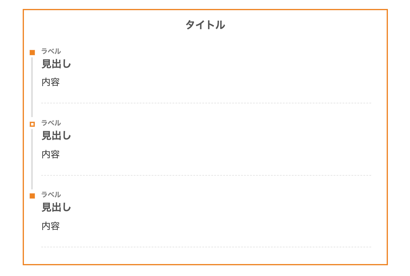
四角のデザインに枠(border)を付けました。
この方がタイムラインが見やすいです。
- CSSをコピペ
-
/*タイムライン*/
.timeline-box ul > li:before {
content: "";
}
.partsUl-1 .timeline-box ul {
background-color: transparent;
}
.timeline > li.timeline-item {
padding-left: 0;
}
.content .timeline-item-content {
margin-top:0;
margin-left: 5px;
padding: 0 0 1.5em 1.1em;
width: 95%;
}
.content .timeline-item-snippet {
margin-top: .5em;
padding: 0 0 1.5em;
border-bottom: dashed 1px #e0e0e0;
}
/*ボックス*/
.timeline-box {
margin-bottom: 20px;
padding-top: 10px;
box-sizing: border-box;
border: solid 3px #f08300;
}
.timeline-box *{
box-sizing: border-box;
}
.timeline-box .timeline {
list-style: none;
padding: 0 0 6px 0;
margin: 0;
}
.content .timeline ul {
margin-bottom: 20px;
}
/*タイトル*/
.timeline-title {
font-weight: bold;
font-size: 1.1em;
text-align: center;
margin-bottom:2rem;
color:#555555;
}
.timeline > li {
margin-bottom: 60px;
}
.timeline > li.timeline-item {
overflow: hidden;
margin: 0 0 0 10px;
position: relative;
}
/*ラベル*/
.timeline-item-label {
padding-top: 2px;
font-weight: 700;
font-size: 14px;
margin-left: 1.8em;
color:gray;
}
@media screen and (max-width : 480px){
.timeline-item-label {
font-size:16px;
}
}
/*見出し*/
.timeline-item-title {
font-size: 1.1em;
font-weight: 700;
line-height: 1.5;
color:#555555;
}
/*●部分*/
.content .timeline-item:first-of-type:before {
background:#f08300;
}
.content .timeline-item:last-of-type:before {
background:#f08300;
}
.content .timeline-item:before {
content: '';
width: 15px;
height: 15px;
background: #ffffff;
position: absolute;
left: 0;
top: 7px;
border: solid 4px #f08300;
}
.content .timeline-item:last-of-type:after {
background: 0 0;
}
/*縦線*/
.content .timeline-item:after {
content: "";
width: 3px;
background:#e0e0e0;
display: block;
position: absolute;
top: 25px;
bottom: 0;
left: 5px;
}
26. 四角タイムライン(角丸)
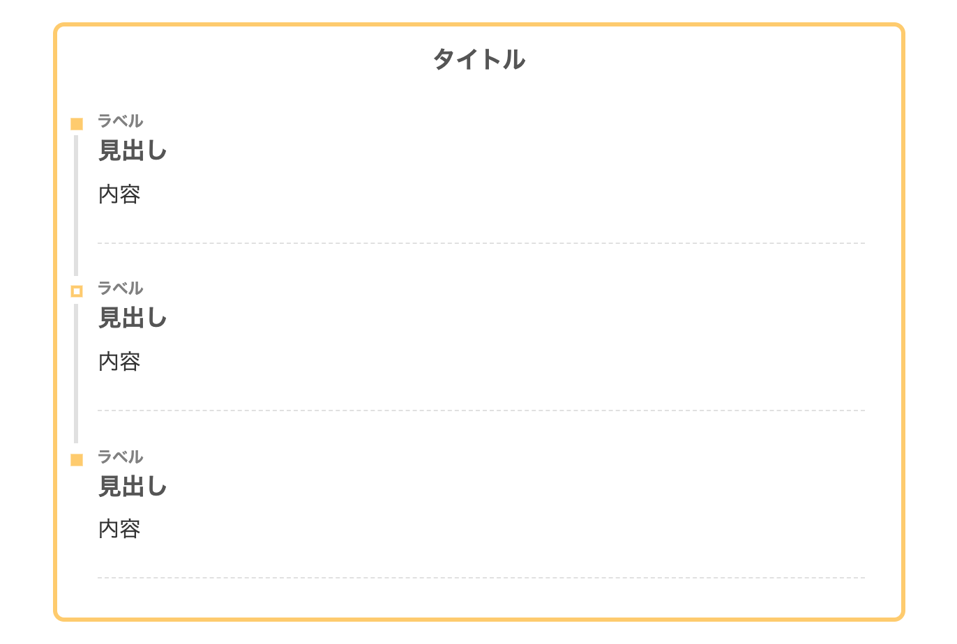
四角デザインの枠を角丸(border-radius)にしてみました。
やや四角とバランスが悪い気もしますね。
- CSSをコピペ
-
/*タイムライン*/
.timeline-box ul > li:before {
content: "";
}
.partsUl-1 .timeline-box ul {
background-color: transparent;
}
.timeline > li.timeline-item {
padding-left: 0;
}
.content .timeline-item-content {
margin-top:0;
margin-left: 5px;
padding: 0 0 1.5em 1.1em;
width: 95%;
}
.content .timeline-item-snippet {
margin-top: .5em;
padding: 0 0 1.5em;
border-bottom: dashed 1px #e0e0e0;
}
/*ボックス*/
.timeline-box {
margin-bottom: 20px;
padding-top: 10px;
box-sizing: border-box;
border: solid 4px #ffcc66;
border-radius: 10px;
}
.timeline-box *{
box-sizing: border-box;
}
.timeline-box .timeline {
list-style: none;
padding: 0 0 6px 0;
margin: 0;
}
.content .timeline ul {
margin-bottom: 20px;
}
/*タイトル*/
.timeline-title {
font-weight: bold;
font-size: 1.1em;
text-align: center;
margin-bottom:2rem;
color:#555555;
}
.timeline > li {
margin-bottom: 60px;
}
.timeline > li.timeline-item {
overflow: hidden;
margin: 0 0 0 10px;
position: relative;
}
/*ラベル*/
.timeline-item-label {
padding-top: 2px;
font-weight: 700;
font-size: 14px;
margin-left: 1.8em;
color:gray;
}
@media screen and (max-width : 480px){
.timeline-item-label {
font-size:16px;
}
}
/*見出し*/
.timeline-item-title {
font-size: 1.1em;
font-weight: 700;
line-height: 1.5;
color:#555555;
}
/*●部分*/
.content .timeline-item:first-of-type:before {
background:#ffcc66;
}
.content .timeline-item:last-of-type:before {
background:#ffcc66;
}
.content .timeline-item:before {
content: '';
width: 15px;
height: 15px;
background: #ffffff;
position: absolute;
left: 0;
top: 7px;
border: solid 4px #ffcc66;
}
.content .timeline-item:last-of-type:after {
background: 0 0;
}
/*縦線*/
.content .timeline-item:after {
content: "";
width: 3px;
background:#e0e0e0;
display: block;
position: absolute;
top: 25px;
bottom: 0;
left: 5px;
}
27. 四角タイムライン(枠あり・角丸・影)
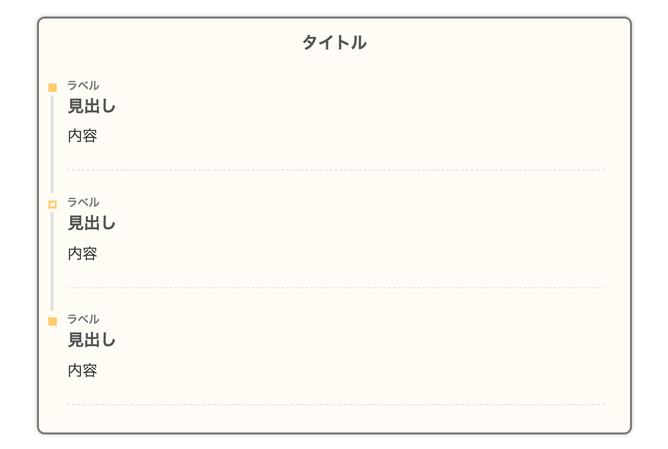
上記のデザインにさらに影(shadow)を付けました。これは見やすいデザインですね。
- CSSをコピペ
-
/*タイムライン*/
.timeline-box ul > li:before {
content: "";
}
.partsUl-1 .timeline-box ul {
background-color: transparent;
}
.timeline > li.timeline-item {
padding-left: 0;
}
.content .timeline-item-content {
margin-top:0;
margin-left: 5px;
padding: 0 0 1.5em 1.1em;
width: 95%;
}
.content .timeline-item-snippet {
margin-top: .5em;
padding: 0 0 1.5em;
border-bottom: dashed 1px #e0e0e0;
}
/*ボックス*/
.timeline-box {
margin-bottom: 20px;
padding-top: 10px;
box-sizing: border-box;
border: solid 3px #777777;
border-radius: 10px;
box-shadow :0px 0px 5px silver;
background:#fffcf4;
}
.timeline-box *{
box-sizing: border-box;
}
.timeline-box .timeline {
list-style: none;
padding: 0 0 6px 0;
margin: 0;
}
.content .timeline ul {
margin-bottom: 20px;
}
/*タイトル*/
.timeline-title {
font-weight: bold;
font-size: 1.1em;
text-align: center;
margin-bottom:2rem;
color:#555555;
}
.timeline > li {
margin-bottom: 60px;
}
.timeline > li.timeline-item {
overflow: hidden;
margin: 0 0 0 10px;
position: relative;
}
/*ラベル*/
.timeline-item-label {
padding-top: 2px;
font-weight: 700;
font-size: 14px;
margin-left: 1.8em;
color:gray;
}
@media screen and (max-width : 480px){
.timeline-item-label {
font-size:16px;
}
}
/*見出し*/
.timeline-item-title {
font-size: 1.1em;
font-weight: 700;
line-height: 1.5;
color:#555555;
}
/*●部分*/
.content .timeline-item:first-of-type:before {
background:#ffcc66;
}
.content .timeline-item:last-of-type:before {
background:#ffcc66;
}
.content .timeline-item:before {
content: '';
width: 15px;
height: 15px;
background: #ffffff;
position: absolute;
left: 0;
top: 7px;
border: solid 4px #ffcc66;
}
.content .timeline-item:last-of-type:after {
background: 0 0;
}
/*縦線*/
.content .timeline-item:after {
content: "";
width: 3px;
background:#e0e0e0;
display: block;
position: absolute;
top: 25px;
bottom: 0;
left: 5px;
}
28. SANGO風
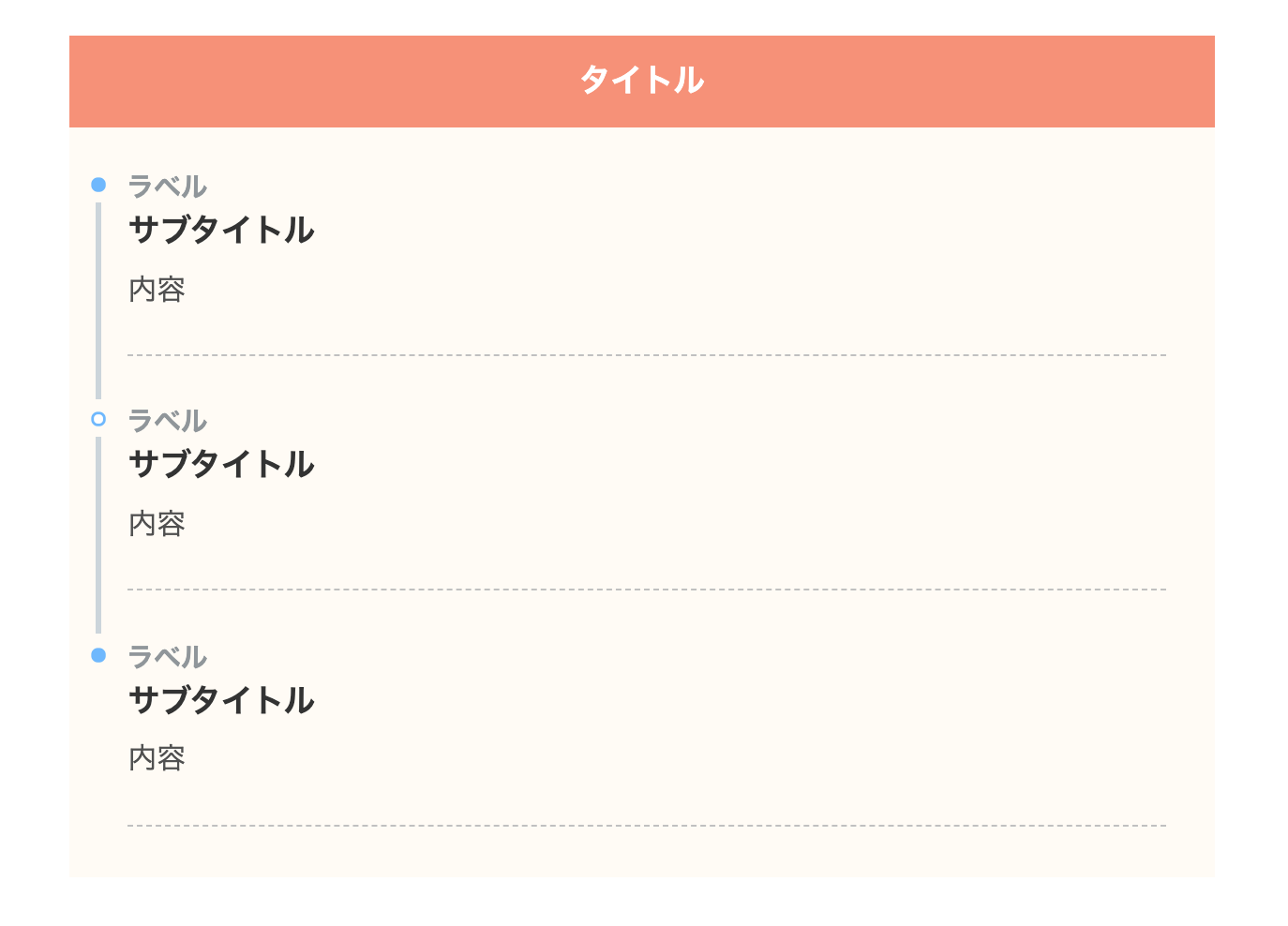
WordPressの有料テーマ SANGOのデザインを再現しました。さすがサルワカさんのデザイン、見やすさとオシャレさは抜群ですね!
タイトルの背景(background)に色を入れてます。
- CSSをコピペ
-
/*タイムライン*/
.timeline-box ul > li:before {
content: "";
}
.partsUl-1 .timeline-box ul {
background-color: transparent;
}
.timeline > li.timeline-item {
padding-left: 0;
}
.content .timeline-item-content {
margin-top:0;
margin-left: 5px;
padding: 0 0 1.5em 1.1em;
width: 95%;
}
.content .timeline-item-snippet {
margin-top: .5em;
padding: 0 0 1.5em;
border-bottom: dashed 1px #c0c0c0;
color: #505050;
}
.timeline-box {
margin-bottom: 20px;
box-sizing: border-box;
background:#fffbf4;
}
/*ボックス*/
.timeline-box *{
box-sizing: border-box;
}
.timeline-box .timeline {
list-style: none;
padding: 0 0 6px 0;
margin: 0;
}
.content .timeline ul {
margin-bottom: 20px;
}
/*タイトル*/
.timeline-title {
font-weight: bold;
font-size: 1.1em;
text-align: center;
margin-bottom:2rem;
border-bottom: 3px solid #f89174;
padding: 10px 0;
background-color: #f89174;
color: #ffffff;
}
.timeline > li {
margin-bottom: 60px;
}
.timeline > li.timeline-item {
overflow: hidden;
margin: 0 0 0 13px;
position: relative;
}
/*ラベル*/
.timeline-item-label {
padding-top: 2px;
font-weight: 700;
font-size: 18px;
margin-left: 1.4em;
color:#90969a;
}
@media screen and (max-width : 480px){
.timeline-item-label {
font-size:16px;
}
}
/*見出し*/
.timeline-item-title {
font-size: 1.1em;
font-weight: 700;
line-height: 1.5;
color:#333;
}
/*●部分*/
.content .timeline-item:first-of-type:before {
background: #6bb6ff;
}
.content .timeline-item:last-of-type:before {
background: #6bb6ff;
}
.content .timeline-item:before {
content: '';
width: 14px;
height: 14px;
background: #ffffff;
position: absolute;
left: 0;
top: 7px;
border-radius: 50%;
border: solid 3px #6bb6ff;
}
.content .timeline-item:last-of-type:after {
background: 0 0;
}
/*縦線*/
.content .timeline-item:after {
content: "";
width: 3px;
background: #ccd5db;
display: block;
position: absolute;
top: 25px;
bottom: 0;
left: 5px;
}
29. SANGO風(イエロー)
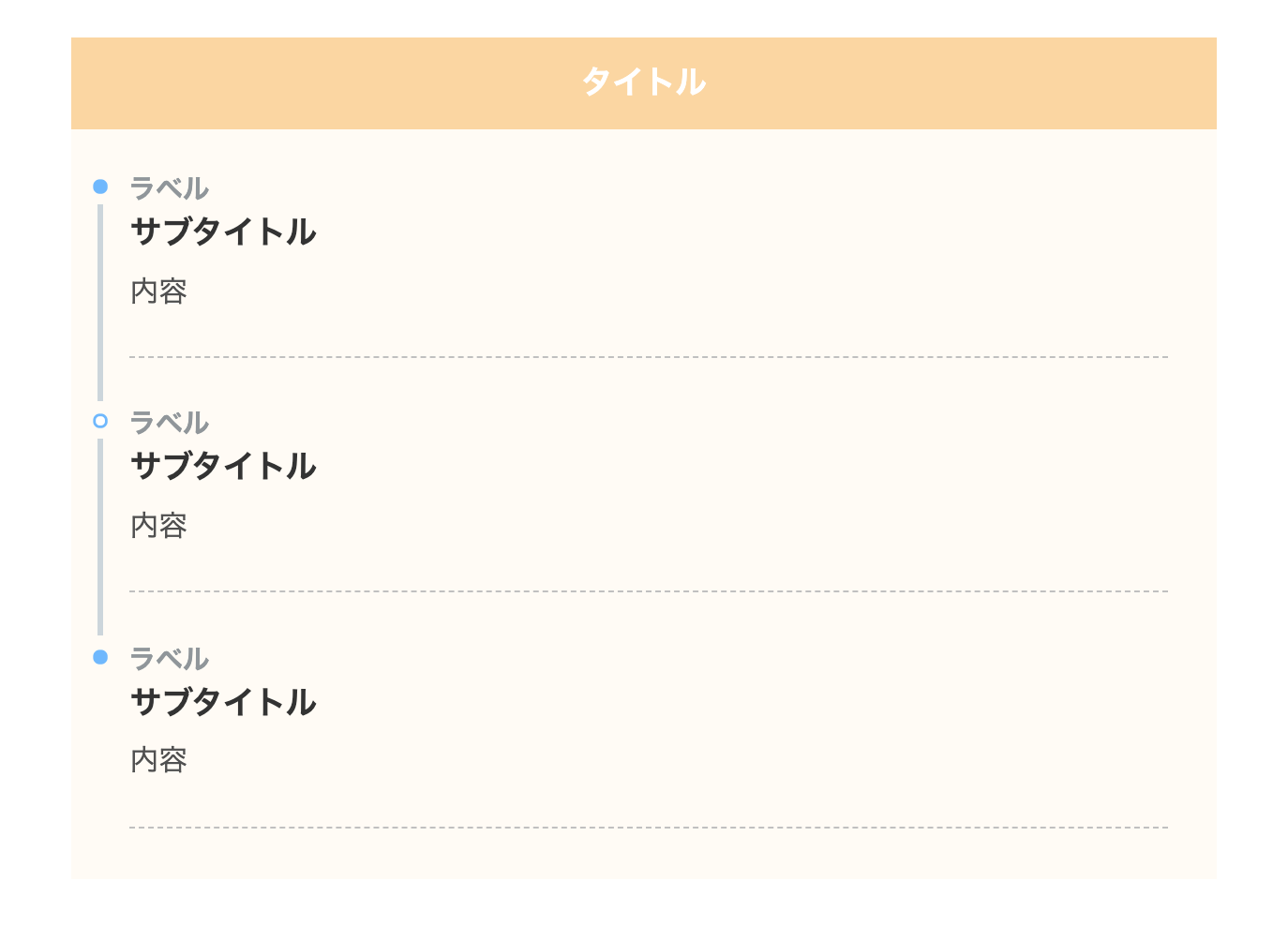
SANGO風デザインの黄色バージョンです。
- CSSをコピペ
-
/*タイムライン*/
.timeline-box ul > li:before {
content: "";
}
.partsUl-1 .timeline-box ul {
background-color: transparent;
}
.timeline > li.timeline-item {
padding-left: 0;
}
.content .timeline-item-content {
margin-top:0;
margin-left: 5px;
padding: 0 0 1.5em 1.1em;
width: 95%;
}
.content .timeline-item-snippet {
margin-top: .5em;
padding: 0 0 1.5em;
border-bottom: dashed 1px #c0c0c0;
color: #505050;
}
/*ボックス*/
.timeline-box {
margin-bottom: 20px;
box-sizing: border-box;
background:#fffbf4;
}
.timeline-box *{
box-sizing: border-box;
}
.timeline-box .timeline {
list-style: none;
padding: 0 0 6px 0;
margin: 0;
}
.content .timeline ul {
margin-bottom: 20px;
}
/*タイトル*/
.timeline-title {
font-weight: bold;
font-size: 1.1em;
text-align: center;
margin-bottom:2rem;
border-bottom: 3px solid #fcd69e;
padding: 10px 0;
background-color: #fcd69e;
color: #ffffff;
}
.timeline > li {
margin-bottom: 60px;
}
.timeline > li.timeline-item {
overflow: hidden;
margin: 0 0 0 13px;
position: relative;
}
/*ラベル*/
.timeline-item-label {
padding-top: 2px;
font-weight: 700;
font-size: 18px;
margin-left: 1.4em;
color:#90969a;
}
@media screen and (max-width : 480px){
.timeline-item-label {
font-size:16px;
}
}
/*見出し*/
.timeline-item-title {
font-size: 1.1em;
font-weight: 700;
line-height: 1.5;
color:#333;
}
/*●部分*/
.content .timeline-item:first-of-type:before {
background: #6bb6ff;
}
.content .timeline-item:last-of-type:before {
background: #6bb6ff;
}
.content .timeline-item:before {
content: '';
width: 14px;
height: 14px;
background: #ffffff;
position: absolute;
left: 0;
top: 7px;
border-radius: 50%;
border: solid 3px #6bb6ff;
}
.content .timeline-item:last-of-type:after {
background: 0 0;
}
/*縦線*/
.content .timeline-item:after {
content: "";
width: 3px;
background: #ccd5db;
display: block;
position: absolute;
top: 25px;
bottom: 0;
left: 5px;
}
30. SANGO風(ブルー)
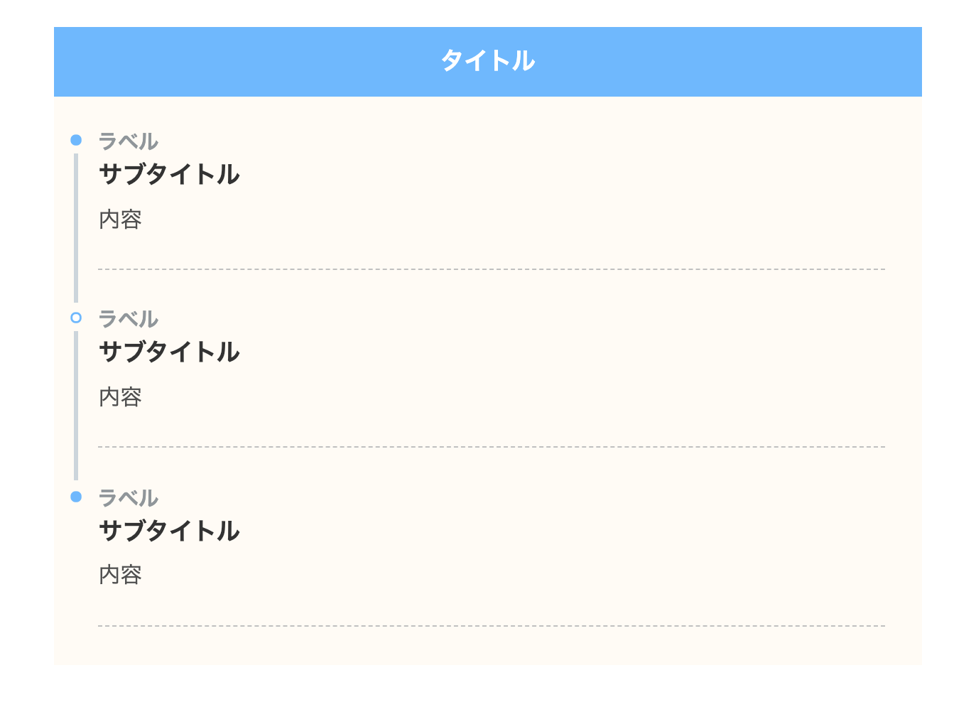
SANGO風タイムラインのブルーです。一番見るデザインかもしれません。
- CSSをコピペ
-
/*タイムライン*/
.timeline-box ul > li:before {
content: "";
}
.partsUl-1 .timeline-box ul {
background-color: transparent;
}
.timeline > li.timeline-item {
padding-left: 0;
}
.content .timeline-item-content {
margin-top:0;
margin-left: 5px;
padding: 0 0 1.5em 1.1em;
width: 95%;
}
.content .timeline-item-snippet {
margin-top: .5em;
padding: 0 0 1.5em;
border-bottom: dashed 1px #c0c0c0;
color: #505050;
}
/*ボックス*/
.timeline-box {
margin-bottom: 20px;
box-sizing: border-box;
background:#fffbf4;
}
.timeline-box *{
box-sizing: border-box;
}
.timeline-box .timeline {
list-style: none;
padding: 0 0 6px 0;
margin: 0;
}
.content .timeline ul {
margin-bottom: 20px;
}
/*タイトル*/
.timeline-title {
font-weight: bold;
font-size: 1.1em;
text-align: center;
margin-bottom:2rem;
border-bottom: 3px solid #6bb6ff;
padding: 10px 0;
background-color: #6bb6ff;
color: #ffffff;
}
.timeline > li {
margin-bottom: 60px;
}
.timeline > li.timeline-item {
overflow: hidden;
margin: 0 0 0 13px;
position: relative;
}
/*ラベル*/
.timeline-item-label {
padding-top: 2px;
font-weight: 700;
font-size: 18px;
margin-left: 1.4em;
color:#90969a;
}
@media screen and (max-width : 480px){
.timeline-item-label {
font-size:16px;
}
}
/*見出し*/
.timeline-item-title {
font-size: 1.1em;
font-weight: 700;
line-height: 1.5;
color:#333;
}
/*●部分*/
.content .timeline-item:first-of-type:before {
background: #6bb6ff;
}
.content .timeline-item:last-of-type:before {
background: #6bb6ff;
}
.content .timeline-item:before {
content: '';
width: 14px;
height: 14px;
background: #ffffff;
position: absolute;
left: 0;
top: 7px;
border-radius: 50%;
border: solid 3px #6bb6ff;
}
.content .timeline-item:last-of-type:after {
background: 0 0;
}
/*縦線*/
.content .timeline-item:after {
content: "";
width: 3px;
background: #ccd5db;
display: block;
position: absolute;
top: 25px;
bottom: 0;
left: 5px;
}
31. SANGO風(角丸)
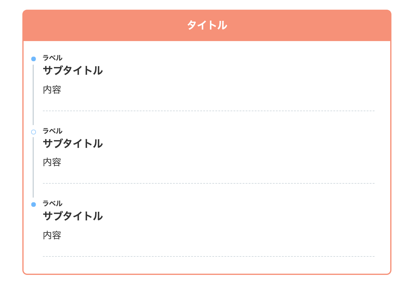
こちらも SANGOのデザインを参考にしました。border-radiusを使って角丸にしてます。
- CSSをコピペ
-
/*タイムライン*/
.timeline-box ul > li:before {
content: "";
}
.partsUl-1 .timeline-box ul {
background-color: transparent;
}
.timeline > li.timeline-item {
padding-left: 0;
}
.content .timeline-item-content {
margin-top:0;
margin-left: 5px;
padding: 0 0 1.5em 1.1em;
width: 95%;
}
.content .timeline-item-snippet {
margin-top: .5em;
padding: 0 0 1.5em;
border-bottom: dashed 1px #ccd5db;
}
/*ボックス*/
.timeline-box {
margin-bottom: 20px;
box-sizing: border-box;
border: 3px solid #f89174;
border-radius: 10px;
}
.timeline-box *{
box-sizing: border-box;
}
.timeline-box .timeline {
list-style: none;
padding: 0 0 6px 0;
margin: 0;
}
.content .timeline ul {
margin-bottom: 20px;
}
/*タイトル*/
.timeline-title {
font-weight: bold;
font-size: 1.1em;
text-align: center;
margin-bottom:2rem;
border-bottom: 3px solid #f89174;
padding:10px;
margin-right:-1px;
background-color: #f89174;
color: #ffffff;
}
.timeline > li {
margin-bottom: 60px;
}
.timeline > li.timeline-item {
overflow: hidden;
margin: 0 0 0 13px;
position: relative;
}
/*ラベル*/
.timeline-item-label {
padding-top: 2px;
font-weight: 700;
font-size: 14px;
margin-left: 1.8em;
}
@media screen and (max-width : 480px){
.timeline-item-label {
font-size:16px;
}
}
/*見出し*/
.timeline-item-title {
font-size: 1.1em;
font-weight: 700;
line-height: 1.5;
}
/*●部分*/
.content .timeline-item:first-of-type:before {
background: #6bb6ff;
}
.content .timeline-item:last-of-type:before {
background: #6bb6ff;
}
.content .timeline-item:before {
content: '';
width: 14px;
height: 14px;
background: #ffffff;
position: absolute;
left: 0;
top: 7px;
border-radius: 50%;
border: solid 2px #6bb6ff;
}
.content .timeline-item:last-of-type:after {
background: 0 0;
}
/*縦線*/
.content .timeline-item:after {
content: "";
width: 3px;
background: #ccd5db;
display: block;
position: absolute;
top: 25px;
bottom: 0;
left: 5px;
}
32. SANGO風(角丸・イエロー)
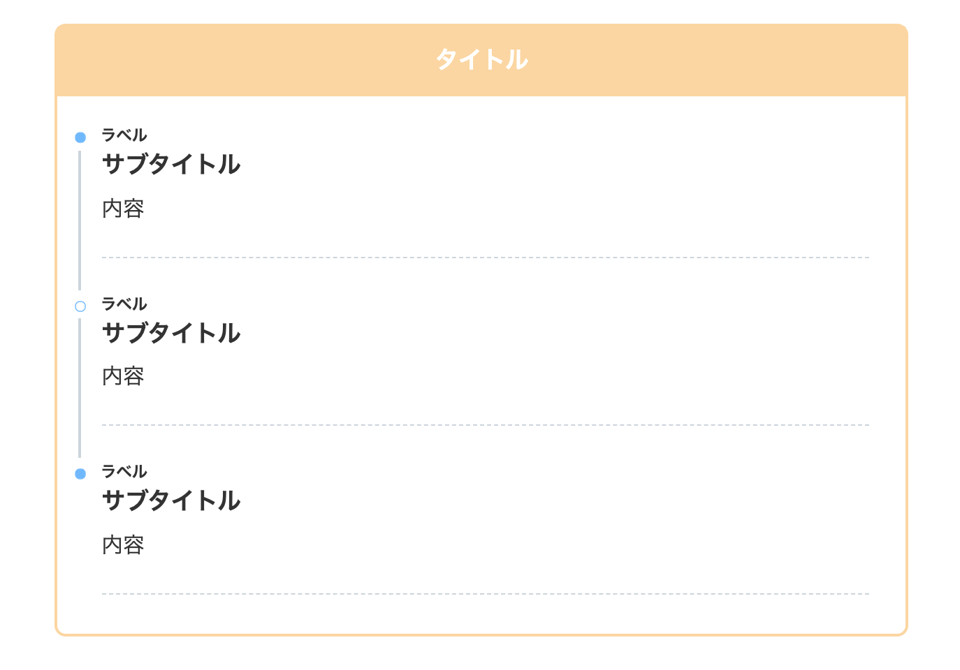
上記のデザインのイエローバージョンです。
- CSSをコピペ
-
/*タイムライン*/
.timeline-box ul > li:before {
content: "";
}
.partsUl-1 .timeline-box ul {
background-color: transparent;
}
.timeline > li.timeline-item {
padding-left: 0;
}
.content .timeline-item-content {
margin-top:0;
margin-left: 5px;
padding: 0 0 1.5em 1.1em;
width: 95%;
}
.content .timeline-item-snippet {
margin-top: .5em;
padding: 0 0 1.5em;
border-bottom: dashed 1px #ccd5db;
}
/*ボックス*/
.timeline-box {
margin-bottom: 20px;
box-sizing: border-box;
border: 3px solid #fcd69e;
border-radius: 10px;
}
.timeline-box *{
box-sizing: border-box;
}
.timeline-box .timeline {
list-style: none;
padding: 0 0 6px 0;
margin: 0;
}
.content .timeline ul {
margin-bottom: 20px;
}
/*タイトル*/
.timeline-title {
font-weight: bold;
font-size: 1.1em;
text-align: center;
margin-bottom:2rem;
border-bottom: 3px solid #fcd69e;
padding:10px;
margin-right:-1px;
background-color: #fcd69e;
color: #ffffff;
}
.timeline > li {
margin-bottom: 60px;
}
.timeline > li.timeline-item {
overflow: hidden;
margin: 0 0 0 13px;
position: relative;
}
/*ラベル*/
.timeline-item-label {
padding-top: 2px;
font-weight: 700;
font-size: 14px;
margin-left: 1.8em;
}
@media screen and (max-width : 480px){
.timeline-item-label {
font-size:16px;
}
}
/*見出し*/
.timeline-item-title {
font-size: 1.1em;
font-weight: 700;
line-height: 1.5;
}
/*●部分*/
.content .timeline-item:first-of-type:before {
background: #6bb6ff;
}
.content .timeline-item:last-of-type:before {
background: #6bb6ff;
}
.content .timeline-item:before {
content: '';
width: 14px;
height: 14px;
background: #ffffff;
position: absolute;
left: 0;
top: 7px;
border-radius: 50%;
border: solid 2px #6bb6ff;
}
.content .timeline-item:last-of-type:after {
background: 0 0;
}
/*縦線*/
.content .timeline-item:after {
content: "";
width: 3px;
background: #ccd5db;
display: block;
position: absolute;
top: 25px;
bottom: 0;
left: 5px;
}
33. SANGO風(角丸・ブルー)
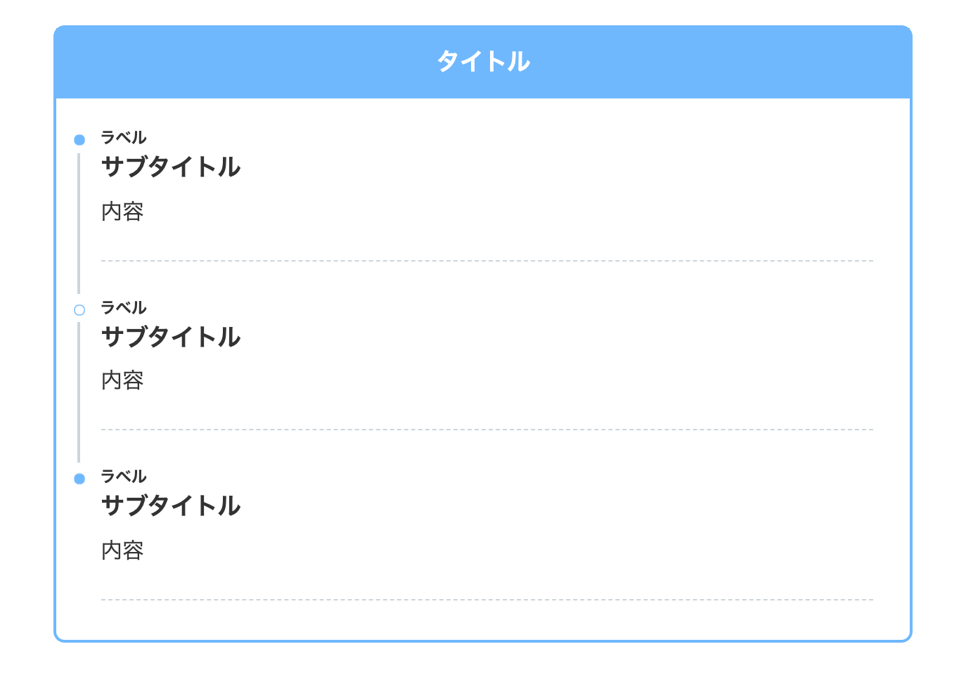
上記のデザインのブルーバージョンです。
- CSSをコピペ
-
/*タイムライン*/
.timeline-box ul > li:before {
content: "";
}
.partsUl-1 .timeline-box ul {
background-color: transparent;
}
.timeline > li.timeline-item {
padding-left: 0;
}
.content .timeline-item-content {
margin-top:0;
margin-left: 5px;
padding: 0 0 1.5em 1.1em;
width: 95%;
}
.content .timeline-item-snippet {
margin-top: .5em;
padding: 0 0 1.5em;
border-bottom: dashed 1px #ccd5db;
}
/*ボックス*/
.timeline-box {
margin-bottom: 20px;
box-sizing: border-box;
border: 3px solid #6bb6ff;
border-radius: 10px;
}
.timeline-box *{
box-sizing: border-box;
}
.timeline-box .timeline {
list-style: none;
padding: 0 0 6px 0;
margin: 0;
}
.content .timeline ul {
margin-bottom: 20px;
}
/*タイトル*/
.timeline-title {
font-weight: bold;
font-size: 1.1em;
text-align: center;
margin-bottom:2rem;
border-bottom: 3px solid #6bb6ff;
padding:10px;
margin-right:-1px;
background-color: #6bb6ff;
color: #ffffff;
}
.timeline > li {
margin-bottom: 60px;
}
.timeline > li.timeline-item {
overflow: hidden;
margin: 0 0 0 13px;
position: relative;
}
/*ラベル*/
.timeline-item-label {
padding-top: 2px;
font-weight: 700;
font-size: 14px;
margin-left: 1.8em;
}
@media screen and (max-width : 480px){
.timeline-item-label {
font-size:16px;
}
}
/*見出し*/
.timeline-item-title {
font-size: 1.1em;
font-weight: 700;
line-height: 1.5;
}
/*●部分*/
.content .timeline-item:first-of-type:before {
background: #6bb6ff;
}
.content .timeline-item:last-of-type:before {
background: #6bb6ff;
}
.content .timeline-item:before {
content: '';
width: 14px;
height: 14px;
background: #ffffff;
position: absolute;
left: 0;
top: 7px;
border-radius: 50%;
border: solid 2px #6bb6ff;
}
.content .timeline-item:last-of-type:after {
background: 0 0;
}
/*縦線*/
.content .timeline-item:after {
content: "";
width: 3px;
background: #ccd5db;
display: block;
position: absolute;
top: 25px;
bottom: 0;
left: 5px;
}
34. SANGO風(影あり)
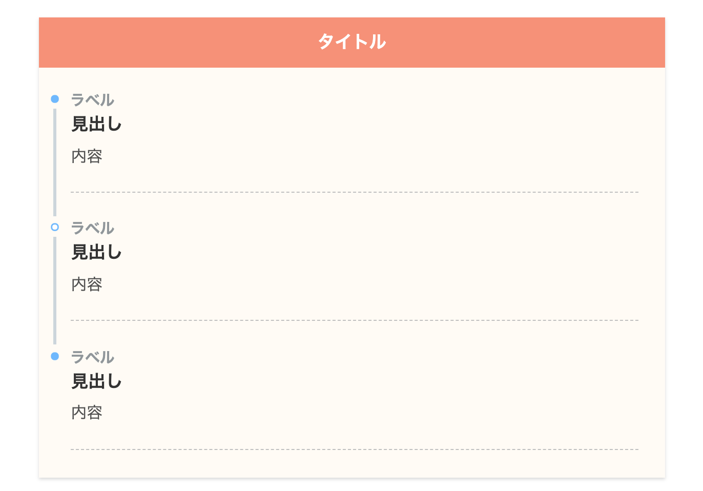
SANGO風で一番見るデザインです。私たちのブログでも採用してるデザインで、とても使い勝手が良いです!
他の色も紹介しようか迷ったんですが、これ一択で良いだろう!と思うくらいハイセンスなデザインでしたので、この色のみ紹介することにしました。
- CSSをコピペ
-
/*タイムライン*/
.timeline-box ul > li:before {
content: "";
}
.partsUl-1 .timeline-box ul {
background-color: transparent;
}
.timeline > li.timeline-item {
padding-left: 0;
}
.content .timeline-item-content {
margin-top:0;
margin-left: 5px;
padding: 0 0 1.5em 1.1em;
width: 95%;
}
.content .timeline-item-snippet {
margin-top: .5em;
padding: 0 0 1.5em;
border-bottom: dashed 1px #c0c0c0;
color: #505050;
}
/*ボックス*/
.timeline-box {
margin-bottom: 20px;
box-sizing: border-box;
background:#fffbf4;
box-shadow:0 2px 4px rgb(0 0 0 / 15%);
}
.timeline-box *{
box-sizing: border-box;
}
.timeline-box .timeline {
list-style: none;
padding: 0 0 6px 0;
margin: 0;
}
.content .timeline ul {
margin-bottom: 20px;
}
/*タイトル*/
.timeline-title {
font-weight: bold;
font-size: 1.1em;
text-align: center;
margin-bottom:2rem;
border-bottom: 3px solid #6bb6ff;
padding: 10px 0;
background-color: #6bb6ff;
color: #ffffff;
}
.timeline > li {
margin-bottom: 60px;
}
.timeline > li.timeline-item {
overflow: hidden;
margin: 0 0 0 13px;
position: relative;
}
/*ラベル*/
.timeline-item-label {
padding-top: 2px;
font-weight: 700;
font-size: 18px;
margin-left: 1.4em;
color:#90969a;
}
@media screen and (max-width : 480px){
.timeline-item-label {
font-size:16px;
}
}
/*見出し*/
.timeline-item-title {
font-size: 1.1em;
font-weight: 700;
line-height: 1.5;
color:#333;
}
/*●部分*/
.content .timeline-item:first-of-type:before {
background: #6bb6ff;
}
.content .timeline-item:last-of-type:before {
background: #6bb6ff;
}
.content .timeline-item:before {
content: '';
width: 14px;
height: 14px;
background: #ffffff;
position: absolute;
left: 0;
top: 7px;
border-radius: 50%;
border: solid 3px #6bb6ff;
}
.content .timeline-item:last-of-type:after {
background: 0 0;
}
/*縦線*/
.content .timeline-item:after {
content: "";
width: 3px;
background: #ccd5db;
display: block;
position: absolute;
top: 25px;
bottom: 0;
left: 5px;
}
35. SANGO風(枠あり・角丸・影あり)
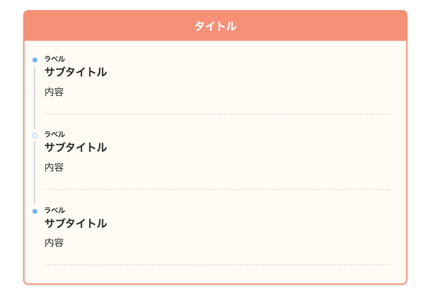
SANGO風デザインの角丸バージョンです。border-radiusを使って角を丸くしてます。
これも見やすくオシャレですね!
- CSSをコピペ
-
/*タイムライン*/
.timeline-box ul > li:before {
content: "";
}
.partsUl-1 .timeline-box ul {
background-color: transparent;
}
.timeline > li.timeline-item {
padding-left: 0;
}
.content .timeline-item-content {
margin-top:0;
margin-left: 5px;
padding: 0 0 1.5em 1.1em;
width: 95%;
}
.content .timeline-item-snippet {
margin-top: .5em;
padding: 0 0 1.5em;
border-bottom: dashed 1px #ccd5db;
}
/*ボックス*/
.timeline-box {
margin-bottom: 20px;
box-sizing: border-box;
border: 3px solid #f89174;
border-radius: 10px;
box-shadow:0 2px 4px rgb(0 0 0 / 15%);
background:#fffbf4;
}
.timeline-box *{
box-sizing: border-box;
}
.timeline-box .timeline {
list-style: none;
padding: 0 0 6px 0;
margin: 0;
}
.content .timeline ul {
margin-bottom: 20px;
}
/*タイトル*/
.timeline-title {
font-weight: bold;
font-size: 1.1em;
text-align: center;
margin-bottom:2rem;
padding:10px;
margin-right:-1px;
background-color: #f89174;
color: #ffffff;
}
.timeline > li {
margin-bottom: 60px;
}
.timeline > li.timeline-item {
overflow: hidden;
margin: 0 0 0 13px;
position: relative;
}
/*ラベル*/
.timeline-item-label {
padding-top: 2px;
font-weight: 700;
font-size: 14px;
margin-left: 1.8em;
}
@media screen and (max-width : 480px){
.timeline-item-label {
font-size:16px;
}
}
/*見出し*/
.timeline-item-title {
font-size: 1.1em;
font-weight: 700;
line-height: 1.5;
}
/*●部分*/
.content .timeline-item:first-of-type:before {
background: #6bb6ff;
}
.content .timeline-item:last-of-type:before {
background: #6bb6ff;
}
.content .timeline-item:before {
content: '';
width: 14px;
height: 14px;
background: #ffffff;
position: absolute;
left: 0;
top: 7px;
border-radius: 50%;
border: solid 2px #6bb6ff;
}
.content .timeline-item:last-of-type:after {
background: 0 0;
}
/*縦線*/
.content .timeline-item:after {
content: "";
width: 3px;
background: #ccd5db;
display: block;
position: absolute;
top: 25px;
bottom: 0;
left: 5px;
}
36. SANGO風(枠あり・角丸・影あり・イエロー)
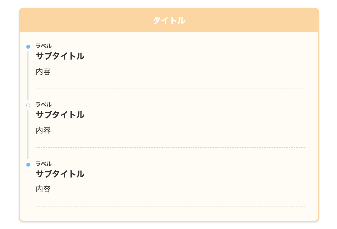
上記のデザインのイエローバージョンです。
- CSSをコピペ
-
/*タイムライン*/
.timeline-box ul > li:before {
content: "";
}
.partsUl-1 .timeline-box ul {
background-color: transparent;
}
.timeline > li.timeline-item {
padding-left: 0;
}
.content .timeline-item-content {
margin-top:0;
margin-left: 5px;
padding: 0 0 1.5em 1.1em;
width: 95%;
}
.content .timeline-item-snippet {
margin-top: .5em;
padding: 0 0 1.5em;
border-bottom: dashed 1px #ccd5db;
}
/*ボックス*/
.timeline-box {
margin-bottom: 20px;
box-sizing: border-box;
border: 3px solid #fcd69e;
border-radius: 10px;
box-shadow:0 2px 4px rgb(0 0 0 / 15%);
background:#fffbf4;
}
.timeline-box *{
box-sizing: border-box;
}
.timeline-box .timeline {
list-style: none;
padding: 0 0 6px 0;
margin: 0;
}
.content .timeline ul {
margin-bottom: 20px;
}
/*タイトル*/
.timeline-title {
font-weight: bold;
font-size: 1.1em;
text-align: center;
margin-bottom:2rem;
padding:10px;
margin-right:-1px;
background-color: #fcd69e;
color: #ffffff;
}
.timeline > li {
margin-bottom: 60px;
}
.timeline > li.timeline-item {
overflow: hidden;
margin: 0 0 0 13px;
position: relative;
}
/*ラベル*/
.timeline-item-label {
padding-top: 2px;
font-weight: 700;
font-size: 14px;
margin-left: 1.8em;
}
@media screen and (max-width : 480px){
.timeline-item-label {
font-size:16px;
}
}
/*見出し*/
.timeline-item-title {
font-size: 1.1em;
font-weight: 700;
line-height: 1.5;
}
/*●部分*/
.content .timeline-item:first-of-type:before {
background: #6bb6ff;
}
.content .timeline-item:last-of-type:before {
background: #6bb6ff;
}
.content .timeline-item:before {
content: '';
width: 14px;
height: 14px;
background: #ffffff;
position: absolute;
left: 0;
top: 7px;
border-radius: 50%;
border: solid 2px #6bb6ff;
}
.content .timeline-item:last-of-type:after {
background: 0 0;
}
/*縦線*/
.content .timeline-item:after {
content: "";
width: 3px;
background: #ccd5db;
display: block;
position: absolute;
top: 25px;
bottom: 0;
left: 5px;
}
37. SANGO風(角丸・影あり・ブルー)
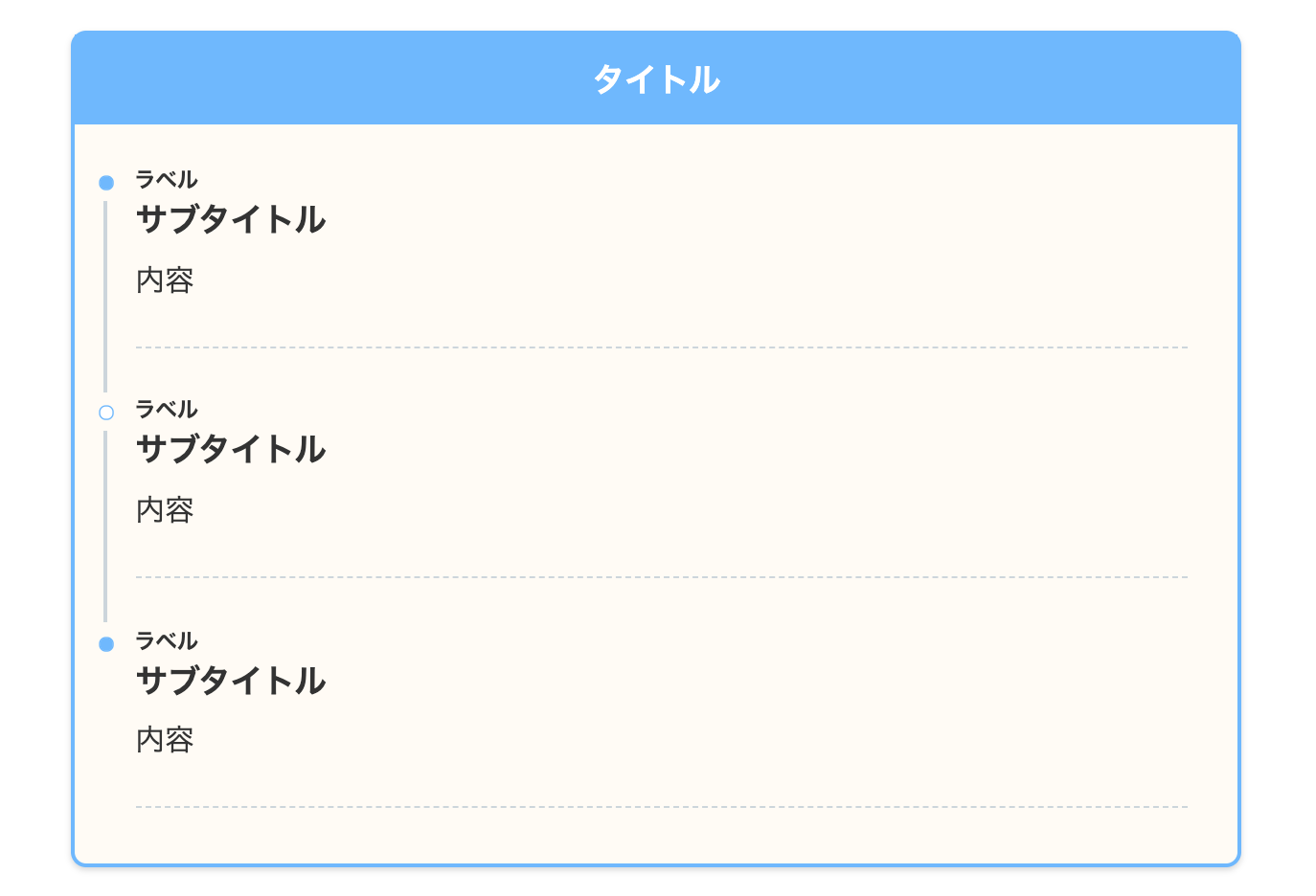
上記のデザインのブルーバージョンです。
- CSSをコピペ
-
/*タイムライン*/
.timeline-box ul > li:before {
content: "";
}
.partsUl-1 .timeline-box ul {
background-color: transparent;
}
.timeline > li.timeline-item {
padding-left: 0;
}
.content .timeline-item-content {
margin-top:0;
margin-left: 5px;
padding: 0 0 1.5em 1.1em;
width: 95%;
}
.content .timeline-item-snippet {
margin-top: .5em;
padding: 0 0 1.5em;
border-bottom: dashed 1px #ccd5db;
}
/*ボックス*/
.timeline-box {
margin-bottom: 20px;
box-sizing: border-box;
border: 3px solid #6bb6ff;
border-radius: 10px;
box-shadow:0 2px 4px rgb(0 0 0 / 15%);
background:#fffbf4;
}
.timeline-box *{
box-sizing: border-box;
}
.timeline-box .timeline {
list-style: none;
padding: 0 0 6px 0;
margin: 0;
}
.content .timeline ul {
margin-bottom: 20px;
}
/*タイトル*/
.timeline-title {
font-weight: bold;
font-size: 1.1em;
text-align: center;
margin-bottom:2rem;
padding:10px;
margin-right:-1px;
background-color: #6bb6ff;
color: #ffffff;
}
.timeline > li {
margin-bottom: 60px;
}
.timeline > li.timeline-item {
overflow: hidden;
margin: 0 0 0 13px;
position: relative;
}
/*ラベル*/
.timeline-item-label {
padding-top: 2px;
font-weight: 700;
font-size: 14px;
margin-left: 1.8em;
}
@media screen and (max-width : 480px){
.timeline-item-label {
font-size:16px;
}
}
/*見出し*/
.timeline-item-title {
font-size: 1.1em;
font-weight: 700;
line-height: 1.5;
}
/*●部分*/
.content .timeline-item:first-of-type:before {
background: #6bb6ff;
}
.content .timeline-item:last-of-type:before {
background: #6bb6ff;
}
.content .timeline-item:before {
content: '';
width: 14px;
height: 14px;
background: #ffffff;
position: absolute;
left: 0;
top: 7px;
border-radius: 50%;
border: solid 2px #6bb6ff;
}
.content .timeline-item:last-of-type:after {
background: 0 0;
}
/*縦線*/
.content .timeline-item:after {
content: "";
width: 3px;
background: #ccd5db;
display: block;
position: absolute;
top: 25px;
bottom: 0;
left: 5px;
}
38. SANGO風(枠あり)
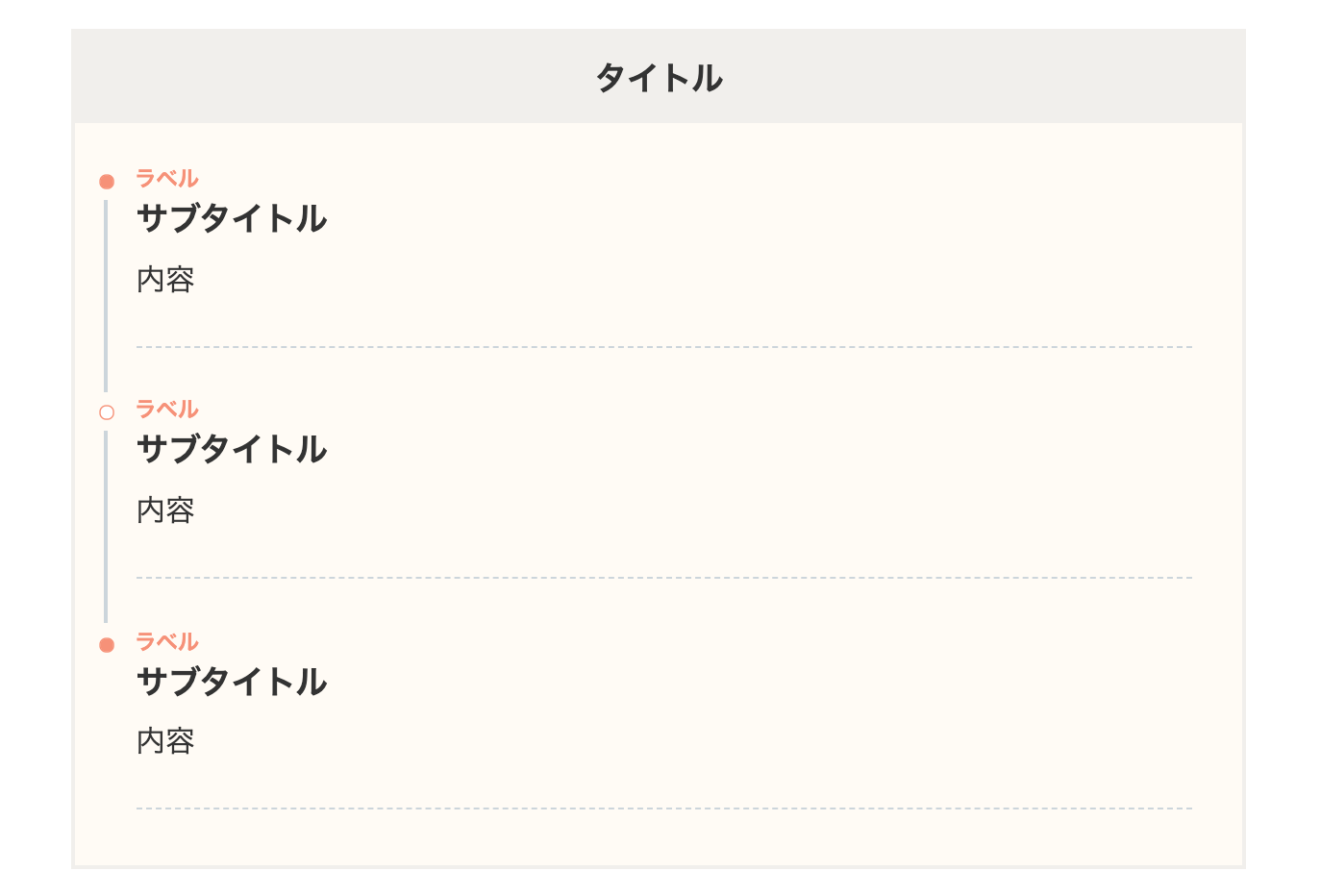
サルワカさんが使っているデザインです。薄いグレーに赤をポイントで入れてます。
超絶オシャレですね!
- CSSをコピペ
-
/*タイムライン*/
.timeline-box ul > li:before {
content: "";
}
.partsUl-1 .timeline-box ul {
background-color: transparent;
}
.timeline > li.timeline-item {
padding-left: 0;
}
.content .timeline-item-content {
margin-top:0;
margin-left: 5px;
padding: 0 0 1.5em 1.1em;
width: 95%;
}
.content .timeline-item-snippet {
margin-top: .5em;
padding: 0 0 1.5em;
border-bottom: dashed 1px #ccd5db;
}
/*ボックス*/
.timeline-box {
margin-bottom: 20px;
box-sizing: border-box;
border: 3px solid #f1efec;
background:#fffbf4;
}
.timeline-box *{
box-sizing: border-box;
}
.timeline-box .timeline {
list-style: none;
padding: 0 0 6px 0;
margin: 0;
}
.content .timeline ul {
margin-bottom: 20px;
}
/*タイトル*/
.timeline-title {
font-weight: bold;
font-size: 1.1em;
text-align: center;
margin-bottom:2rem;
padding:10px;
margin-right:-1px;
background-color: #f1efec;
color: #333333;
}
.timeline > li {
margin-bottom: 60px;
}
.timeline > li.timeline-item {
overflow: hidden;
margin: 0 0 0 13px;
position: relative;
}
/*ラベル*/
.timeline-item-label {
padding-top: 2px;
font-weight: 700;
font-size: 14px;
margin-left: 1.8em;
color:#f89174;
}
@media screen and (max-width : 480px){
.timeline-item-label {
font-size:16px;
}
}
/*見出し*/
.timeline-item-title {
font-size: 1.1em;
font-weight: 700;
line-height: 1.5;
}
/*●部分*/
.content .timeline-item:first-of-type:before {
background:#f89174;
}
.content .timeline-item:last-of-type:before {
background:#f89174;
}
.content .timeline-item:before {
content: '';
width: 14px;
height: 14px;
background: #ffffff;
position: absolute;
left: 0;
top: 7px;
border-radius: 50%;
border: solid 2px #f89174;
}
.content .timeline-item:last-of-type:after {
background: 0 0;
}
/*縦線*/
.content .timeline-item:after {
content: "";
width: 3px;
background: #ccd5db;
display: block;
position: absolute;
top: 25px;
bottom: 0;
left: 5px;
}
39. SANGO風(枠あり・ブルー)
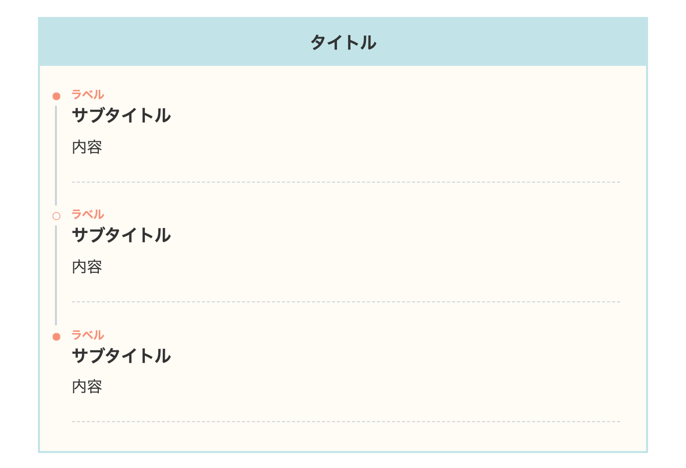
上記のデザインのブルーバージョンです。
色を少し淡くすることにより、マテリアルデザインやパステルカラーのブログに合いそうです。
- CSSをコピペ
-
/*タイムライン*/
.timeline-box ul > li:before {
content: "";
}
.partsUl-1 .timeline-box ul {
background-color: transparent;
}
.timeline > li.timeline-item {
padding-left: 0;
}
.content .timeline-item-content {
margin-top:0;
margin-left: 5px;
padding: 0 0 1.5em 1.1em;
width: 95%;
}
.content .timeline-item-snippet {
margin-top: .5em;
padding: 0 0 1.5em;
border-bottom: dashed 1px #ccd5db;
}
/*ボックス*/
.timeline-box {
margin-bottom: 20px;
box-sizing: border-box;
border: 3px solid #c1e4e9;
background:#fffbf4;
}
.timeline-box *{
box-sizing: border-box;
}
.timeline-box .timeline {
list-style: none;
padding: 0 0 6px 0;
margin: 0;
}
.content .timeline ul {
margin-bottom: 20px;
}
/*タイトル*/
.timeline-title {
font-weight: bold;
font-size: 1.1em;
text-align: center;
margin-bottom:2rem;
padding:10px;
margin-right:-1px;
background-color:#c1e4e9;
color: #333333;
}
.timeline > li {
margin-bottom: 60px;
}
.timeline > li.timeline-item {
overflow: hidden;
margin: 0 0 0 13px;
position: relative;
}
/*ラベル*/
.timeline-item-label {
padding-top: 2px;
font-weight: 700;
font-size: 14px;
margin-left: 1.8em;
color:#f89174;
}
@media screen and (max-width : 480px){
.timeline-item-label {
font-size:16px;
}
}
/*見出し*/
.timeline-item-title {
font-size: 1.1em;
font-weight: 700;
line-height: 1.5;
}
/*●部分*/
.content .timeline-item:first-of-type:before {
background:#f89174;
}
.content .timeline-item:last-of-type:before {
background:#f89174;
}
.content .timeline-item:before {
content: '';
width: 14px;
height: 14px;
background: #ffffff;
position: absolute;
left: 0;
top: 7px;
border-radius: 50%;
border: solid 2px #f89174;
}
.content .timeline-item:last-of-type:after {
background: 0 0;
}
/*縦線*/
.content .timeline-item:after {
content: "";
width: 3px;
background: #ccd5db;
display: block;
position: absolute;
top: 25px;
bottom: 0;
left: 5px;
}
40. SANGO風(枠あり・イエロー)
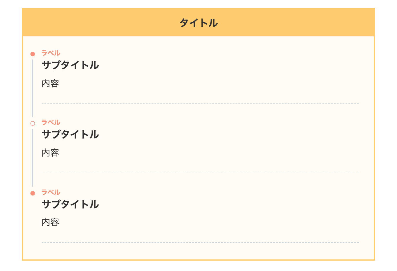
上記のデザインのイエローバージョンです。
逆にパキッとしたビビッドデザインのブログ向けです。
- CSSをコピペ
-
/*タイムライン*/
.timeline-box ul > li:before {
content: "";
}
.partsUl-1 .timeline-box ul {
background-color: transparent;
}
.timeline > li.timeline-item {
padding-left: 0;
}
.content .timeline-item-content {
margin-top:0;
margin-left: 5px;
padding: 0 0 1.5em 1.1em;
width: 95%;
}
.content .timeline-item-snippet {
margin-top: .5em;
padding: 0 0 1.5em;
border-bottom: dashed 1px #ccd5db;
}
/*ボックス*/
.timeline-box {
margin-bottom: 20px;
box-sizing: border-box;
border: 3px solid #ffcc66;
background:#fffbf4;
}
.timeline-box *{
box-sizing: border-box;
}
.timeline-box .timeline {
list-style: none;
padding: 0 0 6px 0;
margin: 0;
}
.content .timeline ul {
margin-bottom: 20px;
}
/*タイトル*/
.timeline-title {
font-weight: bold;
font-size: 1.1em;
text-align: center;
margin-bottom:2rem;
padding:10px;
margin-right:-1px;
background-color:#ffcc66;
color: #333333;
}
.timeline > li {
margin-bottom: 60px;
}
.timeline > li.timeline-item {
overflow: hidden;
margin: 0 0 0 13px;
position: relative;
}
/*ラベル*/
.timeline-item-label {
padding-top: 2px;
font-weight: 700;
font-size: 14px;
margin-left: 1.8em;
color:#f89174;
}
@media screen and (max-width : 480px){
.timeline-item-label {
font-size:16px;
}
}
/*見出し*/
.timeline-item-title {
font-size: 1.1em;
font-weight: 700;
line-height: 1.5;
}
/*●部分*/
.content .timeline-item:first-of-type:before {
background:#f89174;
}
.content .timeline-item:last-of-type:before {
background:#f89174;
}
.content .timeline-item:before {
content: '';
width: 14px;
height: 14px;
background: #ffffff;
position: absolute;
left: 0;
top: 7px;
border-radius: 50%;
border: solid 2px #f89174;
}
.content .timeline-item:last-of-type:after {
background: 0 0;
}
/*縦線*/
.content .timeline-item:after {
content: "";
width: 3px;
background: #ccd5db;
display: block;
position: absolute;
top: 25px;
bottom: 0;
left: 5px;
}
41. SANGO風(枠あり・影あり)
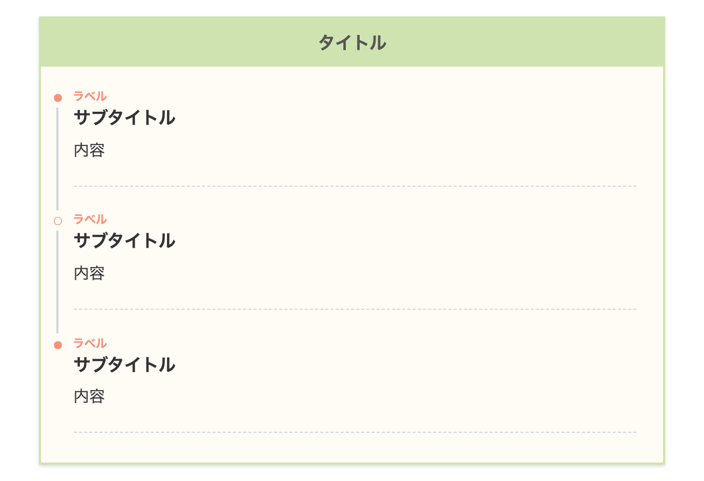
上記のデザインに影(shadow)を付けてみました。
こちらも見やすいデザインですね!
- CSSをコピペ
-
/*タイムライン*/
.timeline-box ul > li:before {
content: "";
}
.partsUl-1 .timeline-box ul {
background-color: transparent;
}
.timeline > li.timeline-item {
padding-left: 0;
}
.content .timeline-item-content {
margin-top:0;
margin-left: 5px;
padding: 0 0 1.5em 1.1em;
width: 95%;
}
.content .timeline-item-snippet {
margin-top: .5em;
padding: 0 0 1.5em;
border-bottom: dashed 1px #ccd5db;
}
/*ボックス*/
.timeline-box {
margin-bottom: 20px;
box-sizing: border-box;
border: 3px solid #cee4ae;
background:#fffbf4;
box-shadow:0 2px 4px rgb(0 0 0 / 15%);
}
.timeline-box *{
box-sizing: border-box;
}
.timeline-box .timeline {
list-style: none;
padding: 0 0 6px 0;
margin: 0;
}
.content .timeline ul {
margin-bottom: 20px;
}
/*タイトル*/
.timeline-title {
font-weight: bold;
font-size: 1.1em;
text-align: center;
margin-bottom:2rem;
padding:10px;
margin-right:-1px;
background-color:#cee4ae;
color:#555555;
}
.timeline > li {
margin-bottom: 60px;
}
.timeline > li.timeline-item {
overflow: hidden;
margin: 0 0 0 13px;
position: relative;
}
/*ラベル*/
.timeline-item-label {
padding-top: 2px;
font-weight: 700;
font-size: 14px;
margin-left: 1.8em;
color:#f89174;
}
@media screen and (max-width : 480px){
.timeline-item-label {
font-size:16px;
}
}
/*見出し*/
.timeline-item-title {
font-size: 1.1em;
font-weight: 700;
line-height: 1.5;
}
/*●部分*/
.content .timeline-item:first-of-type:before {
background:#f89174;
}
.content .timeline-item:last-of-type:before {
background:#f89174;
}
.content .timeline-item:before {
content: '';
width: 14px;
height: 14px;
background: #ffffff;
position: absolute;
left: 0;
top: 7px;
border-radius: 50%;
border: solid 2px #f89174;
}
.content .timeline-item:last-of-type:after {
background: 0 0;
}
/*縦線*/
.content .timeline-item:after {
content: "";
width: 3px;
background: #ccd5db;
display: block;
position: absolute;
top: 25px;
bottom: 0;
left: 5px;
}
42. AFFINGER5風
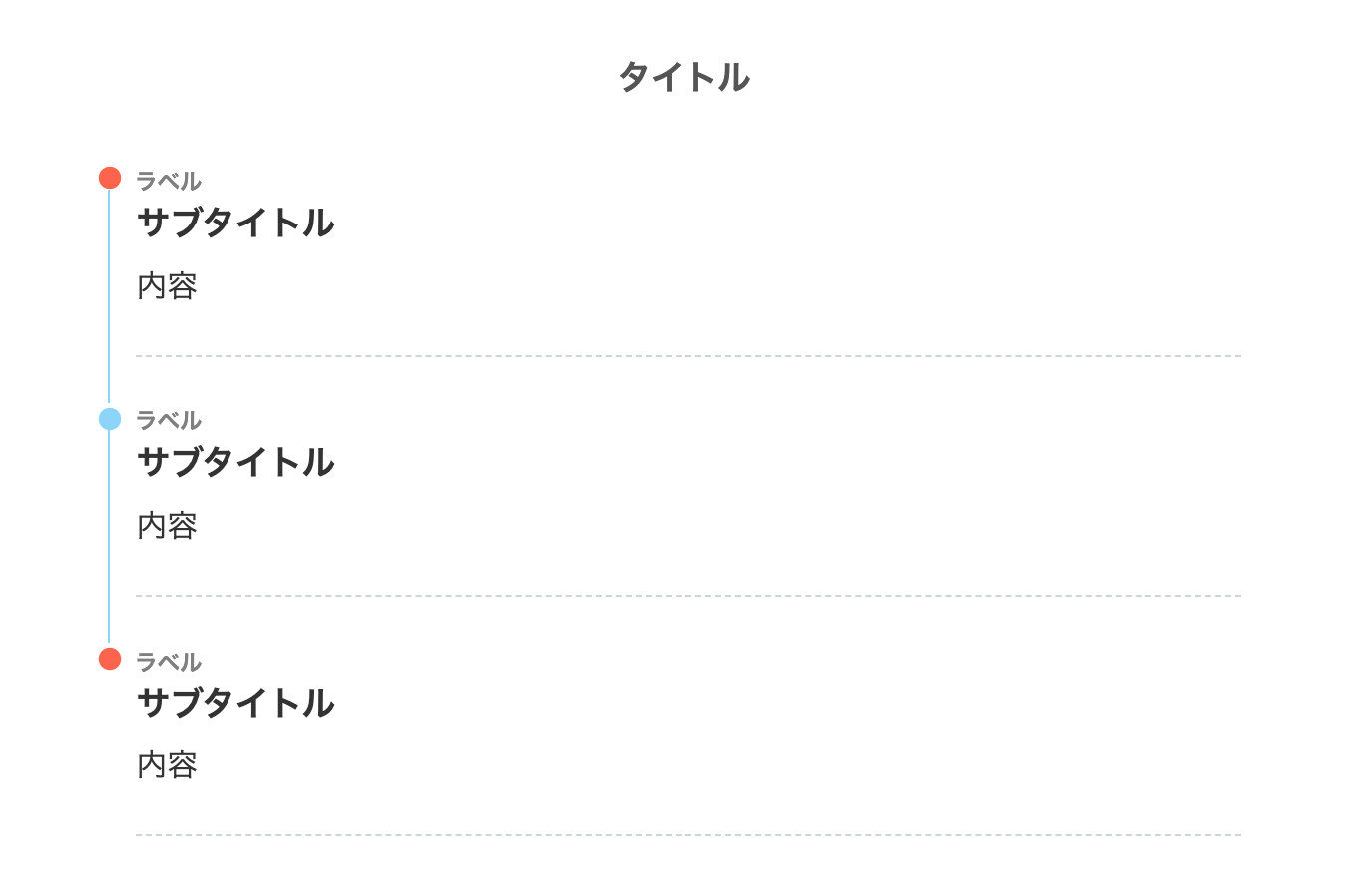
WordPressの有料テーマ AFFINGER5のタイムラインを参考にしました。
シンプルですが、始めと終わりがわかりやすいデザインです。
上下の●の大きさ(width,height)を調節してます。
- CSSをコピペ
-
/*タイムライン*/
.timeline-box ul > li:before {
content: "";
}
.partsUl-1 .timeline-box ul {
background-color: transparent;
}
.timeline > li.timeline-item {
padding-left: 0;
}
.content .timeline-item-content {
margin-top:0;
margin-left: 5px;
padding: 0 0 1.5em 1.1em;
width: 95%;
}
.content .timeline-item-snippet {
margin-top: .5em;
padding: 0 0 1.5em;
border-bottom: dashed 1px #ccd5db;
}
/*ボックス*/
.timeline-box {
margin-bottom: 20px;
box-sizing: border-box;
}
.timeline-box *{
box-sizing: border-box;
}
.timeline-box .timeline {
list-style: none;
padding: 0 0 6px 0;
margin: 0;
}
.content .timeline ul {
margin-bottom: 20px;
}
/*タイトル*/
.timeline-title {
font-weight: bold;
font-size: 1.1em;
text-align: center;
margin-bottom:2rem;
padding:10px;
margin-right:-1px;
color:#555555;
}
.timeline > li {
margin-bottom: 60px;
}
.timeline > li.timeline-item {
overflow: hidden;
margin: 0 0 0 13px;
position: relative;
}
/*ラベル*/
.timeline-item-label {
padding-top: 2px;
font-weight: 700;
font-size: 14px;
margin-left: 1.8em;
color:gray;
}
@media screen and (max-width : 480px){
.timeline-item-label {
font-size:16px;
}
}
/*見出し*/
.timeline-item-title {
font-size: 1.1em;
font-weight: 700;
line-height: 1.5;
}
/*●部分*/
.content .timeline-item:first-of-type:before {
background:#ff6347;
border: solid 3px #ff6347;
width:20px;
height:20px;
}
.content .timeline-item:last-of-type:before {
background:#ff6347;
border: solid 3px #ff6347;
width:20px;
height:20px;
}
.content .timeline-item:before {
content: '';
width:20px;
height: 20px;
background:#8ad3fb;
position: absolute;
left: 0px;
top: 0px;
border-radius: 50%;
border: solid 3px #8ad3fb;
}
.content .timeline-item:last-of-type:after {
background: 0 0;
}
/*縦線*/
.content .timeline-item:after {
content: "";
width: 2px;
background: #8ad3fb;
display: block;
position: absolute;
top:17px;
bottom:0px;
left: 7.8px;
}
43. THE THORのデフォルト風
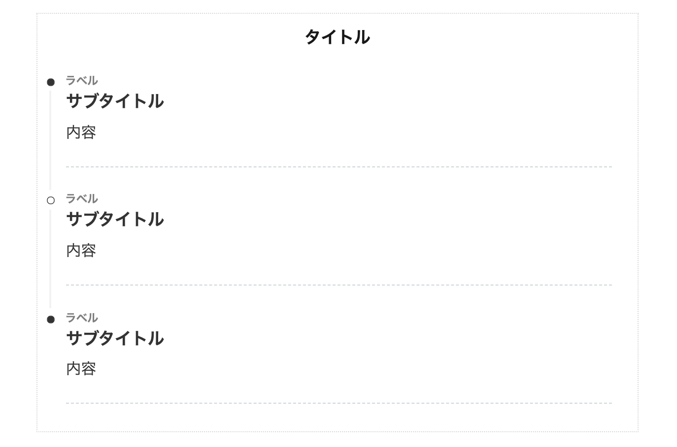
THE THOR(ザ・トール)のデフォルトっぽいデザインにしてみました。
THE THORユーザーさんは分かると思いますが、モチーフは地味で有名な目次のデザインです笑
- CSSをコピペ
-
/*タイムライン*/
.timeline-box ul > li:before {
content: "";
}
.partsUl-1 .timeline-box ul {
background-color: transparent;
}
.timeline > li.timeline-item {
padding-left: 0;
}
.content .timeline-item-content {
margin-top:0;
margin-left: 5px;
padding: 0 0 1.5em 1.1em;
width: 95%;
}
.content .timeline-item-snippet {
margin-top: .5em;
padding: 0 0 1.5em;
border-bottom: dashed 1px #ccd5db;
}
/*ボックス*/
.timeline-box {
margin-bottom: 20px;
padding-top: 10px;
box-sizing: border-box;
border:1px dotted #D8D8D8;
}
.timeline-box *{
box-sizing: border-box;
}
.timeline-box .timeline {
list-style: none;
padding: 0 0 6px 0;
margin: 0;
}
.content .timeline ul {
margin-bottom: 20px;
}
/*タイトル*/
.timeline-title {
font-weight: bold;
font-size: 1.1em;
text-align: center;
margin-bottom:2rem;
}
.timeline > li {
margin-bottom: 60px;
}
.timeline > li.timeline-item {
overflow: hidden;
margin: 0 0 0 10px;
position: relative;
}
/*ラベル*/
.timeline-item-label {
padding-top: 2px;
font-weight: 700;
font-size: 14px;
margin-left: 1.8em;
color:#7f7f7f;
}
@media screen and (max-width : 480px){
.timeline-item-label {
font-size:16px;
}
}
/*見出し*/
.timeline-item-title {
font-size: 1.1em;
font-weight: 700;
line-height: 1.5;
}
/*●部分*/
.content .timeline-item:first-of-type:before {
background: #333333;
}
.content .timeline-item:last-of-type:before {
background: #333333;
}
.content .timeline-item:before {
content: '';
width: 14px;
height: 14px;
background: #ffffff;
position: absolute;
left: 0;
top: 7px;
border-radius: 50%;
border: solid 2px #333333;
}
.content .timeline-item:last-of-type:after {
background: 0 0;
}
/*縦線*/
.content .timeline-item:after {
content: "";
width: 3px;
background:#f2f2f2;
display: block;
position: absolute;
top: 25px;
bottom: 0;
left: 5px;
}
44. Twitterナイトモード風
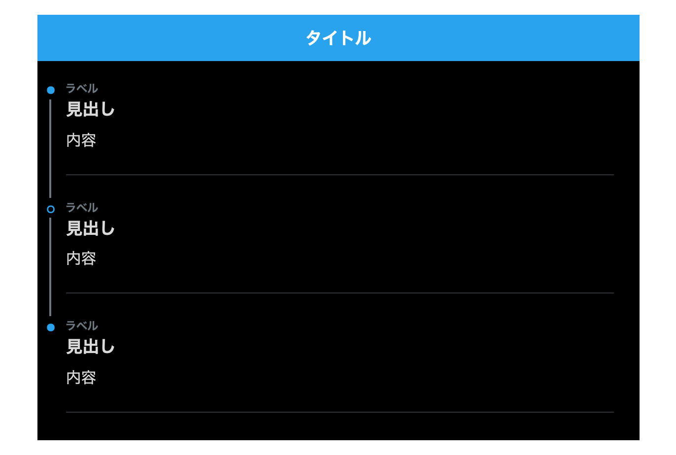
Twitterのナイトモードのデザインをイメージしてます。
カラーバランスが読者の目に優しく、「見たことある!」と言う遊び心を出してみました。
- CSSをコピペ
-
/*タイムライン*/
.timeline-box ul > li:before {
content: "";
}
.partsUl-1 .timeline-box ul {
background-color: transparent;
}
.timeline > li.timeline-item {
padding-left: 0;
}
.content .timeline-item-content {
margin-top:0;
margin-left: 5px;
padding: 0 0 1.5em 1.1em;
width: 95%;
}
.content .timeline-item-snippet {
margin-top: .5em;
padding: 0 0 1.5em;
border-bottom: solid 1px rgb(47, 51, 54);
}
/*ボックス*/
.timeline-box {
margin-bottom: 20px;
box-sizing: border-box;
background:black;
}
.timeline-box *{
box-sizing: border-box;
}
.timeline-box .timeline {
list-style: none;
padding: 0 0 6px 0;
margin: 0;
}
.content .timeline ul {
margin-bottom: 20px;
}
/*タイトル*/
.timeline-title {
font-weight: bold;
font-size: 1.1em;
text-align: center;
margin-bottom:2rem;
color:#ffffff;
background:#1da1f2;
padding:10px;

}
.timeline > li {
margin-bottom: 60px;
}
.timeline > li.timeline-item {
overflow: hidden;
margin: 0 0 0 10px;
position: relative;
color:#d9d9d9;
}
/*ラベル*/
.timeline-item-label {
padding-top: 2px;
font-weight: 700;
font-size: 14px;
margin-left: 1.8em;
color:#6e767d;
}
@media screen and (max-width : 480px){
.timeline-item-label {
font-size:16px;
}
}
/*見出し*/
.timeline-item-title {
font-size: 1.1em;
font-weight: 700;
line-height: 1.5;
color:#d9d9d9;
}
/*●部分*/
.content .timeline-item:first-of-type:before {
background:#1da1f2;
}
.content .timeline-item:last-of-type:before {
background:#1da1f2;
}
.content .timeline-item:before {
content: '';
width: 14px;
height: 14px;
background: black;
position: absolute;
left: 0;
top: 7px;
border-radius: 50%;
border: solid 3px #1da1f2;;
}
.content .timeline-item:last-of-type:after {
background: 0 0;
}
/*縦線*/
.content .timeline-item:after {
content: "";
width: 3px;
background:#6e767d;
display: block;
position: absolute;
top: 25px;
bottom: 0;
left: 5px;
}
45. Googleマップ風
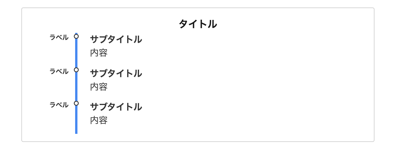
Googleマップのタイムラインをモチーフにしました。
手順を紹介すると言うより、時系列でスケジュールを紹介する時などに重宝しそうです。
- CSSをコピペ
-
/*タイムライン*/
.timeline-box {
margin-bottom: 20px;
border: 1px solid #ccc;
border-radius: 4px;
padding: 16px 5px;
box-sizing: border-box;
}
.timeline-box *{
box-sizing: border-box;
}
.timeline-box .timeline {
list-style: none;
padding: 0;
margin: 0;
}
/*タイトル*/
.timeline-title {
font-weight: bold;
font-size: 1.1em;
text-align: center;
}
.timeline > li {
margin-bottom: 60px;
}
.timeline > li.timeline-item {
overflow: hidden;
margin: 0;
position: relative;
}
/*ラベル*/
.timeline-item-label {
width: 110px;
float: left;
font-weight:bold;
text-align: right;
padding-right: 1em;
font-size: 14px;
}
@media screen and (max-width : 480px){
.timeline-item-label {
font-size:16px;
}
}
/*見出し*/
.timeline-item-title {
font-weight: bold;
}
.timeline-item-content {
width: calc(100% - 110px);
float: left;
padding: .8em 1.4em;
padding-top:0px;
border-left: 5px #4285F4 solid;
}
.timeline-item:before {
content: '';
width: 15px;
height: 15px;
background: #ffffff;
border:solid 3px #333333;
position: absolute;
left: 105px;
top: 24px;
border-radius: 100%;
}

/* for Smartphone */
@media screen and (max-width: 480px) {
.timeline-box .timeline {
padding-left: 10px;
}
.timeline > li.timeline-item {
overflow: visible;
border-left: 3px #e5e5d1 solid;
}
.timeline-item-label {
width: auto;
float: none;
text-align: left;
padding-left: 16px;
}
.timeline-item-content {
width: auto;
padding: 8px;
float: none;
border: none;
}
.timeline-item:before {
top: 19px;
width: 21px;
height: 21px;
}
}
.timeline-box ul > li:before {
content: "";
}
.partsUl-1 .timeline-box ul {
background-color: transparent;
}
.timeline > li.timeline-item {
padding-left: 0;
}
.content .timeline-item-content {
margin-top:0;
}
.content .timeline-item-snippet {
margin-top:0;
}
/* for PC */
@media screen and (min-width: 481px) {
.timeline-box ul > li:before {
left:105px;
}
}
/* for Smartphone */
@media screen and (max-width: 480px) {
.timeline-box ul > li:before {
left:-12px;
}
}
46. manablog風
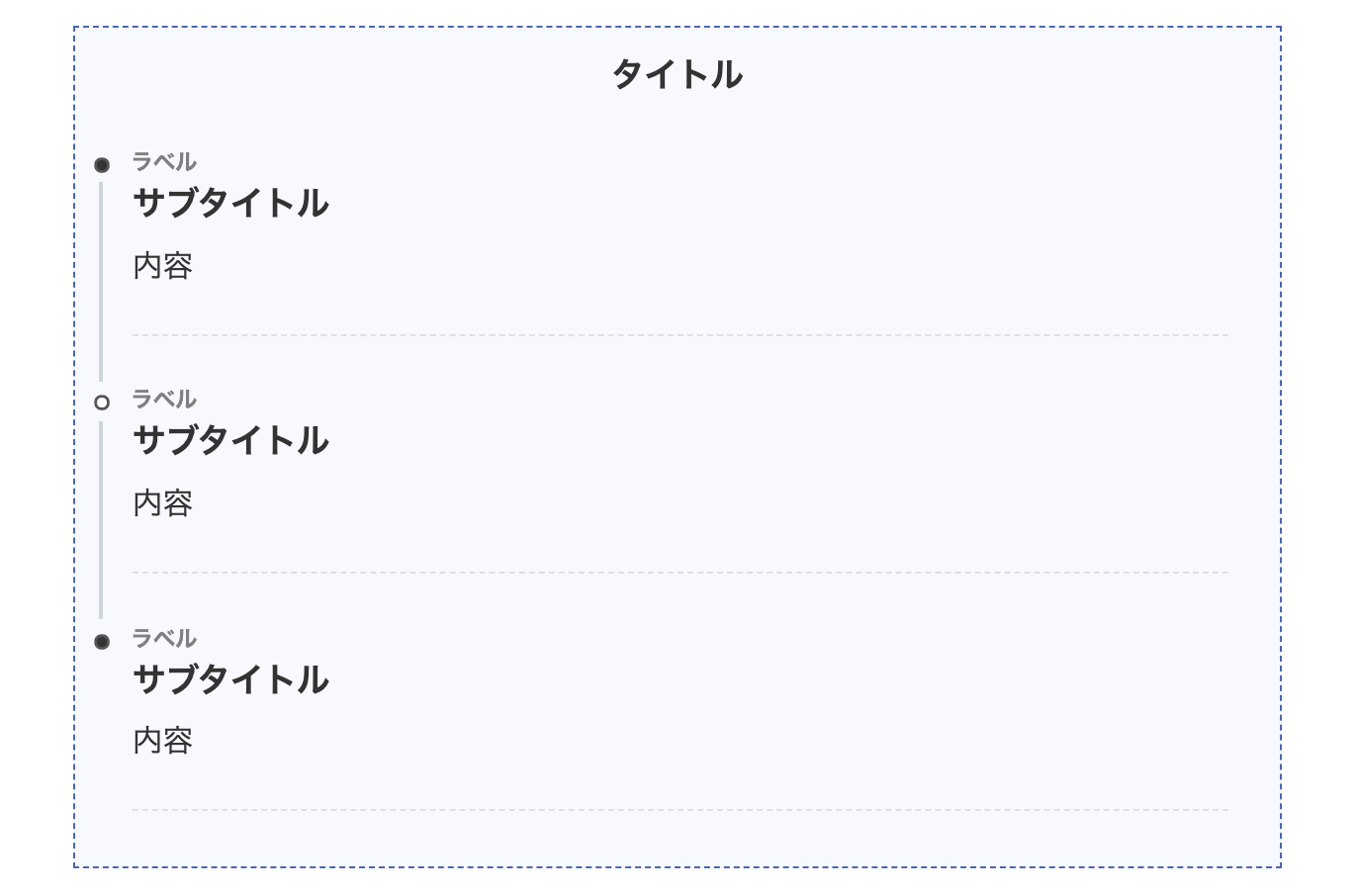
誰もが知るブロガー界のインフルエンサー manablogさんのデザインをイメージしてます。
ミニマリストっぽいデザインが使いやすさ抜群ですね!
- CSSをコピペ
-
/*タイムライン*/
.timeline-box ul > li:before {
content: "";
}
.partsUl-1 .timeline-box ul {
background-color: transparent;
}
.timeline > li.timeline-item {
padding-left: 0;
}
.content .timeline-item-content {
margin-top:0;
margin-left: 5px;
padding: 0 0 1.5em 1.1em;
width: 95%;
}
.content .timeline-item-snippet {
margin-top: .5em;
padding: 0 0 1.5em;
border-bottom: dashed 1px #e0e0e0;
}
/*ボックス*/
.timeline-box {
margin-bottom: 20px;
padding-top: 10px;
box-sizing: border-box;
border:dashed 1px #4865b2;
background:#f8f9ff;
}
.timeline-box *{
box-sizing: border-box;
}
.timeline-box .timeline {
list-style: none;
padding: 0 0 6px 0;
margin: 0;
}
.content .timeline ul {
margin-bottom: 20px;
}
/*タイトル*/
.timeline-title {
font-weight: bold;
font-size: 1.1em;
text-align: center;
margin-bottom:2rem;
color:#333333;
}
.timeline > li {
margin-bottom: 60px;
}
.timeline > li.timeline-item {
overflow: hidden;
margin: 0 0 0 10px;
position: relative;
}
/*ラベル*/
.timeline-item-label {
padding-top: 2px;
font-weight: 700;
font-size: 14px;
margin-left: 1.8em;
color:gray;
}
@media screen and (max-width : 480px){
.timeline-item-label {
font-size:16px;
}
}
/*見出し*/
.timeline-item-title {
font-size: 1.1em;
font-weight: 700;
line-height: 1.5;
color:#333333;
}
/*●部分*/
.content .timeline-item:first-of-type:before {
background: #333333;
}
.content .timeline-item:last-of-type:before {
background:#333333;
}
.content .timeline-item:before {
content: '';
width: 14px;
height: 14px;
background: #ffffff;
position: absolute;
left: 0;
top: 7px;
border-radius: 50%;
border: solid 3px #555555;
}
.content .timeline-item:last-of-type:after {
background: 0 0;
}
/*縦線*/
.content .timeline-item:after {
content: "";
width: 3px;
background:#ccd5dd;
display: block;
position: absolute;
top: 25px;
bottom: 0;
left: 5px;
}
47. クール&シンプル
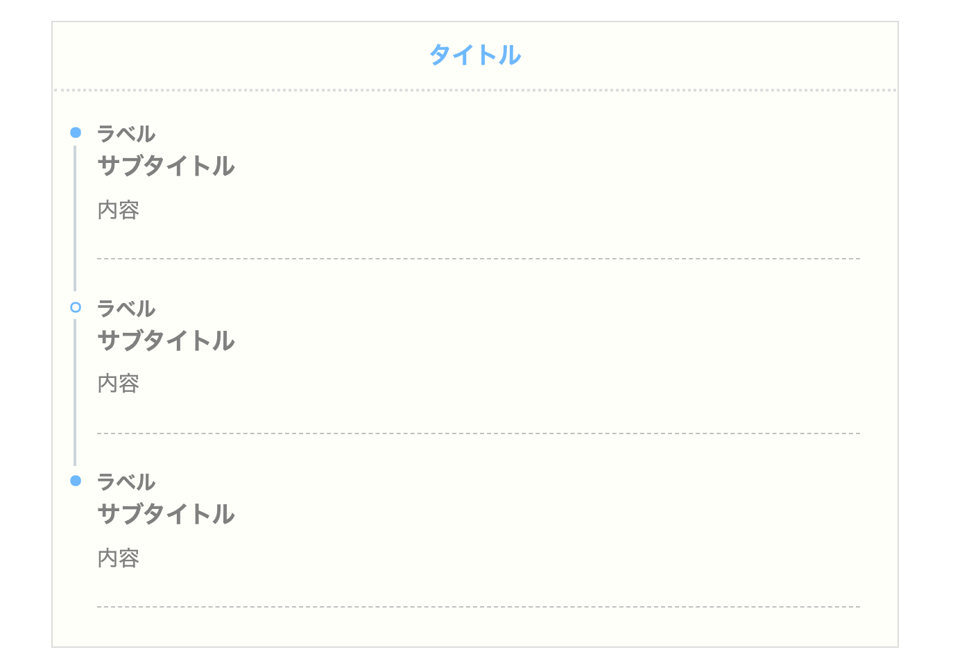
シンプルかつオシャレなデザインです。タイトルの下にボーダー(border-bottom)をつけ、さらに点線(dotted)にしてます。
- CSSをコピペ
-
/*タイムライン*/
.timeline-box ul > li:before {
content: "";
}
.partsUl-1 .timeline-box ul {
background-color: transparent;
}
.timeline > li.timeline-item {
padding-left: 0;
}
.content .timeline-item-content {
margin-top:0;
margin-left: 5px;
padding: 0 0 1.5em 1.1em;
width: 95%;
}
.content .timeline-item-snippet {
margin-top: .5em;
padding: 0 0 1.5em;
border-bottom: dashed 1px #c0c0c0;
color:gray;
}
/*ボックス*/
.timeline-box {
margin-bottom: 20px;
box-sizing: border-box;
background:#fffff9;
border: solid 2px #dcdddd;
}
.timeline-box *{
box-sizing: border-box;
}
.timeline-box .timeline {
list-style: none;
padding: 0 0 6px 0;
margin: 0;
}
.content .timeline ul {
margin-bottom: 20px;
}
/*タイトル*/
.timeline-title {
font-weight: bold;
font-size: 1.1em;
text-align: center;
margin-bottom:2rem;
border-bottom: 3px dotted #dcdddd;
padding: 10px;
color:#6bb6ff;
}
.timeline > li {
margin-bottom: 60px;
}
.timeline > li.timeline-item {
overflow: hidden;
margin: 0 0 0 13px;
position: relative;
}
/*ラベル*/
.timeline-item-label {
padding-top: 2px;
font-weight: 700;
font-size: 18px;
margin-left: 1.4em;
color:gray;
}
@media screen and (max-width : 480px){
.timeline-item-label {
font-size:16px;
}
}
/*見出し*/
.timeline-item-title {
font-size: 1.1em;
font-weight: 700;
line-height: 1.5;
color:gray;
}
/*●部分*/
.content .timeline-item:first-of-type:before {
background: #6bb6ff;
}
.content .timeline-item:last-of-type:before {
background: #6bb6ff;
}
.content .timeline-item:before {
content: '';
width: 14px;
height: 14px;
background: #ffffff;
position: absolute;
left: 0;
top: 7px;
border-radius: 50%;
border: solid 3px #6bb6ff;
}
.content .timeline-item:last-of-type:after {
background: 0 0;
}
/*縦線*/
.content .timeline-item:after {
content: "";
width: 3px;
background: #ccd5db;
display: block;
position: absolute;
top: 25px;
bottom: 0;
left: 5px;
}
48. クール&カジュアル
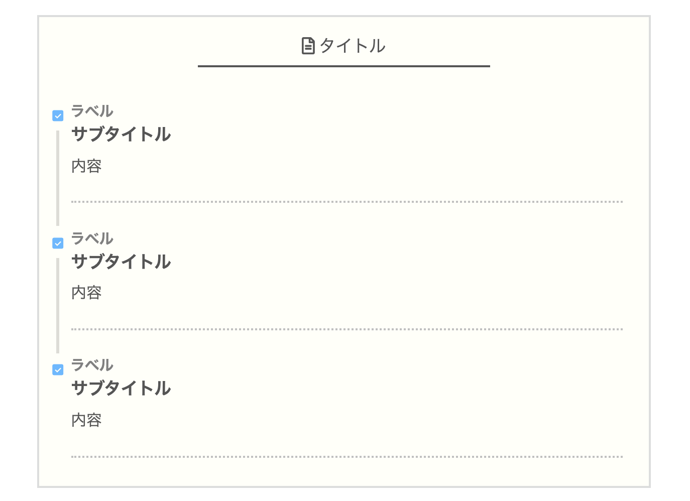
少し高度なデザインです。
タイトルの左にアイコンを設置、ボーダー(border-bottom)を付けてます。
さらに●をチェックアイコンに変更してます。
アイコンは Font Awesomeを使ってますので、変更したい場合はこの後に紹介する Font Awesomeの使い方をご覧ください。
- CSSをコピペ
-
/*タイムライン*/
.timeline-box ul > li:before {
content: "";
}
.partsUl-1 .timeline-box ul {
background-color: transparent;
}
.timeline > li.timeline-item {
padding-left: 0;
}
.content .timeline-item-content {
margin-top:0;
margin-left: 5px;
padding: 0 0 1.5em 1.1em;
width: 95%;
}
.content .timeline-item-snippet {
margin-top: .5em;
padding: 0 0 1.5em;
border-bottom: dotted 3px #c0c0c0;
color:#555555;
}
/*ボックス*/
.timeline-box {
margin-bottom: 20px;
box-sizing: border-box;
background:#fffff9;
border: solid 3px #dcdddd;
}
.timeline-box *{
box-sizing: border-box;
}
.timeline-box .timeline {
list-style: none;
padding: 0 0 6px 0;
margin: 0;
}
.content .timeline ul {
margin-bottom: 20px;
}
/*タイトル*/
.timeline-title {
font-size: 1.1em;
text-align: center;
margin-bottom:2rem;
padding: 15px;
color:#555555;
}
/*タイトル前のアイコン*/
.timeline-title:before{
font-family: "FontAwesome";
content:"\f15c";
margin-right:5px;
}
.timeline-title:after {
border-bottom: solid 3px #555555;
width:50%;
margin-right:auto;
margin-left:auto;
margin-top:5px;
}
.timeline > li {
margin-bottom: 60px;
}
.timeline > li.timeline-item {
overflow: hidden;
margin: 0 0 0 13px;
position: relative;
}
/*ラベル*/
.timeline-item-label {
padding-top: 2px;
font-weight: 700;
font-size: 18px;
margin-left: 1.4em;
color:gray;
}
@media screen and (max-width : 480px){
.timeline-item-label {
font-size:16px;
}
}
/*見出し*/
.timeline-item-title {
font-size: 1.1em;
font-weight: 700;
line-height: 1.5;
color:#555555;
}
/*●部分*/
.content .timeline-item:before {
position: absolute;
left: 0;
top: 7px;
font-family: "icomoon";/*Icomoon*/
content: "\ea53";/*アイコン*/
color: #6bb6ff;
}
.content .timeline-item:last-of-type:after {
background: 0 0;
}
/*縦線*/
.content .timeline-item:after {
content: "";
width: 4px;
background: #dddcd6;
display: block;
position: absolute;
top: 40px;
bottom: 0px;
left: .4em;
}
※このカスタマイズでは Font Awesomeのアイコンを使用しています。デザインを利用したい場合は以下で紹介している Font Awesomeの設定をしてからご使用ください。
49. MASAa.net風
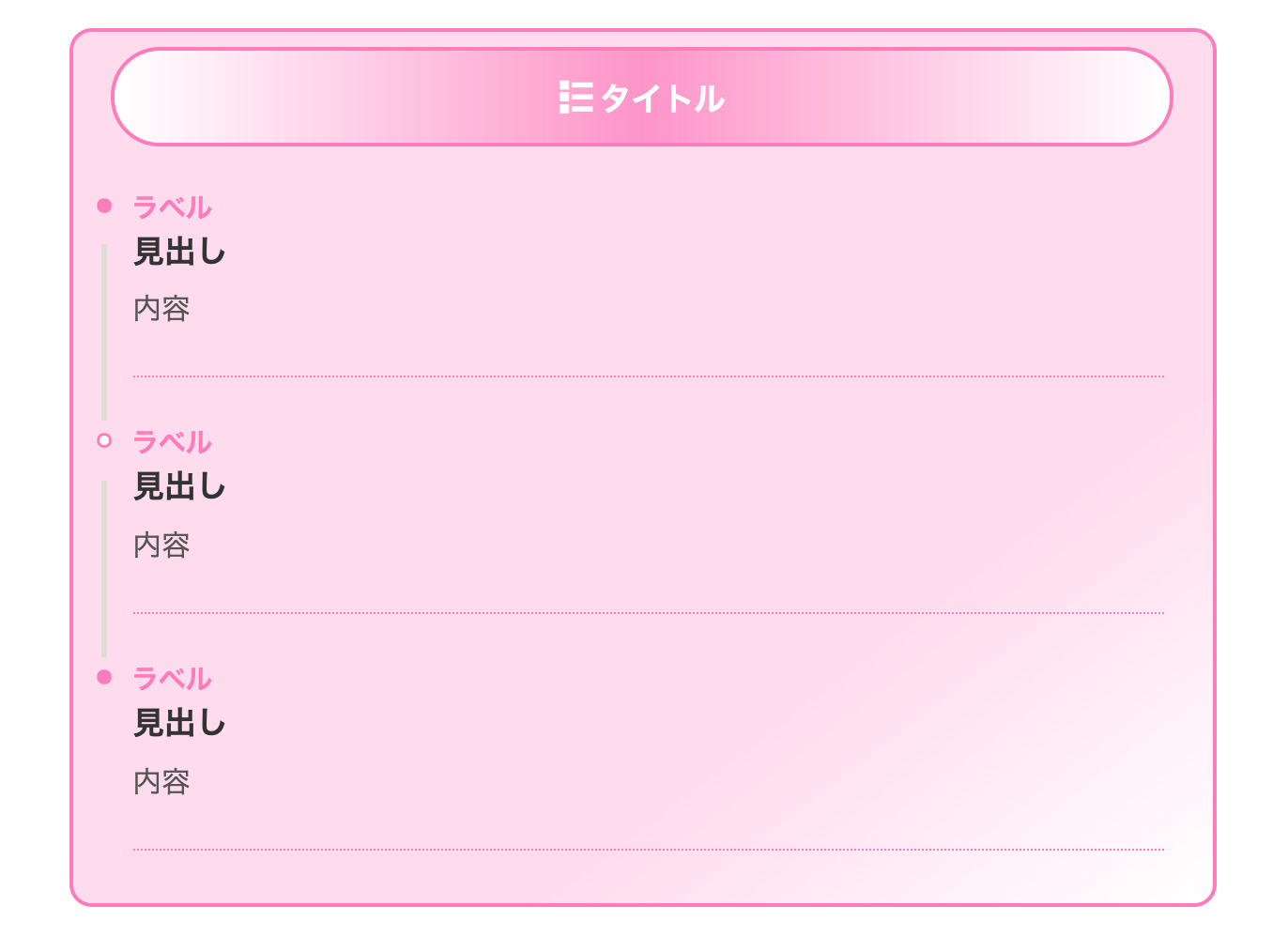
私たちが THE THOR(ザ・トール)のデザインカスタマイズで常に参考にさせていただいてる MASAa.netさんのデザインをモチーフにしてます。
かなりオシャレなデザインです。実はかなり高度なカスタマイズだったりするので一番気に入ってます。
- CSSをコピペ
-
/*タイムライン*/
.timeline-box ul > li:before {
content: "";
}
.partsUl-1 .timeline-box ul {
background-color: transparent;
}
.timeline > li.timeline-item {
padding-left: 0;
}
.content .timeline-item-content {
margin-top:0;
margin-left: 5px;
padding: 0 0 1.5em 1.1em;
width: 95%;
}
.content .timeline-item-snippet {
margin-top: .5em;
padding: 0 0 1.5em;
border-bottom: dotted 2px #ff7abc;
color:#555555;
}
/*ボックス*/
.timeline-box {
margin-bottom: 20px;
box-sizing: border-box;
border: solid 3px #ff7abc;
border-radius:15px;
padding-top:10px;
background: linear-gradient(to bottom right, #ffdbed 70%, #ffffff);
}
.timeline-box *{
box-sizing: border-box;
}
.timeline-box .timeline {
list-style: none;
padding: 0 0 6px 0;
margin: 0;
}
.content .timeline ul {
margin-bottom: 20px;
}
/*タイトル*/
.timeline-title {
font-size: 1.1em;
text-align: center;
padding:10px;
color:#ffffff;
font-weight:bold;
margin:25px;
border: solid 3px #ff7abc;
border-radius:50px;
background: linear-gradient(to right , #ffffff , #ff93c9, #ffffff);
}
/*タイトル前のアイコン*/
.timeline-title:before{
font-family: "icomoon";
content:"\e9c1";
margin-right:5px;
}
.timeline > li {
margin-bottom: 60px;
}
.timeline > li.timeline-item {
overflow: hidden;
margin: 0 0 0 13px;
position: relative;
}
/*ラベル*/
.timeline-item-label {
padding-top: 2px;
font-weight: 700;
font-size: 18px;
margin-left: 1.4em;
color:#ff7abc;
}
@media screen and (max-width : 480px){
.timeline-item-label {
font-size:16px;
}
}
/*見出し*/
.timeline-item-title {
font-size: 1.1em;
font-weight: 700;
line-height: 1.5;
color:#333333;
}
.content .timeline-item:before {
content: '';
width: 14px;
height: 14px;
background: #ffffff;
position: absolute;
left: 0;
top: 7px;
border-radius: 50%;
border: solid 3px #ff7abc;
}
/*●部分*/
.content .timeline-item:first-of-type:before {
background: #ff7abc;
}
.content .timeline-item:last-of-type:before {
background: #ff7abc;
}
.content .timeline-item:last-of-type:after {
background: 0 0;
}
/*縦線*/
.content .timeline-item:after {
content: "";
width: 3px;
background: #dddcd6;
display: block;
position: absolute;
top: 40px;
bottom: 0px;
left: .3em;
}
MASAa.netさんではとても役に立つ THE THOR(ザ・トール)のカスタマイズを多く紹介されています。大半がコピペだけで OKなので、初心者の方でもぜひ参考にしてください。
※ちなみに私たちは MASAa.netさんでカスタマイズの勉強をさせていただいてます。

50. アイコン付き
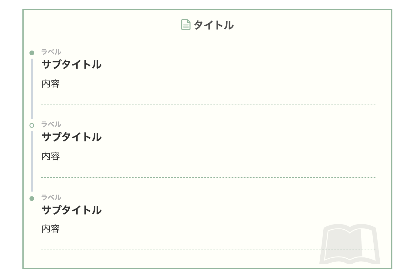
タイトルの左とボックスの右下に Font Awesomeのアイコンを設置しました。
かなりオシャレなタイムライン(ステップフロー)になったと思います。
- CSSをコピペ
-
/*タイムライン*/
.timeline-box ul > li:before {
content: "";
}
.partsUl-1 .timeline-box ul {
background-color: transparent;
}
.timeline > li.timeline-item {
padding-left: 0;
}
.content .timeline-item-content {
margin-top:0;
margin-left: 5px;
padding: 0 0 1.5em 1.1em;
width: 95%;
}
.content .timeline-item-snippet {
margin-top: .5em;
padding: 0 0 1.5em;
border-bottom: dashed 1px #93b69c;
}
/*ボックス*/
.timeline-box {
margin-bottom: 20px;
padding-top: 10px;
box-sizing: border-box;
border:solid 3px #93b69c;
background:#fffff9;
}
.timeline-box *{
box-sizing: border-box;
}
.timeline-box .timeline {
list-style: none;
padding: 0 0 6px 0;
margin: 0;
}
.content .timeline ul {
margin-bottom: 20px;
}
/*タイトル*/
.timeline-title {
font-weight: bold;
font-size: 1.1em;
text-align: center;
margin-bottom:2rem;
color: #505050;
}
/*タイトル前のアイコン*/
.timeline-title:before{
content: "\e92f";
font-family: "icomoon";
margin-right:5px;
color:#93b69c;
}
.timeline > li {
margin-bottom: 60px;
}
.timeline > li.timeline-item {
overflow: hidden;
margin: 0 0 0 10px;
position: relative;
}
/*ラベル*/
.timeline-item-label {
padding-top: 2px;
font-weight: 700;
font-size: 14px;
margin-left: 1.8em;
color:#afafb0;
}
@media screen and (max-width : 480px){
.timeline-item-label {
font-size:16px;
}
}
/*見出し*/
.timeline-item-title {
font-size: 1.1em;
font-weight: 700;
line-height: 1.5;
}
/*●部分*/
.content .timeline-item:first-of-type:before {
background: #93b69c;
}
.content .timeline-item:last-of-type:before {
background: #93b69c;
}
.content .timeline-item:last-of-type:after{
content: "\f212";
position: absolute;
font-family: "FontAwesome";
left:80%;
font-size: 6em;
opacity: 0.1;
}
@media screen and (max-width : 480px){
.content .timeline-item:last-of-type:after{
content: "\f212";
position: absolute;
font-family: "FontAwesome";
left:63%;
font-size: 5em;
opacity: 0.1;
}
}
.content .timeline-item:before {
content: '';
width: 14px;
height: 14px;
background: #ffffff;
position: absolute;
left: 0;
top: 7px;
border-radius: 50%;
border: solid 3px #93b69c;
}

.content .timeline-item:last-of-type:after {
background: 0 0;
}
/*縦線*/
.content .timeline-item:after {
content: "";
width: 3px;
background:#ccd5dd;
display: block;
position: absolute;
top: 25px;
bottom: 0;
left: 5px;
}
※このカスタマイズでは Font Awesomeのアイコンを使用しています。デザインを利用したい場合は以下で紹介している Font Awesomeの設定をしてからご使用ください。
51. 背景ありラベル
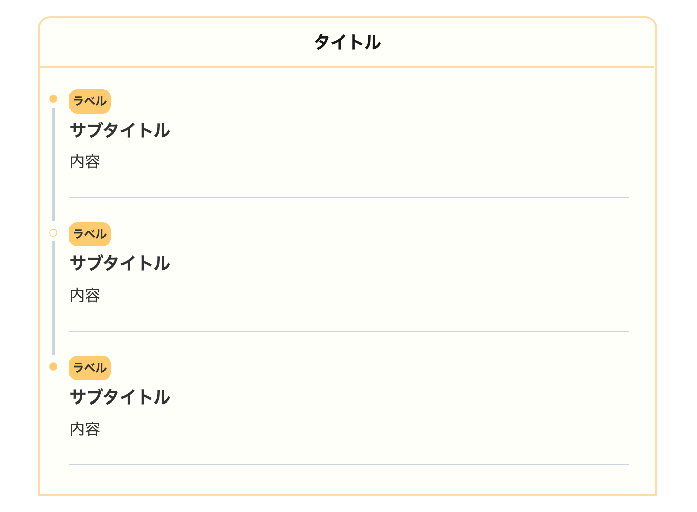
ラベルに背景(background)を付けてわかりやすい表にしました。意外と一番使いやすいかもですね!
- CSSをコピペ
-
/*タイムライン*/
.timeline-box ul > li:before {
content: "";
}
.partsUl-1 .timeline-box ul {
background-color: transparent;
}
.timeline > li.timeline-item {
padding-left: 0;
}
.content .timeline-item-content {
margin-top:0;
margin-left: 5px;
padding: 0 0 1.5em 1.1em;
width: 95%;
}
.content .timeline-item-snippet {
margin-top: .5em;
padding: 0 0 1.5em;
border-bottom: solid 1px #ccd5db;
}
/*ボックス*/
.timeline-box {
margin-bottom: 20px;
padding-top: 10px;
box-sizing: border-box;
border:solid 3px #fddea5;
border-radius:15px 15px 0 0;
background:#fffff9;
}
.timeline-box *{
box-sizing: border-box;
}
.timeline-box .timeline {
list-style: none;
padding: 0 0 6px 0;
margin: 0;
}
.content .timeline ul {
margin-bottom: 20px;
}
/*タイトル*/
.timeline-title {
font-weight: bold;
font-size: 1.1em;
text-align:center;
margin-bottom:2rem;
border-bottom:solid 3px #fddea5;
padding-bottom:10px;
}
.timeline > li {
margin-bottom: 60px;
}
.timeline > li.timeline-item {
overflow: hidden;
margin: 0 0 0 10px;
position: relative;
}
/*ラベル*/
.timeline-item-label {
display:inline-block;
padding-top: 2px;
font-weight: 700;
font-size: 14px;
margin-left: 1.8em;
background:#ffcc66;
padding:5px;
margin-bottom:5px;
border-radius:10px;
}
@media screen and (max-width : 480px){
.timeline-item-label {
font-size:16px;
}
}
/*見出し*/
.timeline-item-title {
font-size: 1.1em;
font-weight: 700;
line-height: 1.5;
}
/*●部分*/
.content .timeline-item:first-of-type:before {
background: #ffcc66;
}
.content .timeline-item:last-of-type:before {
background: #ffcc66;
}
.content .timeline-item:before {
content: '';
width: 14px;
height: 14px;
background: #ffffff;
position: absolute;
left: 0;
top: 7px;
border-radius: 50%;
border: solid 2px #ffcc66;
}
.content .timeline-item:last-of-type:after {
background: 0 0;
}
/*縦線*/
.content .timeline-item:after {
content: "";
width: 3px;
background: #ccd5db;
display: block;
position: absolute;
top: 25px;
bottom: 0;
left: 5px;
}
52.グラデーション
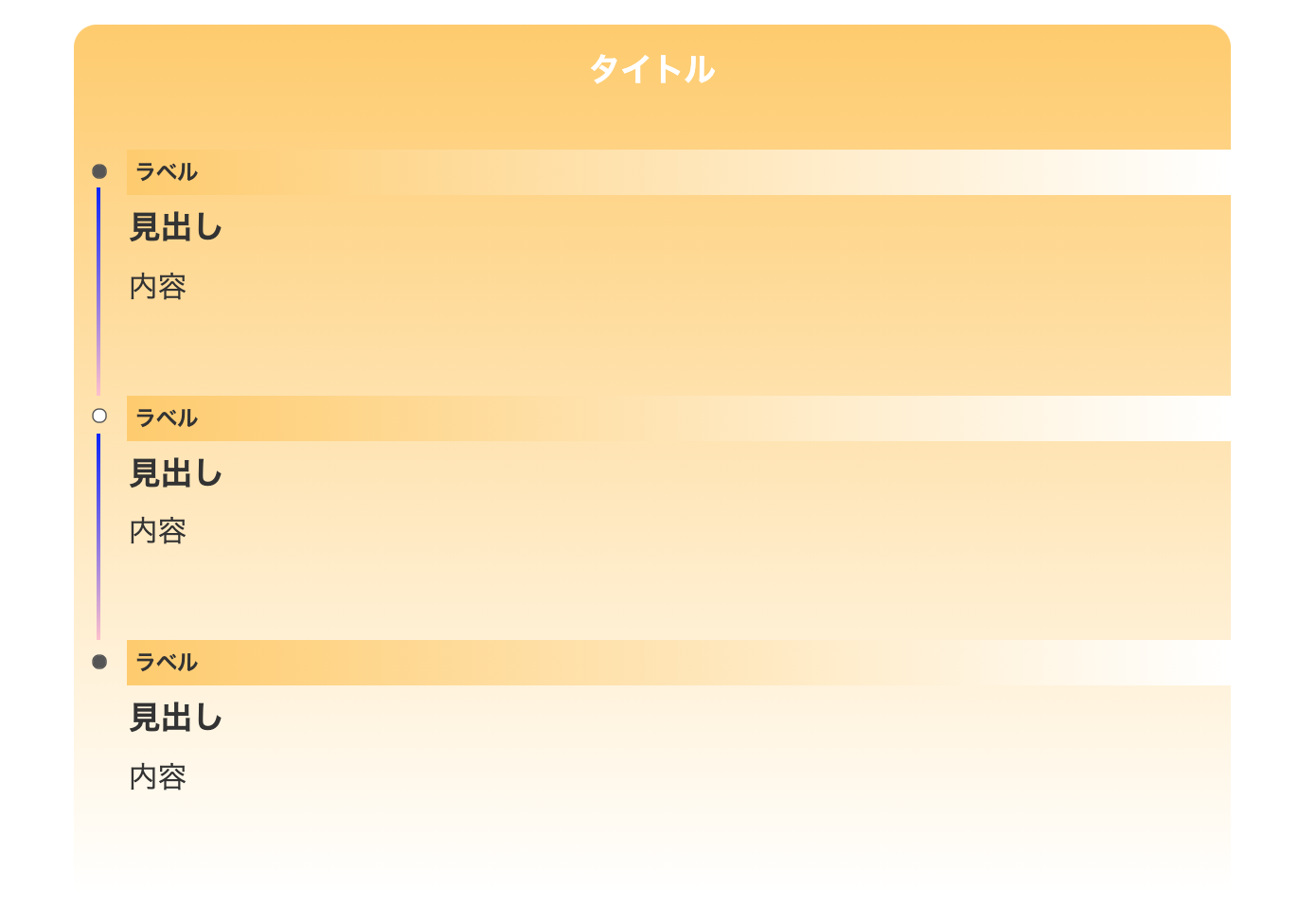
ボックスをグラデーションで色つけしました。background: linear-gradient(#ffcc66 1px, #ffffff);の部分のカラーコードを希望の色にして使用してください。
- CSSをコピペ
-
/*タイムライン*/
.timeline-box ul > li:before {
content: "";
}
.partsUl-1 .timeline-box ul {
background-color: transparent;
}
.timeline > li.timeline-item {
padding-left: 0;
}
.content .timeline-item-content {
margin-top:0;
margin-left: 5px;
padding: 0 0 1.5em 1.1em;
width: 95%;
}
.content .timeline-item-snippet {
margin-top: .5em;
padding: 0 0 1.5em;
}
/*ボックス*/
.timeline-box {
margin-bottom: 20px;
padding-top: 10px;
box-sizing: border-box;
border-radius:15px 15px 0 0;
background: linear-gradient(#ffcc66 1px, #ffffff);
}
.timeline-box *{
box-sizing: border-box;
}
.timeline-box .timeline {
list-style: none;
padding: 0 0 6px 0;
margin: 0;
}
.content .timeline ul {
margin-bottom: 20px;
}
/*タイトル*/
.timeline-title {
font-weight: bold;
font-size: 1.1em;
text-align:center;
margin-bottom:2rem;
padding-bottom:10px;
color:#ffffff;
}
.timeline > li {
margin-bottom: 60px;
}
.timeline > li.timeline-item {
overflow: hidden;
margin: 0 0 0 10px;
position: relative;
}
/*ラベル*/
.timeline-item-label {
padding-top: 2px;
font-weight: 700;
font-size: 14px;
margin-left: 1.8em;
background: linear-gradient(to right ,#ffcc66, #ffffff);
padding:5px;
margin-bottom:5px;
}
@media screen and (max-width : 480px){
.timeline-item-label {
font-size:16px;
}
}
/*見出し*/
.timeline-item-title {
font-size: 1.1em;
font-weight: 700;
line-height: 1.5;
}
/*●部分*/
.content .timeline-item:first-of-type:before {
background: #555555;
}
.content .timeline-item:last-of-type:before {
background: #555555;
}
.content .timeline-item:before {
content: '';
width: 14px;
height: 14px;
background: #ffffff;
position: absolute;
left: 0;
top: 7px;
border-radius: 50%;
border: solid 2px #555555;
}
.content .timeline-item:last-of-type:after {
background: 0 0;
}
/*縦線*/
.content .timeline-item:after {
content: "";
width: 3px;
background: linear-gradient(blue, pink);
display: block;
position: absolute;
top: 25px;
bottom: 0;
left: 5px;
}
続いてタイムラインの色をカスタマイズする方法を解説していきますね!
ステップフローの色をカスタマイズする方法
タイムライン(ステップフロー)の色を変更する方法を解説していきます。各デザインテンプレートによって多少 編集する部分は変わってますが、やり方は基本的に同じです!
- 文字の色を変更する
- 背景色を変更する
- 枠線を変更する
- アイコンを変更する(FontAwesome)
その前に CSSの色の変更方法を簡単にお伝えします。
デザインの色を変更するには、カラーコード(#)を変更します。
#000000となってる #プラス 6桁の番号がカラーコードです。
例えば、以下のコードだと #555555がカラーコードですね。
background: #555555;
カラーコード以外にも、「gray,red,blue」など、単色なら英語表示で設定することもできます。
background: red;
カラーコードを知りたい場合は原色大辞典がとても分かりやすく、見てて楽しいのでオススメです。
文字の色を変更する
文字の色を変更したい場合は、colorプロパティを編集します。
color:#ffffff;/*文字色*/
colorプロパティ内のカラーコードを変更すると、希望の色に変更することができます。
例) color: #555555;
背景の色を変更する
ボックスやタイトルの背景を変更したい場合は、backgroundプロパティを編集します。
background:#ffffff;/*背景色*/
枠線を変更する
枠線の色を変更したい場合は、borderプロパティを編集します。
borderを使用する場合は、カラーコードだけではありません。このコード内には、「線の種類、線の太さ、カラーコード」の 3つを書き加える必要があります。
border:solid 3px #ffffff;/*種類 太さ カラー*/
線の種類
- solid:一本線
- double:二重線
- dashed:破線
- dotted:点線
他にもいくつかありますが基本的には上記で十分です。
線の太さ
線の太さは数字+pxで示します。
例) 5px
数字が大きいほど線が太くなりますが、太くても 5pxがマックスかなと思います。それ以上太くするとタイムラインより枠線が目立ちます。
アイコンを変更する【Font Awesome】
ステップフローのアイコンを変更する際は FontAwesomeを使用します。Font Awesomeは、数多くのウェブアイコンを扱う Webサイトです。PRO(有料)もありますが、ブログで使用するだけなら無料プランで十分です。
Font Awesomeの登録・設定については以下の記事で詳しく解説してるので、ご覧ください。
>>【THE THOR向け】初心者でも簡単!Font Awesomeを導入する方法
Ai 無料アイコンが使い放題!Font Awesomeを THE THOR(ザ・トール)に導入する方法を紹介するよ! こんな人にオススメ THE THORでオシャレなアイコンを使いたい記事内でTwitterやチ[…]
Font Awesomeの使い方を簡単に説明
Font Awesomeの使い方を簡単に説明しますね!
まずアイコンを表示するには、アイコンコードと言うものを使っています。
\f015 ←これがアイコンコードです。
このアイコンコードを変更したい CSSの箇所に入力して使います。
例えば、今回で言うと以下の部分です。
.content .timeline-item:last-of-type:after{
position: absolute;
font-family: “FontAwesome”;
content: “\f212”;
left:80%;
font-size: 6em;
opacity: 0.1;
}
上記のように、font-familiy:”FontAwesome”;と合わせて使います。
※アイコンコードの前に必ずバックスラッシュ( \ )を付けてください。そうじゃないとアイコンが反映されません。
Font Awesomeのアイコンを使う手順は以下の通りです。
1. サイト上部の「Icons」からアイコンを選ぶ
2. そのアイコン画面からコードをコピペ
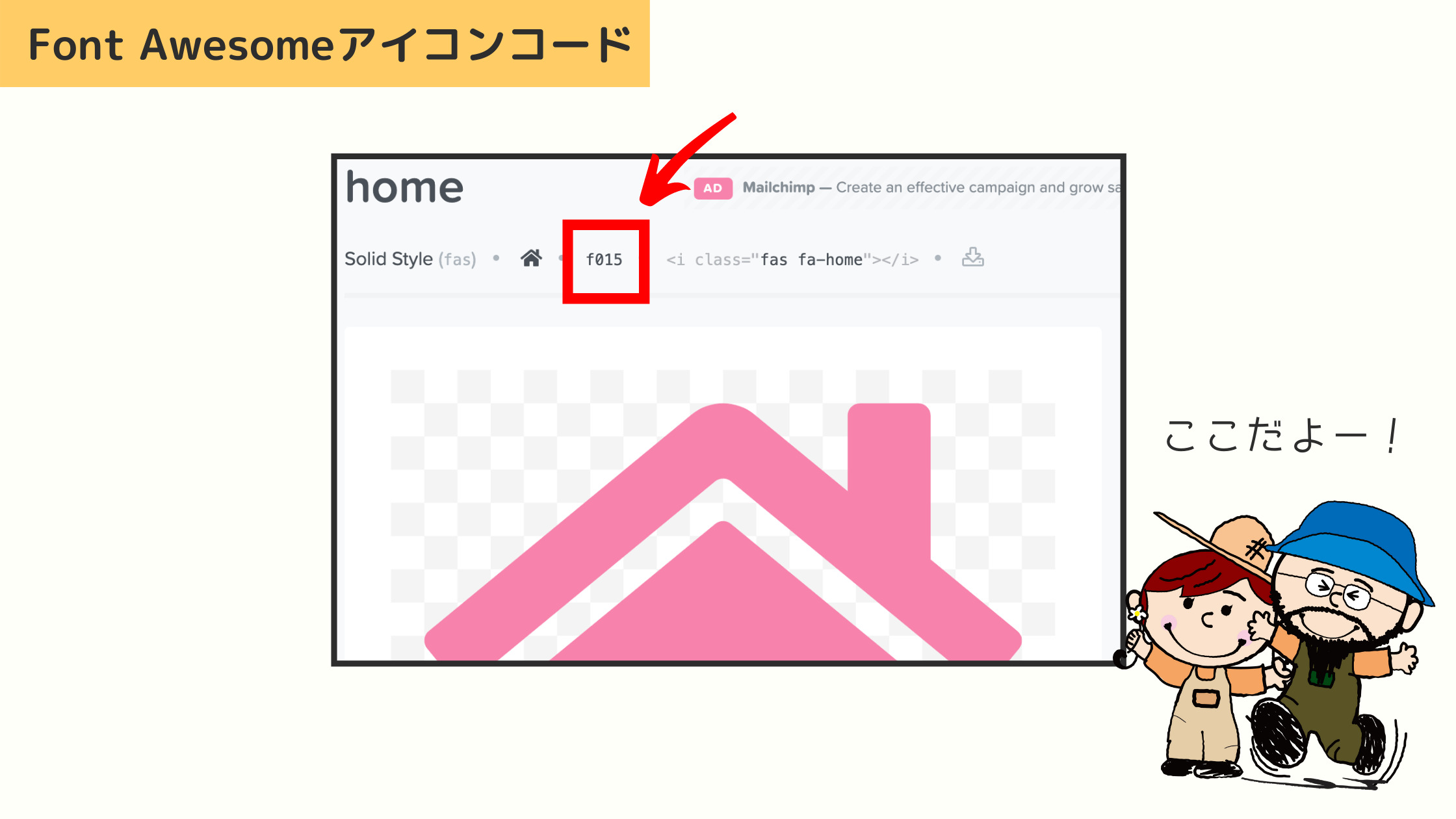
あとは希望の部分にアイコンコードを貼り付けて完了です。
ステップフロー(タイムライン)の使い方
最後に、ステップフロー(タイムライン)の使い方を説明します。HTMLや CSSが何か分からない人のために、CSSコードの説明もしておきますね。デザインをアレンジしたい時にご参考ください。
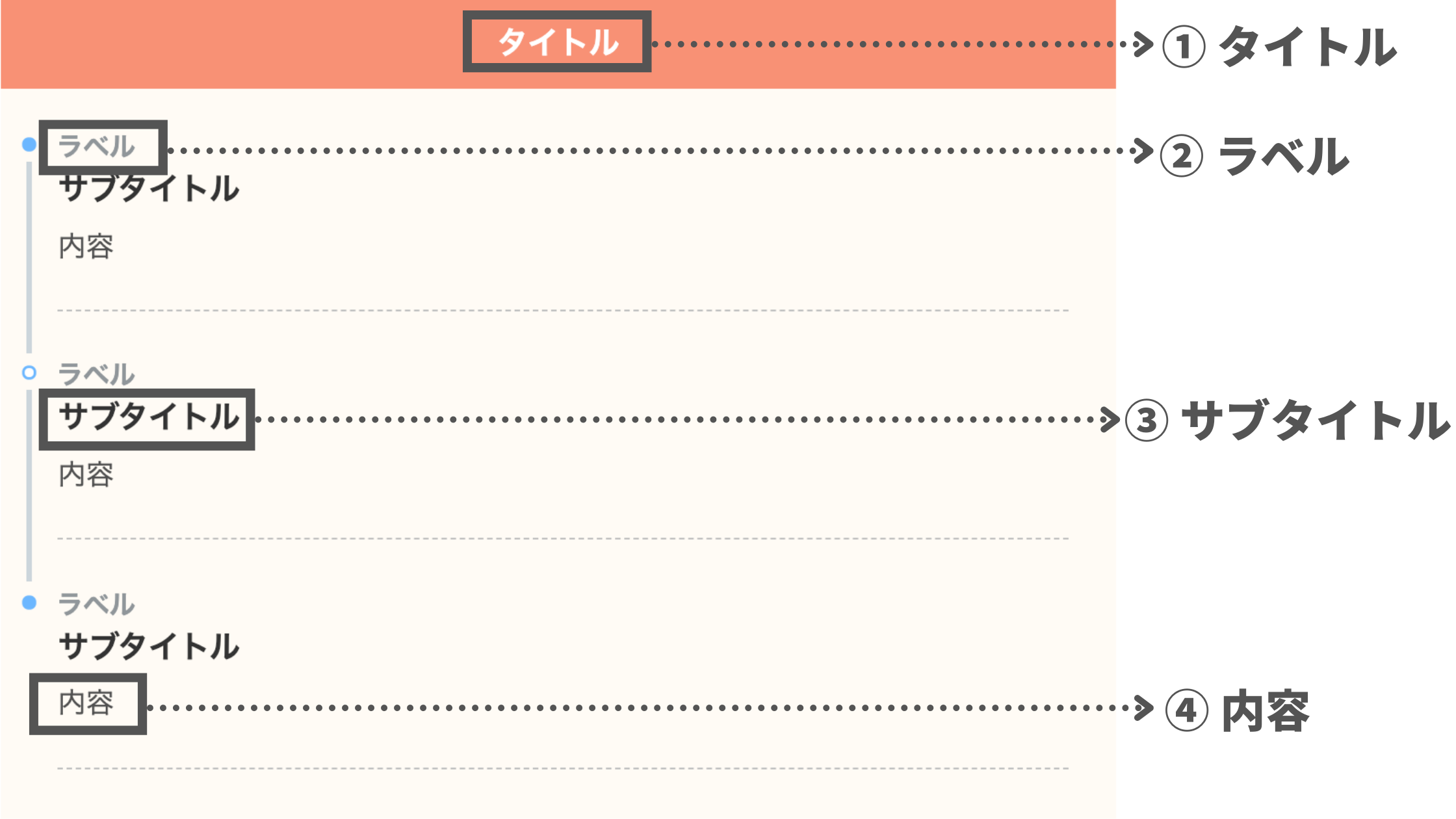
② ラベル:どの工程部分かを表すラベル
③ 見出し:作業の内容のタイトル
④ 内容:その作業の内容
ひとつずつ説明していきます。
① タイトル
ステップフロー(タイムライン)が何を示すタイトルかを設定します。
あまり長くなると 2列になって見た目がブサイクになるので、10文字前後が目安です。
例)
× タイムライン(ステップフロー)を作るカスタマイズ手順
○ ステップフローを作る手順
② ラベル
ラベルはステップフローの段階を説明する役割があります。1〜5文字以内で収めるのがオススメです。
例えば以下のワードがメジャーです。
- 手順1
- STEP1
- その1
③ 見出し
見出しは手順を説明するタイトルです。見出しも簡単に説明しましょう。大まかなタイトルにして、細かい説明は「内容」で説明してください。
テーマの設定にもよりますが、私たちの検証では 10〜15文字が目安です。
コツは、ユーザーが見出しだけで何をするかが理解できるものが良いでしょう!
④ 内容
内容はその手順で何をするかを説明する部分です。本文で詳しく説明するので、内容ではそれを要約したものを設置すると良いでしょう。
特に文章の長さは決まってませんが、長すぎると逆に読まれません。50字以内でまとめると分かりやすいステップフローになります。
上記で紹介した通り、リンクテキストや画像、ボックスなども挿入が可能です。
THE THORにステップフローを実装したユーザーさんのコメント
このカスタマイズを実装していただいたユーザーさんから、嬉しいコメントをいただきました!
昨日これ使いました😊
すっごく簡単に導入できた!
phpとcssをコピペすればいいだけ。
3分もかからなかったです😆
THE THORユーザーさんには、ホントおすすめ。 https://t.co/7uWOH25RDm— ヨフカシ♂️@昼間は個人商店を頑張ってる人。 (@yofukashi_kirin) June 23, 2021
ご覧のように、誰でも 3分で実装できる簡単なカスタマイズです。
今回コメントをいただいたヨフカシさん(@yofukashi_kirin)は、THE THORの使い方やカスタマイズをたくさん紹介されてるブロガーさんです。記事はとても読みやすく、特に THE THORのタブコンテンツの記事はたいへん勉強になるので、ぜひご覧ください!
導入済みのブログを紹介させてください
「この記事を見てカスタマイズ導入したよ!」という人で、SNSやブログでこの記事を紹介していただいた場合、このブログで紹介させていただきます!
SNSの場合は、私たちのアカウントのタグを付けてください。そうしないとシェアしていただいたことに気づくことができません。
ブログの場合は、外部リンク(テキストでもカード型でも可)を設置したのち、当サイトのお問い合わせからご連絡ください。
たくさんの人に導入していただきたいので、ご連絡お待ちしております!
THE THORでステップフロー(タイムライン)を作るカスタマイズ:まとめ
今回は THE THOR(ザ・トール)でタイムライン(ステップフロー)を作るカスタマイズを紹介しました。
最後に作り方をおさらいしておきましょう。
- STEP1functions.phpを編集するTHE THOR(ザ・トール)でタイムラインを実装させるコードを functions.phpに貼り付けます。
- STEP2CSSをコピペするタイムラインのデザインを整える CSSを THE THORの「追加CSS」にコピペします。
- STEP3HTMLをコピペHTMLコードを記事内の好きな場所に設置してタイムラインを使用します。
タイムラインは旅行のスケジュールや、手順などを紹介する時にとても役に立ちます。それが残念ながら THE THOR(ザ・トール)にはデフォルトで搭載されていません。
今回のカスタマイズでより読みやすい、オシャレなブログを作ってくださいね!他にも THE THOR(ザ・トール)に関するカスタマイズを紹介してるので読んでみてください♪
何か質問やカスタマイズの要望があれば、お問い合わせいただくか Twitterにて DMください。
最後まで読んでいただきありがとうございます。
おわり
- 2022年1月23日
- THE THORのカスタマイズ
- CSSカスタマイズ, THE THOR